An ocean of colour: Why blue is autumn's next big colour trend
Despite the turn of the seasons, this autumn welcomes warm and bright hues of blue contrasted with white, which has taken inspiration from water, weather and cities
Your support helps us to tell the story
From reproductive rights to climate change to Big Tech, The Independent is on the ground when the story is developing. Whether it's investigating the financials of Elon Musk's pro-Trump PAC or producing our latest documentary, 'The A Word', which shines a light on the American women fighting for reproductive rights, we know how important it is to parse out the facts from the messaging.
At such a critical moment in US history, we need reporters on the ground. Your donation allows us to keep sending journalists to speak to both sides of the story.
The Independent is trusted by Americans across the entire political spectrum. And unlike many other quality news outlets, we choose not to lock Americans out of our reporting and analysis with paywalls. We believe quality journalism should be available to everyone, paid for by those who can afford it.
Your support makes all the difference.Come September, bright colours in nature will fade as fluorescent greens dull into mustard yellows and weaken into earthy tones, and blue sunny skies become covered with grey clouds. But as the season turns autumnal, winter catalogues and catwalks are brimming with bright blues mixed with bold and moody tones, with an element of glassier and icier light hues, reminiscent of the sea in summer. The colours are paired with white to re-create the soft feel of water.
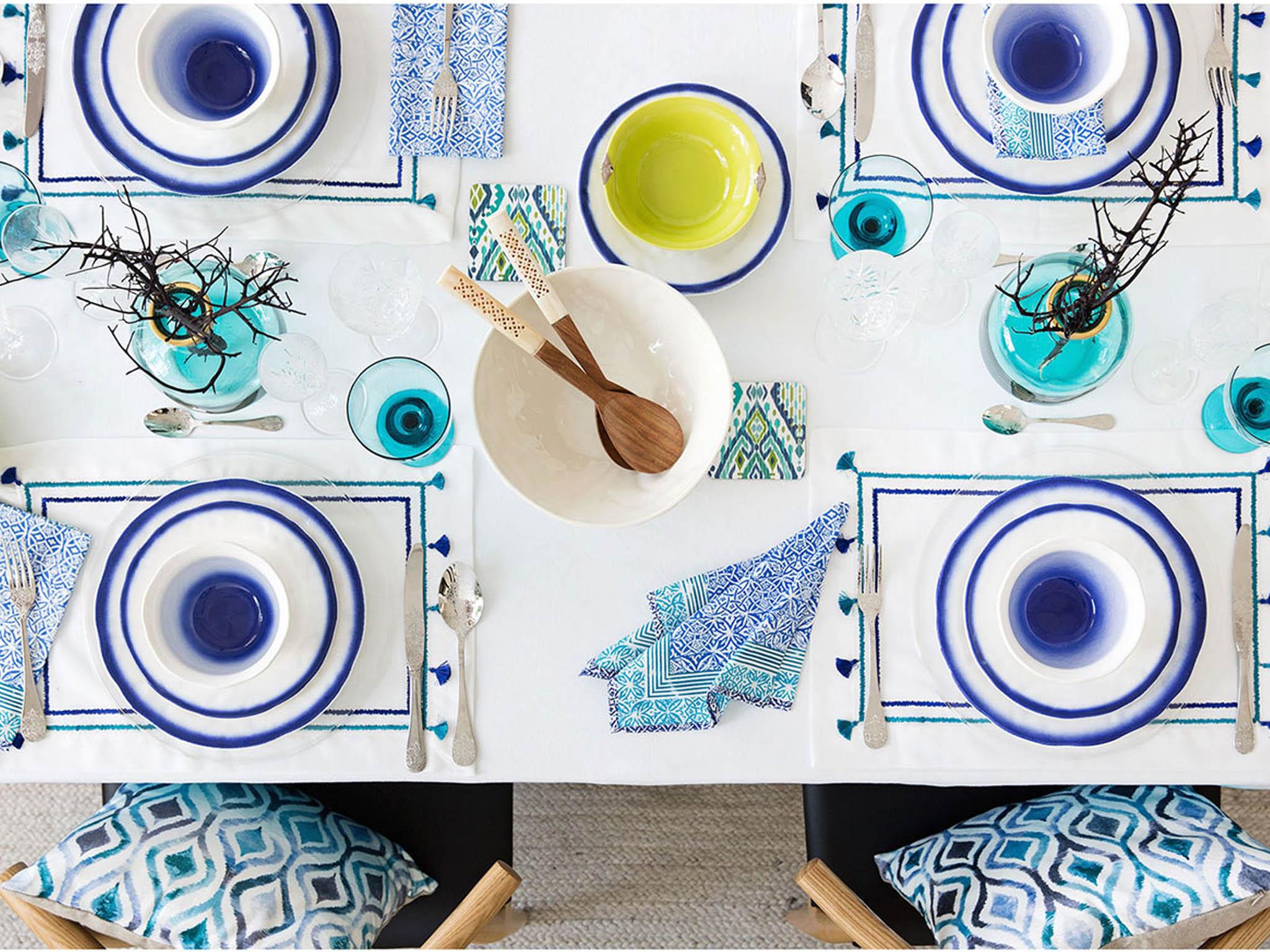
As well as water, inspiration is drawn from India and the Middle East, as Zara Home Jaipur’s collection takes its name from the pink city, but includes blue, pinks and golds subtly mixed with Asian patterns and ombre fading. The colours evoke blue cities of the world, including India’s Jodpur, where the buildings take on hues of Bramin blue mixed with cornflower and royal blues which from the air looks like the ocean.
And similarly Chefchaouen in Morocco, where the buildings favour a pale shade of blue-wash, while Marrakech is home to the famous Majorelle Gardens, known for its cobalt blue – named Majorelle blue after the painter and founder of the gardens.
As well as being on the outside of homes, the colour penetrates inside the home, spreading acrossn everything from crockery to bedding. Sam Hood, founder of luxury homewares Amara, says: “Blue is one of the most versatile colours when it comes to interior design ideas, and is a trend to look out for in the upcoming season.”
“A multitude of blue tones in your home decor can develop a refreshing living space. Try mixing deep blue hues with crisp whites to create a sense of serenity and a room reminiscent of the Greek islands.''
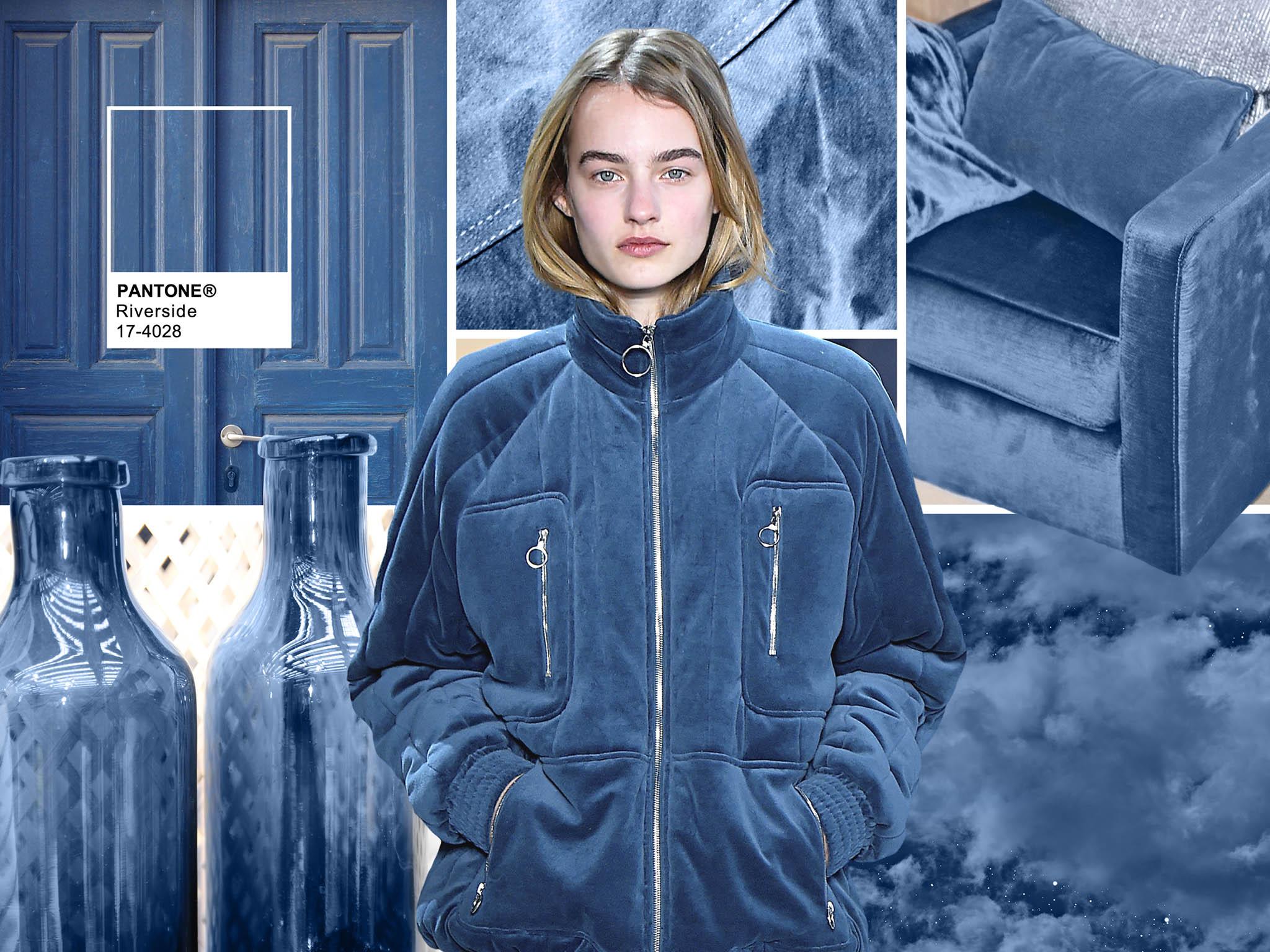
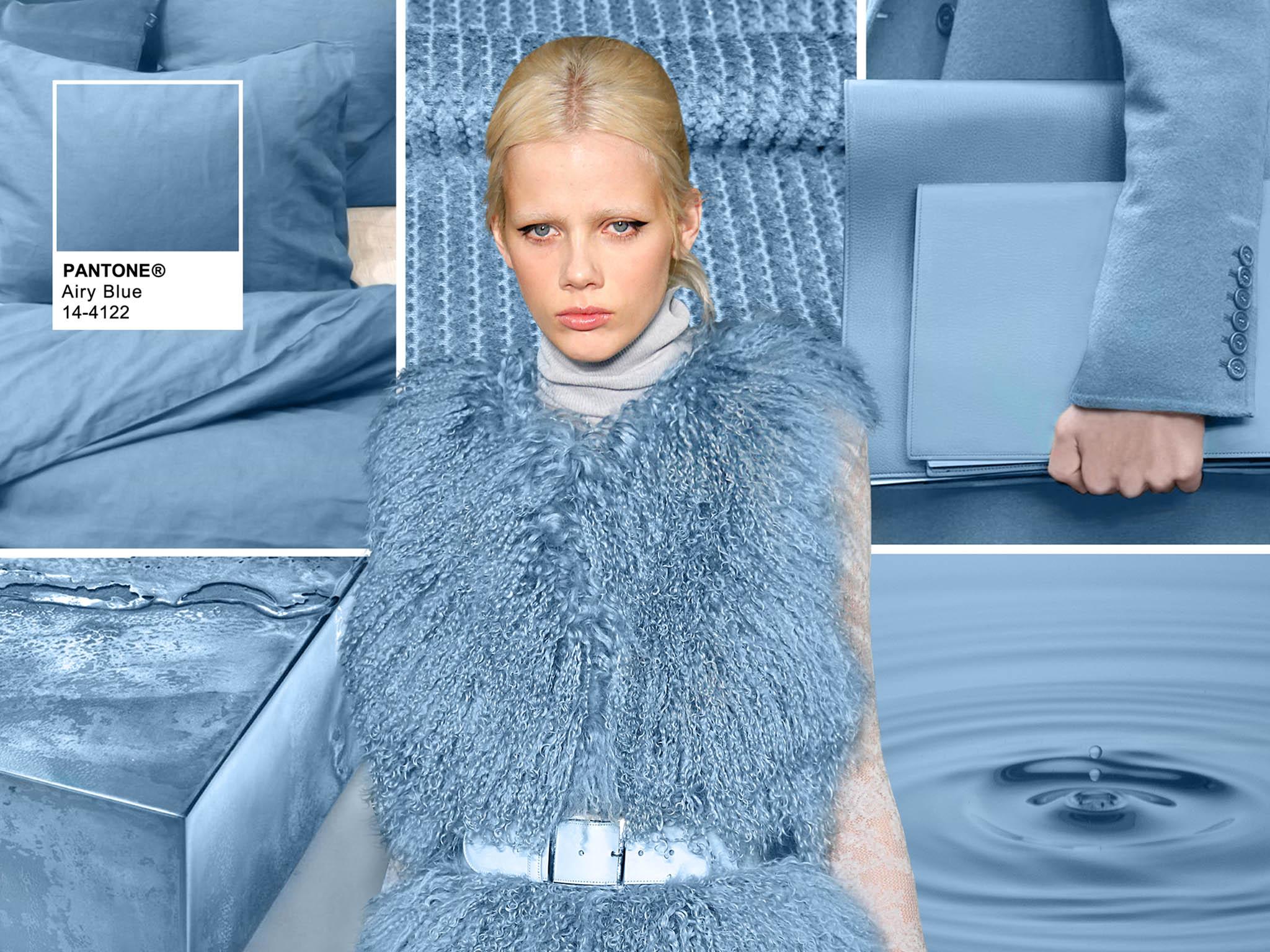
The Pantone colour report for autumn 2016 introduces a new colour, riverside. It marks the importance of blue in the season’s palette, describing it as cool and calming as well as strong and stable and brings with is sophistication. A second blue tone from Pantone is airy blue, which is says offers an idea of weightlessness, with nods to serenity.
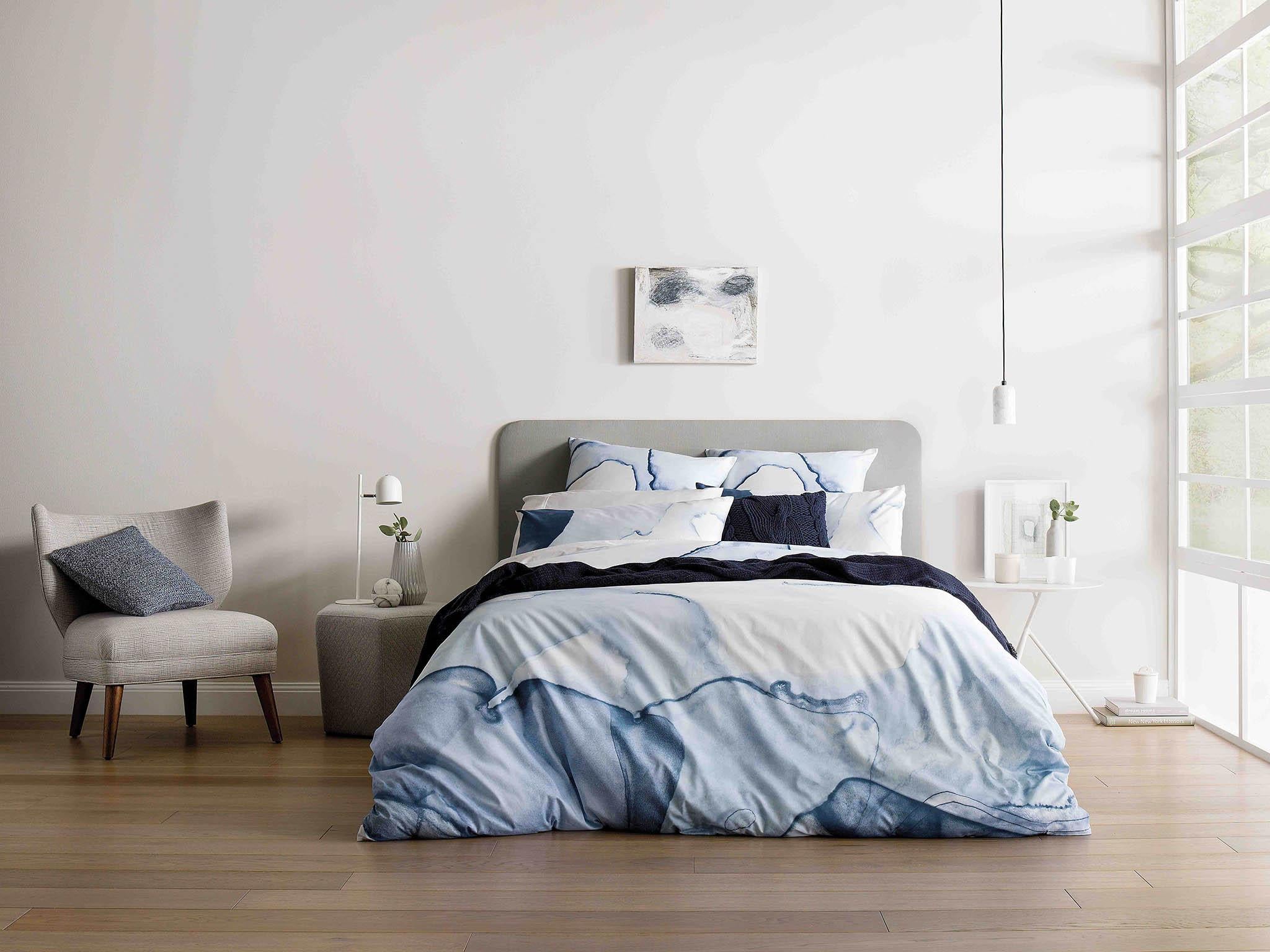
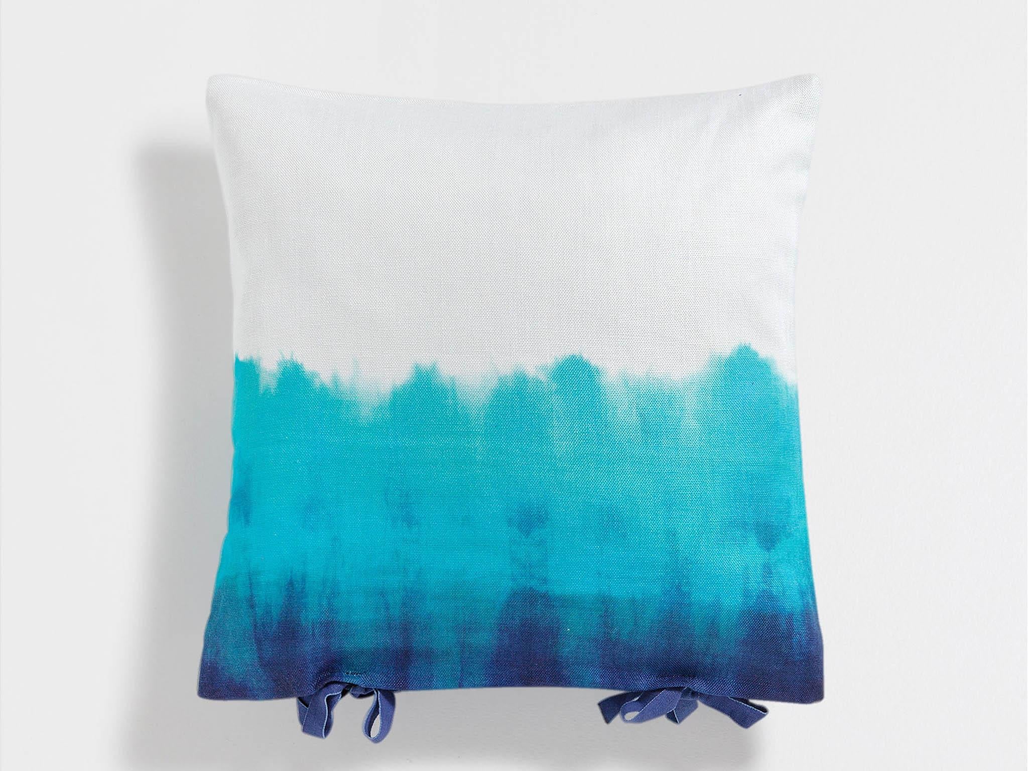
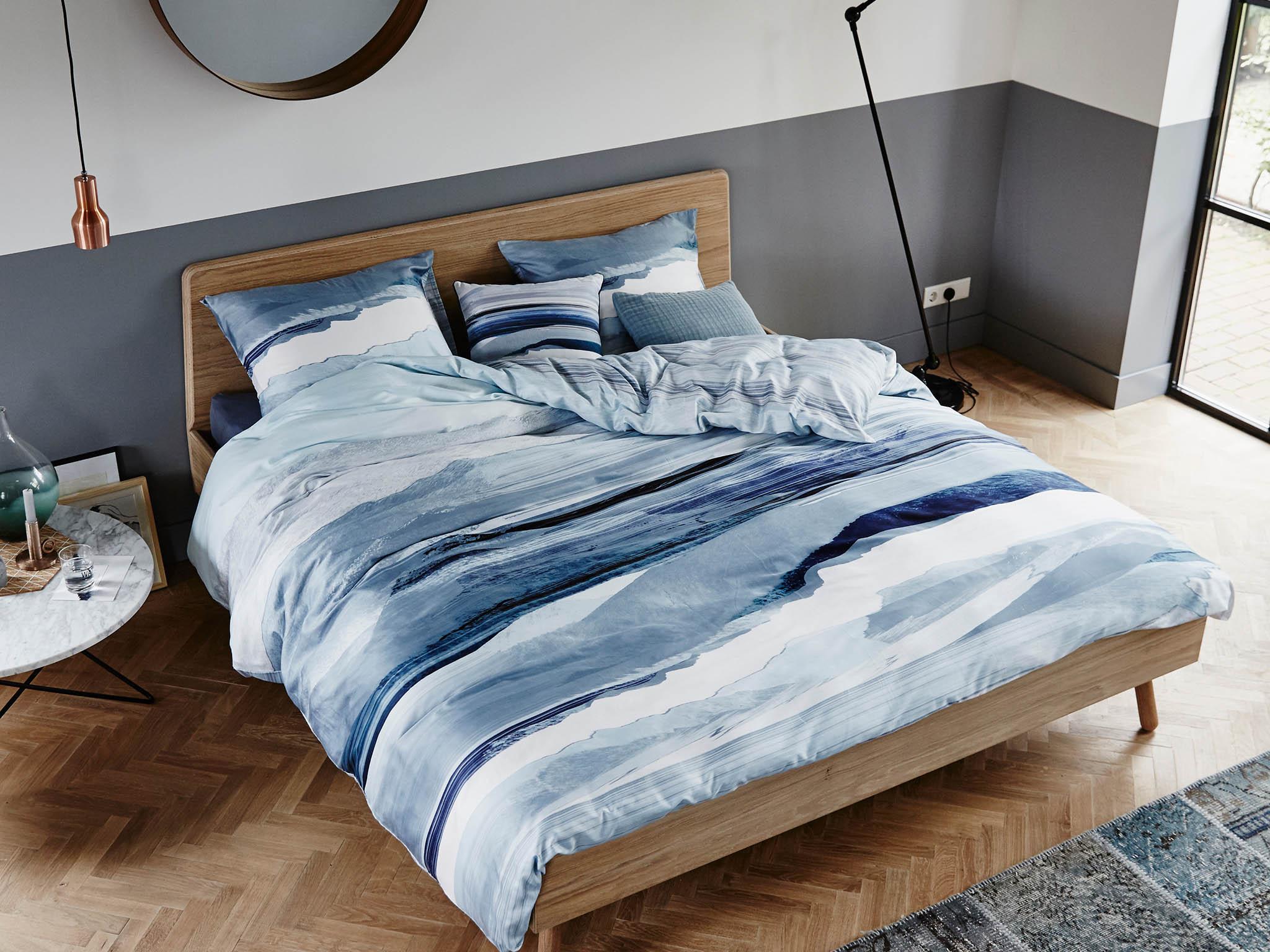
Sheridan’s autumn/winter collection includes Drift, inspired by Western Australia. The sheets have been painted by hand, using ink drawings as an ode to the shorelines and caves found along the WA coastline. The sheets' soft textures and varying hues replicate the natural light that reflects on the water too from the washed-out tones of the morning light to the saturated hues from the afternoon.
“Blue is becoming an increasingly important colour in the Habitat palette, so much so that we’re going to be launching a range of products specifically around cobalt for spring 2017,” says Polly Dickens, creative director for Habitat.
“It is a wonderful colour with lots of references – Picasso, Yves St Laurent, Yves Klein, Hockney. As a colour it works well in glazes on ceramic which gives great depth and vividness, creating a big shot of colour impact on its own, or equally it mixes very well with terracotta, brown, black and ivory tones.
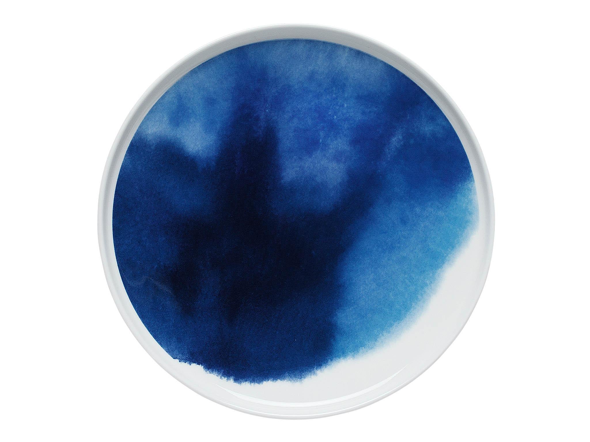
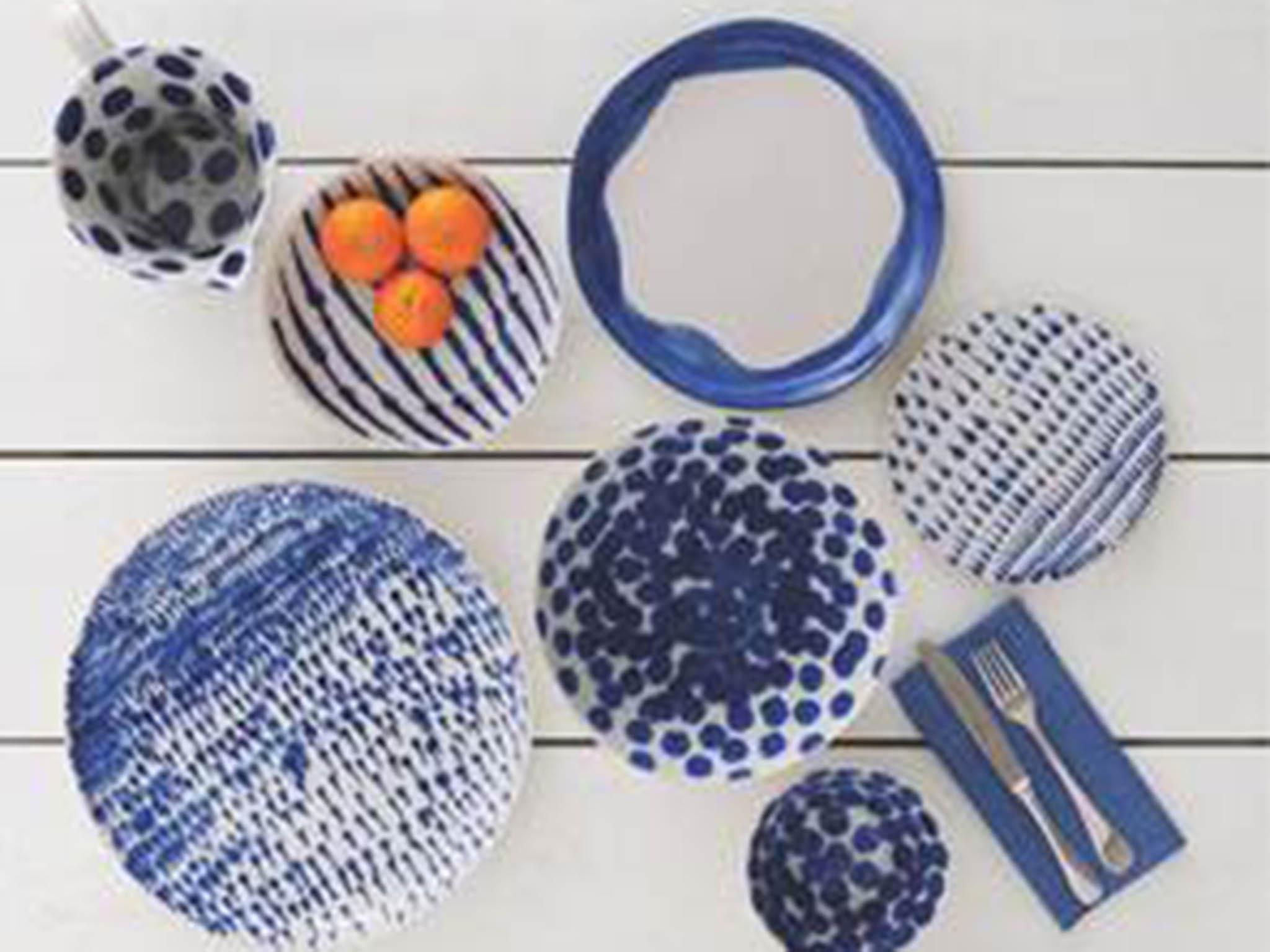
“It’s a colour that can be used throughout the house and we have seen particular success recently with our blue ‘Blot’ collection which continues to be one of our best-selling and expanding tabletop ranges.
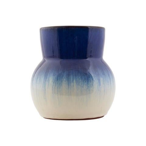
“In accessories we recently introduced the new Abaya vase with an intense cobalt blue and white design – a precursor to the new SS17 collection – which has again proved a real hit with customers so we’re extending blue to the garden next year as it looks especially good against greenery and works well with a variety of plants and flowers.”
Join our commenting forum
Join thought-provoking conversations, follow other Independent readers and see their replies
Comments