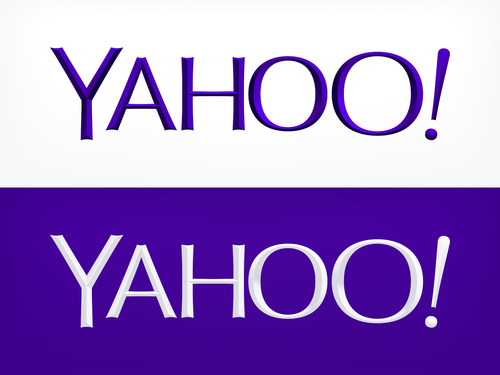
Yahoo's reveals new logo, bevels and all
Slimmer typeface offers a re-design, but nothing drastic

After trialling 30 different possibilities over 30 days Yahoo have finally unveiled a new logo. The update is part of an ongoing push to rejuvenate the ailing brand, led by CEO Marissa Mayer.
However, the updated logo suggests that Mayer doesn’t want to break with tradition too much. The new typeface is slimmer, but the colour has been kept the same (Pantone Violet C) and the notorious exclamation mark has clung on, teetering on the edge at a nine degree angle.
Mayer described the changes on her Tumblr: “We knew we wanted a logo that reflected Yahoo - whimsical, yet sophisticated. Modern and fresh, with a nod to our history. Having a human touch, personal. Proud.”
And despite the apparent simplicity, as ever with the branding of a Fortune 500 company there’s been a lot of work going on behind the scenes. The video below shows off the logo’s “mathematical consistency”, showing of the mirrored angles and repeated widths of various elements. Whether the average punter can see all that is probably less of a mathematical cert.
The main oddity though might be the bevels that add depth to the typeface. “For the texture,” says Mayer, “we came up with the nice idea of creating a chiseled triangular depth to the logo - this causes the letter Y to appear in the shading at the ends of each of the letters.”
Reaction from Twitter was as even-handed and calm as you’d expect. “THE NEW YAHOO LOGO IS SO UGLY LITERALLY WHY” says KimJongIl (no relation); whilst Justin Williams comments that “The new Yahoo logo looks like it got run through Alien Skin Eye Candy on Photoshop 4.0.” And, leading the charge of the snark brigade, is this comment from Ian Schafer: “I believe the font is "Meh Condensed"”
Join our commenting forum
Join thought-provoking conversations, follow other Independent readers and see their replies
Comments
Bookmark popover
Removed from bookmarks