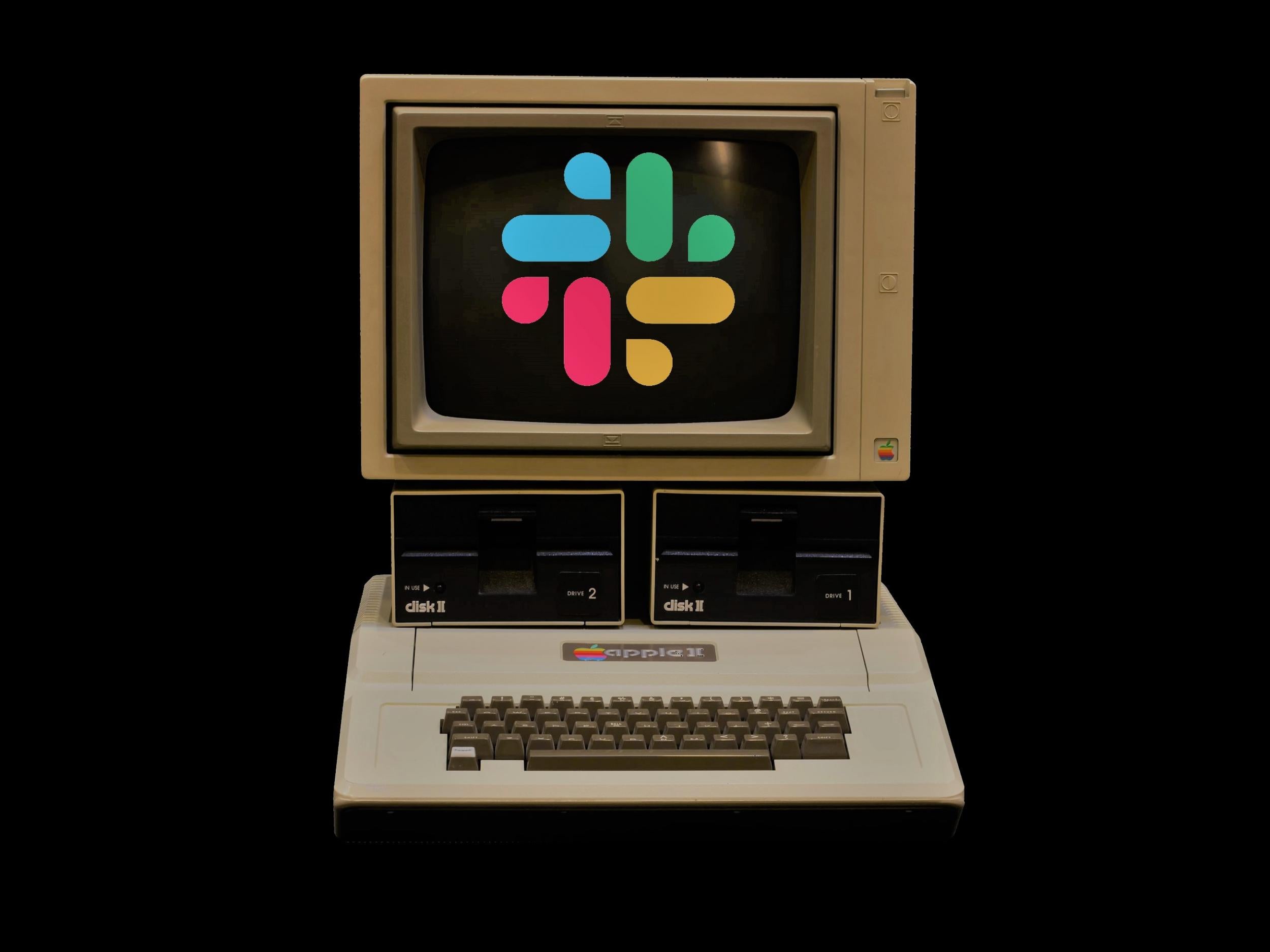
New Slack logo proves controversial among messaging app users
The workplace app described its old hashtag logo as 'simply awful'

Slack has launched a new logo to replace its hashtag icon, prompting intense reactions from users of the popular workplace messaging app.
The updated logo will be introduced to the firm's website and app over the next few months, featuring similar colours as its predecessor but with a simpler design.
Slack cited various issues with its old logo for launching the new one, explaining in a blog post that it was "extremely easy to get wrong."
The firm stated: "It was 11 different colours – and if placed on any colour other than white, or at the wrong angle (instead of the precisely prescribed 18-degree rotation), or with the colours tweaked wrong, it looked terrible."
One person responded to the announcement on Twitter: "Yuk! Undo quickly! Pull a Trump! Undo and delete this tweet!"
Slack responded: "Appreciate the advice but we're going to leave as is."
Others pointed out the apparent similarities between the new design and the logo for Google Photos.
Slack's blog post described the new logo as "reassuringly similar" to its predecessor, while also being being more adaptable for use within different contexts.
"It uses a simpler colour palette and, we believe, is more refined, but still contains the spirit of the original," the post states.
"It's an evolution, and one that can scale easily, and work better, in many more places... It’s still us. We’re still Slack. But more consistent and, we hope, more instantly recognizable."
Previous companies to spark a strong reaction for changing its logo include Airbnb, which replaced its lowercase 'a' logo for a looping design in 2014.
People were quick to point out the new logo's apparent similarity to various parts of the body – one in particular.
Join our commenting forum
Join thought-provoking conversations, follow other Independent readers and see their replies
Comments