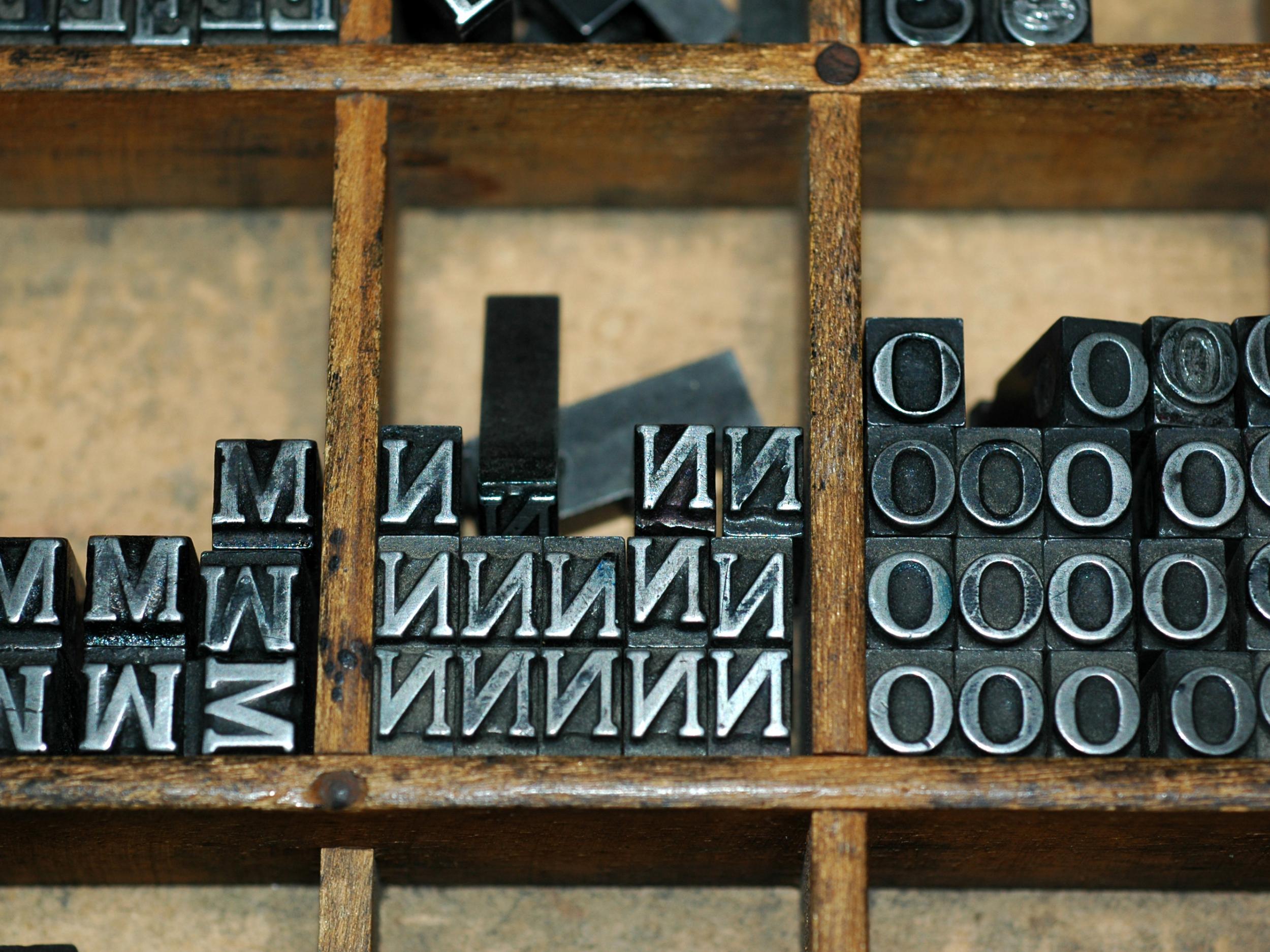
One space or two spaces after a full stop? Scientists have finally found the answer
'Typing two spaces after a period is totally, completely, utterly and inarguably wrong'

In the beginning, the rules of space bar were simple. Two spaces after each full stop. Every time. Easy.
That made sense in the age of the typewriter. Letters of uniform width looked cramped without extra space after the full stop. Typists learned not to do it.
But then, at the end of the 20th century, the typewriter gave way to the word processor and the computer and modern variable width fonts. And the world divided.
Some insisted on keeping the two space rule. They could not get used to seeing just one space after a period. It simply looked wrong.
Some said this was blasphemy. The designers of modern fonts had built the perfect amount of spacing, they said. Anything more than a single space between sentences was too much.
And so the rules of typography fell back into chaos. “Typing two spaces after a period is totally, completely, utterly and inarguably wrong,” Farhad Manjoo wrote in Slate in 2011.
“You can have my double space when you pry it from my cold, dead hands,” Megan McArdle wrote in The Atlantic the same year. (And yes, she double spaced it).
This schism has actually existed throughout most of typed history, the writer and type enthusiast James Felici once observed (in a single spaced essay).
The rules of spacing have been wildly inconsistent since the invention of the printing press. The original printing of the United States Declaration of Independence used extra long spaces between sentences.
John Baskerville’s 1763 Bible used a single space. Single spaces. Double spaces. Em spaces. Trends went back and forth between continents and eras for hundreds of years, Mr Felici wrote. It is not a good look.
And that is just English. Some written languages have no spaces at all and others require a space between every syllable
Obviously, there need to be standards. Unless you are doing avante garde poetry or something , you cannot just space words however you want. That would be insanity. Or at least, obnoxious.
Three psychology researchers from Skidmore College, who decided it is time for modern science to sort this out once and for all.
“Professionals and amateurs in a variety of fields have passionately argued for either one or two spaces following this punctuation mark,” they wrote in a paper published last week in the journal Attention, Perception and Psychophysics.
They cite dozens of theories and previous research, arguing for one space or two. A 2005 study that found two spaces reduced lateral interference in the eye and helped reading. A 2015 study that found the opposite. A 1998 experiment that suggested it did not matter.
“However,” they wrote, “to date, there has been no direct empirical evidence in support of these claims, nor in favour of the one space convention.”
So the researchers, Rebecca Johnson, Becky Bui and Lindsay Schmitt, rounded up 60 students and some eye tracking equipment and set out to heal the divide.
First, they put the students in front of computers and dictated a short paragraph, to see how many spaces they naturally used. Turns out, 21 of the 60 were “two spacers” and the rest typed with close-spaced sentences that would have horrified the Founding Fathers of the US.
The researchers then clamped each student’s head into place and used an Eyelink 1000 to record where they looked as they silently read 20 paragraphs. The paragraphs were written in various styles: one spaced, two spaced and strange combinations like two spaces after commas, but only one after periods. And vice versa, too.
And the verdict was: two spaces after the period is better. It makes reading slightly easier.
Actually, Lifehacker’s one space purist Nick Douglas pointed out some important caveats to the study’s conclusion.
Most notably, the test subject read in Courier New, a fixed-width font similar to the old typewriters and rarely used on modern computers.
Ms Johnson, one of the authors, told Mr Douglas that the fixed-width font was standard for eye tracking tests and the benefits of two spacing should carry over to any modern font.
Mr Douglas found more solace in the fact that the benefits of two spacing, as described in the study, appear to be very minor.
Reading speed only improved marginally, the paper found and only for the 21 “two spacers”, who naturally typed with two spaces between sentences. The majority of one spacers, on the other hand, read at pretty much the same speed either way. And reading comprehension was unaffected for everyone, regardless of how many spaces followed a period.
The major reason to use two spaces, the researchers wrote, was to make the reading process smoother, not faster. Everyone tended to spend fewer milliseconds staring at periods when a little extra blank space followed it. (Putting two spaces after a comma, if you are wondering, slowed down reading speed, so do not do that).
The study’s authors concluded that two spacers in the digital age actually have science on their side and more research should be done to “investigate why reading is facilitated when periods are followed by two spaces”.
But no sooner did the paper publish than the researchers discovered that science does not necessarily govern matters of the space bar.
Ms Johnson told Lifehacker that she and her co-authors submitted the paper with two spaces after each period – as was proper. And the journal deleted all the extra spaces anyway.
The Washington Post
Join our commenting forum
Join thought-provoking conversations, follow other Independent readers and see their replies
Comments
Bookmark popover
Removed from bookmarks