New Airbnb logo draws inevitable genitalia comparisons
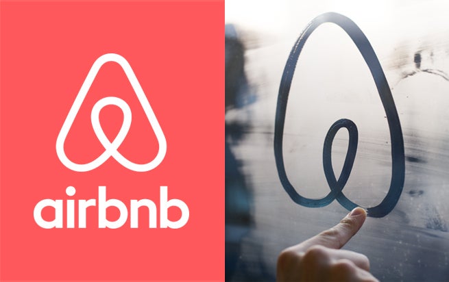
Showing the logo drawn on a glass window may have been the tipping point
In a world where Google moving its second 'g' one pixel to the right is worthy of comment, overhauling a brand logo can be a bit of a minefield. A minefield filled with comments like "It looks like butts!"
Airbnb found that out the hard way this week with the introduction of its new symbol it has christened 'Bélo', which has remarkably managed to draw comparisons on Twitter to breasts, a bum, a penis and a vagina – a true feat of juvenile Freudian interpretation.
In a move that will surely only make things worse, Airbnb wants you to design your own version of the logo, a promotional tool DiGiorno's Pizza was recently burnt by when it was inundated with pies covered in phallically-arranged pepperoni.
The new logo is part of an overhaul of the Airbnb site, which now has a more flat, stripped back design repositioning the company as a lifestyle brand rather than just an apartment rental site.
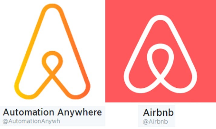
It has been noted that the looped 'A' looks uncannily like that of software company Automation Anywhere though:
The logo is designed to reflect the feeling of 'belonging', with Airbnb writing on Twitter: "Tonight, we're bringing the community together to break bread and celebrate belonging.
"Our symbols are as diverse as our community."
Join our commenting forum
Join thought-provoking conversations, follow other Independent readers and see their replies
Comments