Microsoft Windows update: Major new redesign coming this year, company confirms
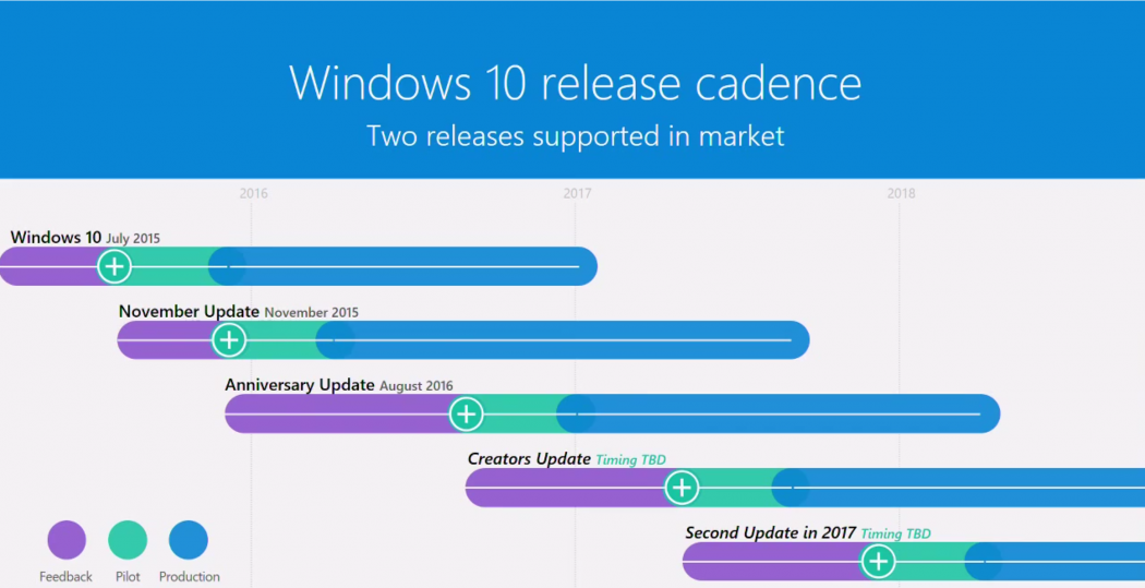
A timeline unveiled at the company's Ignite conference shows that two major software upgrades are coming in 2017

Your support helps us to tell the story
From reproductive rights to climate change to Big Tech, The Independent is on the ground when the story is developing. Whether it's investigating the financials of Elon Musk's pro-Trump PAC or producing our latest documentary, 'The A Word', which shines a light on the American women fighting for reproductive rights, we know how important it is to parse out the facts from the messaging.
At such a critical moment in US history, we need reporters on the ground. Your donation allows us to keep sending journalists to speak to both sides of the story.
The Independent is trusted by Americans across the entire political spectrum. And unlike many other quality news outlets, we choose not to lock Americans out of our reporting and analysis with paywalls. We believe quality journalism should be available to everyone, paid for by those who can afford it.
Your support makes all the difference.A timeline outlining the evolution of Windows 10 has confirmed that two major updates are in the pipeline for 2017.
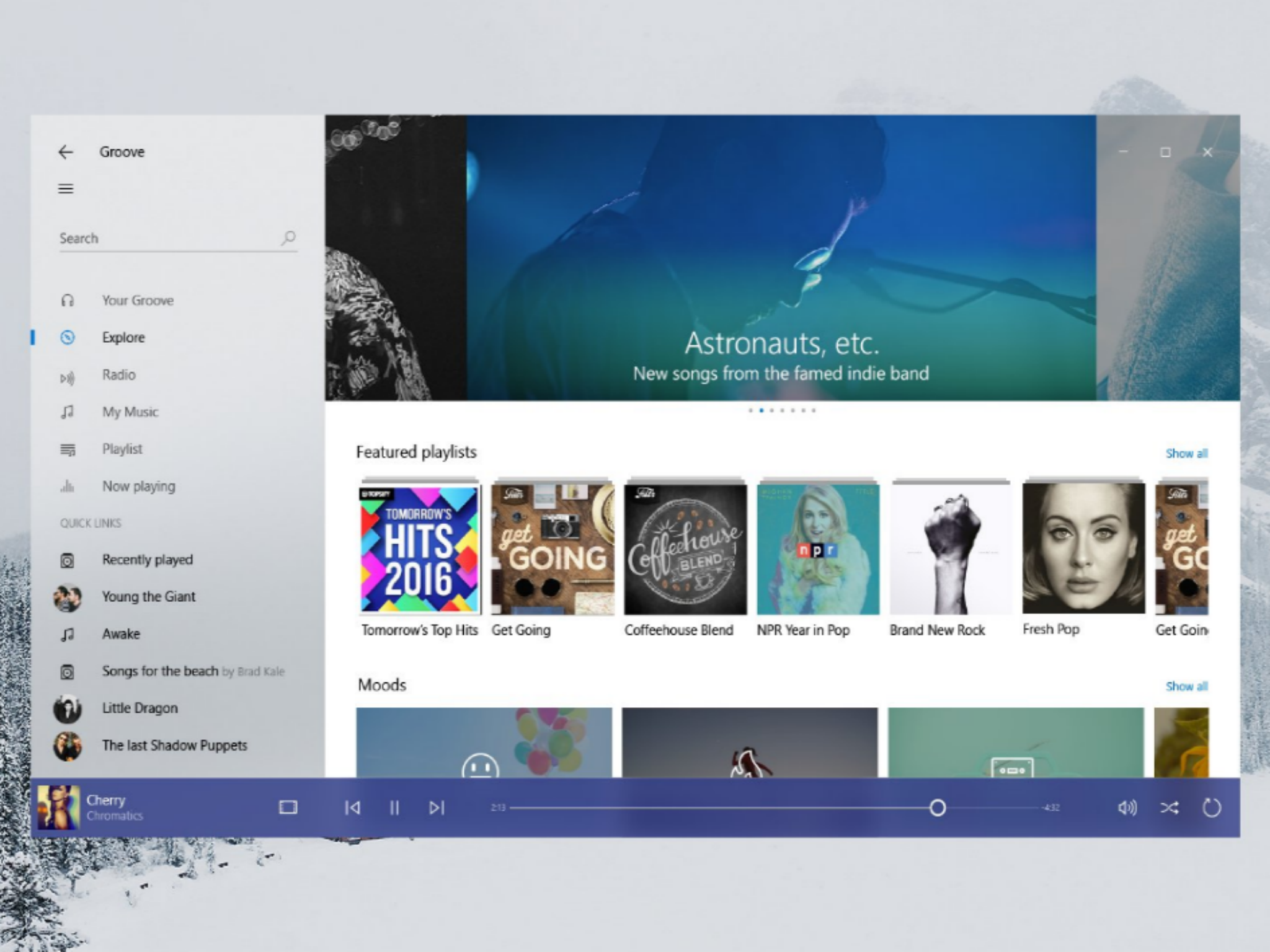
The company is known to be working on a drastically different-looking user interface for the operating system, known as Project Neon, which is likely to arrive with the second update.
The timeline, which doesn’t reveal any specific dates, was spotted by onMSFT at Microsoft’s Ignite conference in Australia.

However, the Creators update – the first of the two – is currently being tested by Windows Insiders and looks set to land in April.
The graphic shows that Microsoft plans to release the second update to consumers towards the end of the year, before a stage dubbed ‘production’ kicks off in 2018.
A leaked screenshot gave us a glimpse of Project Neon earlier this month, and Microsoft appears to be on the verge of ditching several classic features.
The update could kill off window borders and the title bar, alter the appearance of the minimise, restore/maximise and close buttons and remove all colour from the taskbar.
They’re significant changes, but the resulting look is much cleaner and more modern.
Join our commenting forum
Join thought-provoking conversations, follow other Independent readers and see their replies
Comments