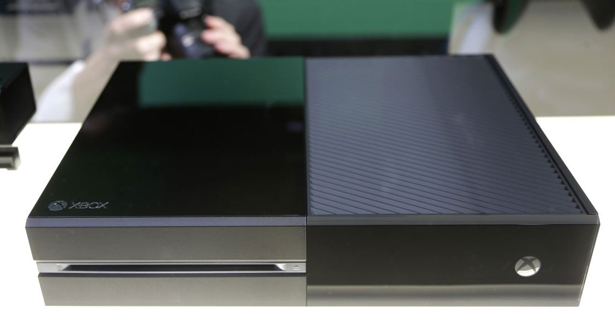
Microsoft defends 'holistic' design of Xbox One: Is it sneaking a PC into the living room?

Although most of the anger directed at the new Xbox One has focused on Microsoft’s policies regarding second-hand games, the actual look of the new console has also been met with confusion.
Microsoft took to its blog yesterday to defend their new design, despite unflattering comparisons between the One and old fashioned VCRs.
“Xbox has always had something to say,” said Carl Ledbetter, creative director of Industrial Design for the One, “It’s always been bold with a strong personality.”
Ledbetter also designed the Xbox 360 S, and The Verge has been among those pointing out the similarities between the two designs.
Matte black features heavily in both, alongside a segmented construction and diagonal vents.
Microsoft describes the One as designed from a “holistic perspective” to create a sense of unity between “hardware and user interface.”
While this sort of ethos may not be the most apparent feature for consumers, the similarities between the One’s UI and that of Windows 8 and Surface are striking. They also show how Microsoft’s desire for a “holistic” system really means further collusion between its console and PC markets.
Calling the dashboard of the new Xbox One “an experience centred on simplicity and intuitive navigation” is fine if consumers are on board with the experience of using Windows 8, but – as a recent roll-back for the Windows 8.1 update of the OS show - this may be a fairly rare experience.
Many industry commentators have seen the new console as Microsoft’s attempt to sneak a PC into the living room, and the shared design language between the One’s UI and Windows 8 seem to confirm these suspicions.
Join our commenting forum
Join thought-provoking conversations, follow other Independent readers and see their replies
Comments
Bookmark popover
Removed from bookmarks