Mac OS X El Capitan first look: Apple tightens up performance and stability, but doesn't forget neat new features
The new software for Mac computers focuses on performance and neat extras
Your support helps us to tell the story
From reproductive rights to climate change to Big Tech, The Independent is on the ground when the story is developing. Whether it's investigating the financials of Elon Musk's pro-Trump PAC or producing our latest documentary, 'The A Word', which shines a light on the American women fighting for reproductive rights, we know how important it is to parse out the facts from the messaging.
At such a critical moment in US history, we need reporters on the ground. Your donation allows us to keep sending journalists to speak to both sides of the story.
The Independent is trusted by Americans across the entire political spectrum. And unlike many other quality news outlets, we choose not to lock Americans out of our reporting and analysis with paywalls. We believe quality journalism should be available to everyone, paid for by those who can afford it.
Your support makes all the difference.The new operating software for Apple computers comes out in the autumn. It was revealed at last Monday’s World Wide Developers Conference keynote and I’ve been using it since the day of the announcement. So this is early software but I’m already reluctant to go back to the current OS, good though that is.
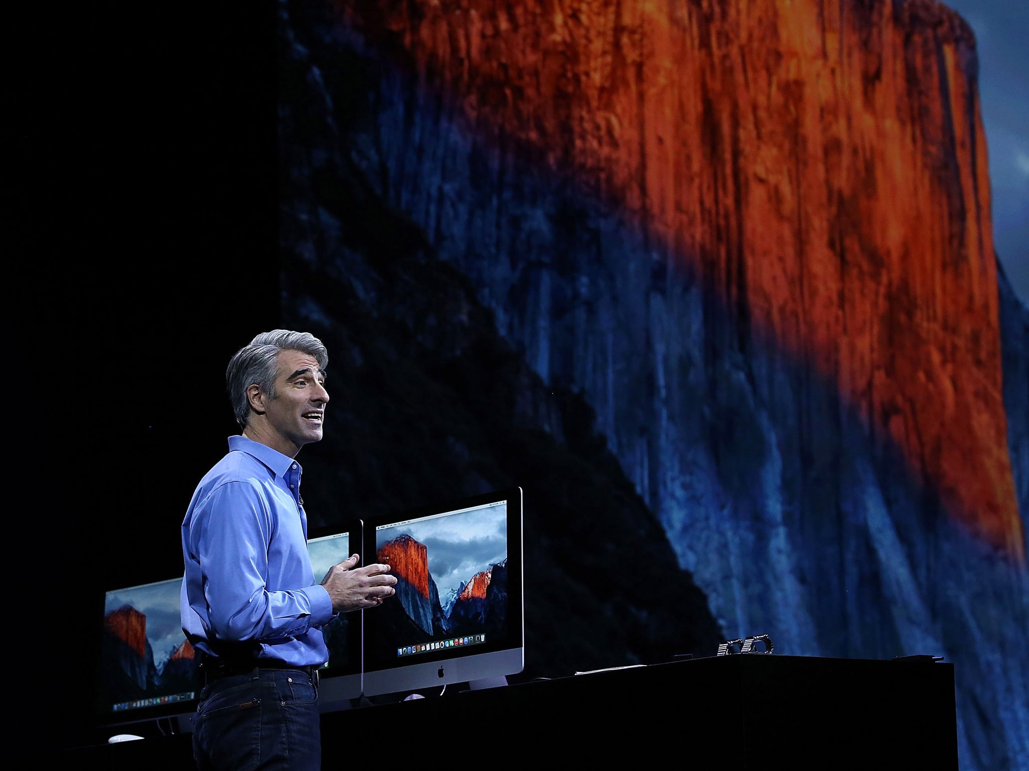
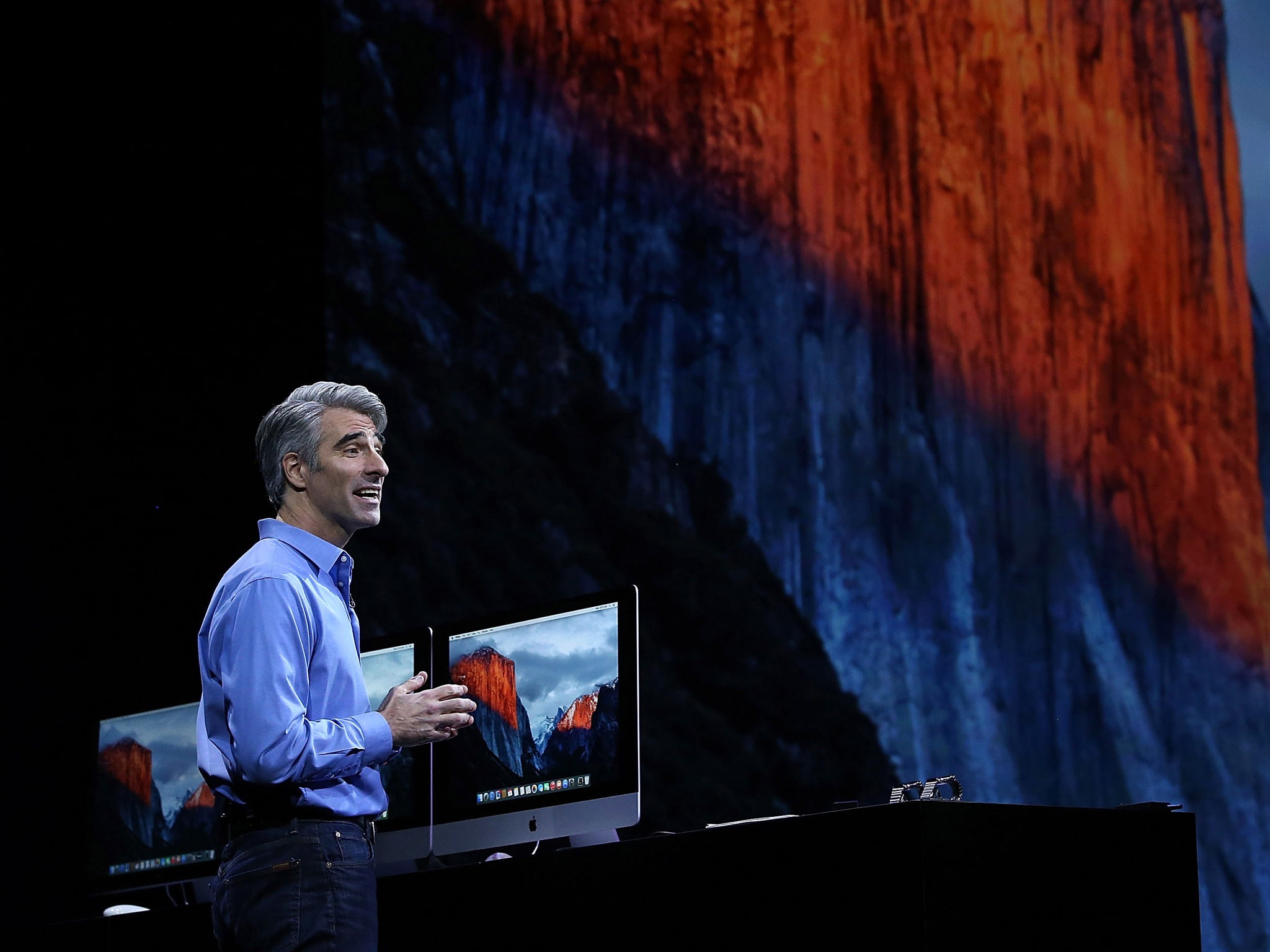
Let’s start with the name. Previously, Apple has followed an annual update cycle where a hugely changed update one year was followed by subtler changes the next. The first year would introduce lots of newly designed apps and a fresher interface, then the second would focus on under-the-hood improvements. These were signified by related names: Lion was followed by Mountain Lion, Snow Leopard came out after Leopard. So last year’s Yosemite is followed by one named after the largest stone edifice in Yosemite national park: El Capitan.
That’s not to say there aren’t important new elements this time around. In fact, the first one jumps out at you as soon as you touch your mouse. You know how sometimes you can’t see the cursor? Wiggling the mouse often reveals the cursor’s position, but not always.

With El Capitan, this movement causes the cursor to magnify until it’s unmissable to even the most myopic. This is a small change but it’s really going to save me time and is sorted without any change to the gesture I naturally employ.
Then there’s the computer’s system font, which is now changed from Helvetica Neue to San Francisco, an Apple-created font introduced earlier this year on the Apple Watch. It’s a subtle change though if you look closely you can see differences – the capital I is no longer the same height as lower case L, for instance, which is clearer, especially in words like “Illumination”.
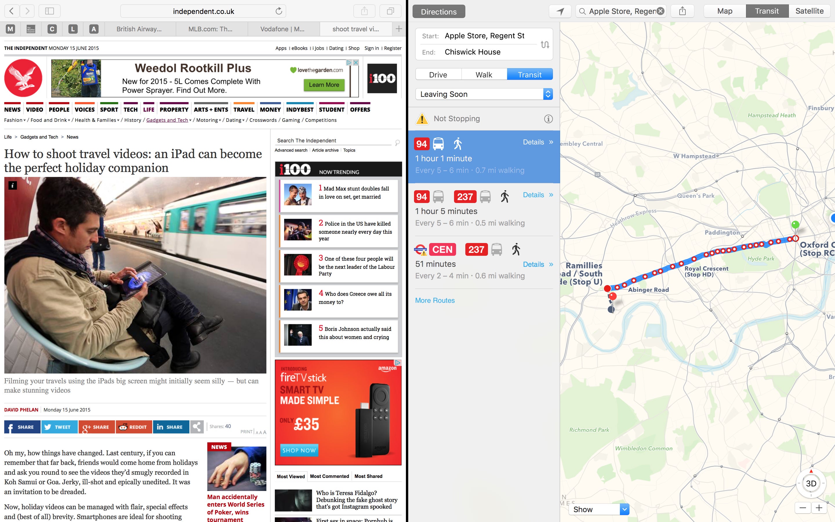
How you use your computer screen is addressed by an improved version of Mission Control – Apple’s system for showing you which apps and documents you have open. With El Capitan it’s possible to have two programs open in full screen view at the same time. Each app is assigned half the screen, though you can adjust the proportions. And both apps are live simultaneously. Multi-tasking is nothing new on a Mac, and Windows had a similar feature in the past, but this is more elegantly done and is a useful precursor for a comparable feature due in the autumn for the iPad Air 2.
The Spotlight search function is improved, fixing little gripes along the way: in the previous version you couldn’t resize the search window; now you can. And it’s been made considerably smarter. Type in the words “weather tomorrow” and Spotlight reports back with graphics and details of the forecast for where you are. Sport is also an area where Spotlight is smarter than the average Yosemite bear, featuring more information, stats and logos, showing when a team is playing, who’s on the team and more. Stocks are also a new area where Spotlight has greater knowledge to display and it’s also ready to search for video and public transport information. Many of these searches can work if you search online through a browser, but of course Spotlight is taking a squint in your hard drive as well.
If you find search a challenge for fear you aren’t asking the question in the right way, El Capitan can help. It employs natural language so that a search for “documents I worked on last week” will simultaneously limit the search to documents in the last seven days and widen it to all documents including emails and Word files, something it does more comprehensively than in Yosemite.
If you enjoy the gestures you can employ in Mail or Mailbox on an iPhone to swipe on an email to delete it, that’s here on El Capitan, too. Touch the trackpad with two fingers, swipe left and the mail is in the trash. Even better, to undo your action you simply press Command and Z, which is easier than the jiggling process you have to go through on an iPhone or iPad.
There are more Mail improvements, including what information the program understands. So if a friend says they’re arriving on the British Airways 286 in the body of an email, the system is clever enough to connect you with the latest flight status information and confirm the airport and terminal. Similarly, data detectors, as Apple calls them, recognise when an email includes an invitation like “How about drinks tomorrow at 8PM?”. So a line appears above the mail saying “1 event found” and you can add it to your calendar, though you can edit it as you do so. These are handy little features that will now be common to iOS as well as OSX.
Adjustments have also been made to how Mail works in full screen. Full screen apps are highly useful, allowing you to work just in one program with the most real estate and fewest distractions. But until El Capitan it restricted how you composed messages. Now, you can create multiple messages. Once one is up and running, you click outside the message area and it drops to the bottom of the screen. Click compose and both messages are back. You can switch between them by clicking on the tabbed headers. It’s as easy to manage as multiple tabs in a browser and is very versatile, especially if you want to copy and paste an attachment from one email to another.
Speaking of Safari, pinned tabs are now a thing. If you have a lot of browser tabs open and you can’t remember which of them was the one you really wanted to get back to, a two-finger click on that tab turns it into a pinned tab which shuffles neatly over to the left of the window for when you need it next. Other innovations include a simple but useful one. If your computer suddenly starts playing music, from an advert on a page, say, it can take time to track down which page is revealing to the rest of the office that you’re connected to something non-work-related. Now, Safari displays a speaker icon in the browser bar and clicking it will mute any tabs with audio, or you can pick which tab to silence.
There’s a whole new Notes app which has text styles and even a dedicated checklist button. Since you’re likely to be using Notes to make lists, this is handy. Type the list, highlight it and choose the Make a checklist button and bullet circles appear to the left of each line. Better yet, when you’ve actually completed that task, clicking the circle turns it into a yellow tick. You can also drag pictures, videos and links into the Notes.
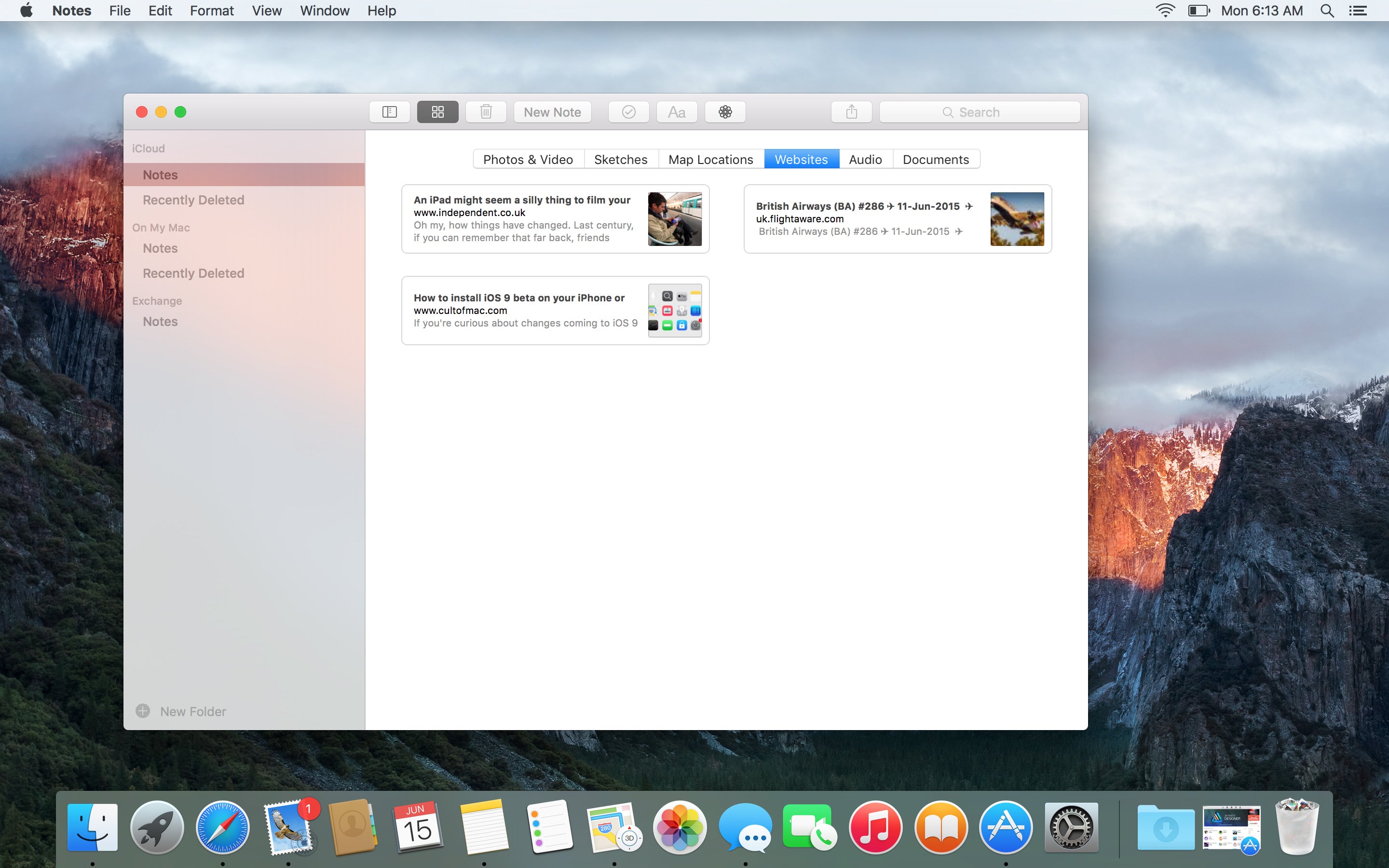
For me, the best new feature here is the attachment view. If you know you pasted a picture of something into a note but not a clue which one, the attachment view brings up all the photos, websites and documents you’ve attached. Notes automatically connects with the appropriate app on iPhone and iPad to keep the two in sync.
Maps has been improved with public transport information: this will also come to the iOS version in the next major release. Google Maps has had something similar already but Apple’s version, though later, looks better. It’s limited to certain cities for now, including London, San Francisco and New York, with more following by the time the software is released. The routing is efficient and beautifully described.
If you want to try El Capitan, you won’t have long to wait. Apple has announced it’ll have a public Beta Program from next month, with the final version available from the autumn. Even the final version, as in recent years, is free.
El Capitan, from a week’s attention, has yielded lots of subtle and enjoyable extras. It’s too early yet to say how much performance is improved, but these changes are already efficient and pleasing.
Join our commenting forum
Join thought-provoking conversations, follow other Independent readers and see their replies
Comments