Interactive: watch the world’s winds swirl across the globe in real time
New visualization uses live weather data to trace weather patterns

Satellites and monitoring equipment station around the world are continually pulling in reams of data that helps scientists learn more about the world. However, it’s not often that the rest of us can get a clear look at this information.
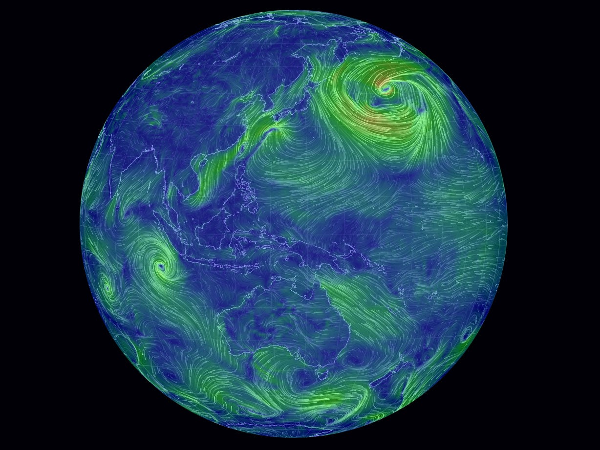
A new interactive map created by software engineer Cameron Beccario of the world’s wind patterns offers exactly this sort of insight, turning data collected by the US National Weather Service’s Global Forecast System into a swirling neon globe.
The map is interactive, and users can click and drag the globe and zoom in and out. It takes a second or two to load up the relevant data, but it’s well worth it – scroll round to the west of the UK to see out the wind that helps propel the Gulf Stream, or head east to look at the powerful storms still blowing off the coast of Japan.
The information is updated every three hours, so offers a near-real time look at global weather - just don't go looking for advice about whether to bring a brolly to work.
Wind Map
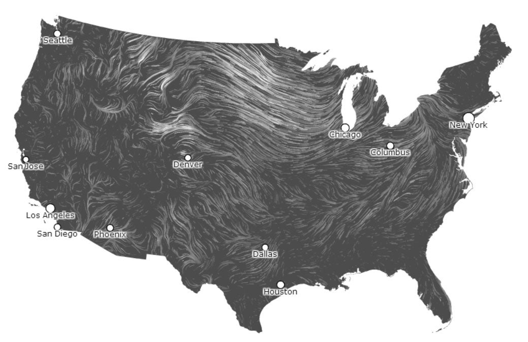
The design of the global Wind Map looks like it was inspired by a US-specific interactive produced in 2012. Designers Fernanda Viégas and Martin Wattenberg created a black-and-white design that shows the same tendril like patterns swirling over the land.
“An invisible, ancient source of energy surrounds us—energy that powered the first explorations of the world, and that may be a key to the future,” writes the pair on their website. “This map shows you the delicate tracery of wind flowing over the US.”

Perpetual Ocean
The grand ancestor of both the Wind Maps above is probably Nasa’s ‘Perpetual Ocean’ – a computer animation rendered from data of the ocean’s currents between 2005 and 2007.
The computation that turned this numerical data into the video below was one of the largest computations of its kind, and according to Nasa offers "realistic study in both the order and the chaos of the circulating waters that populate Earth's ocean."
It also bears an uncanny resemblance to Van Gogh's famous painting The Starry Night, proof, if any were needed, that science and art often offer similar interpretations of the same world.
Join our commenting forum
Join thought-provoking conversations, follow other Independent readers and see their replies
Comments
Bookmark popover
Removed from bookmarks