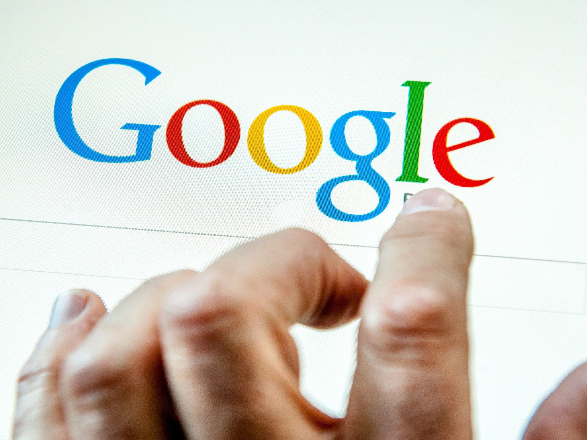
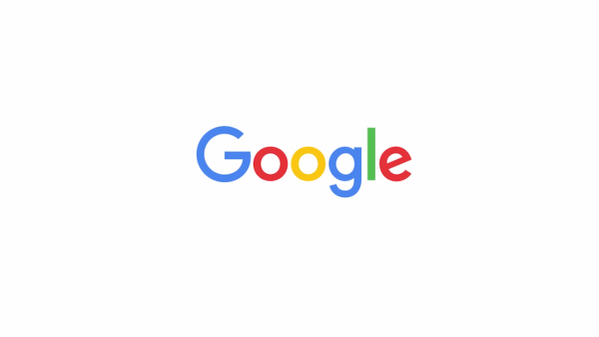
Google logo has changed: search giant unveils smooth new text to look good on tiny screens
Site says that the new, smooth text reflects the site's evolution

Your support helps us to tell the story
From reproductive rights to climate change to Big Tech, The Independent is on the ground when the story is developing. Whether it's investigating the financials of Elon Musk's pro-Trump PAC or producing our latest documentary, 'The A Word', which shines a light on the American women fighting for reproductive rights, we know how important it is to parse out the facts from the messaging.
At such a critical moment in US history, we need reporters on the ground. Your donation allows us to keep sending journalists to speak to both sides of the story.
The Independent is trusted by Americans across the entire political spectrum. And unlike many other quality news outlets, we choose not to lock Americans out of our reporting and analysis with paywalls. We believe quality journalism should be available to everyone, paid for by those who can afford it.
Your support makes all the difference.Google has revealed a new logo, smoothing the text into a new image that it says can more easily read on tiny screens.
The site has clipped off the curly serifs from the letters and instead replaced them with a much smoother look that it says "reflects [the] reality" of what the site is today. It also has slightly softer colours.
"As you’ll see, we’ve taken the Google logo and branding, which were originally built for a single desktop browser page, and updated them for a world of seamless computing across an endless number of devices and different kinds of inputs (such as tap, type and talk)," the company wrote in its blogpost announcing the change.

The new logo has already appeared on the homepage, with a little animation that wipes away the old logo and replaces it with the new one.
nullThe change doesn't seem to be related to the company's re-organisation, which saw what used to be called Google changed into Alphabet. Though it is the first major change announced since then, Google's statement made no reference to the change and instead discussed the importance of shrinking the text for legibility on all kinds of screens.
But it does bring the look of Google in line with the more simple design of Alphabet.
Much more of Google's branding will be changed to match the new logo, it said. That included the little G that pops up when users click on the small microphone that Google sometimes shows.
Google noted that it had changed its logo multiple times over the last 17 years, and that it would be likely to change again. But it said the new change recast the logo "not just for the Google of today, but for the Google of the future".
Join our commenting forum
Join thought-provoking conversations, follow other Independent readers and see their replies
Comments