Facebook redesign transforms News Feed with circular profile pictures and new Like button
'With so many types of stories available, each feed is more complex than ever'

Your support helps us to tell the story
From reproductive rights to climate change to Big Tech, The Independent is on the ground when the story is developing. Whether it's investigating the financials of Elon Musk's pro-Trump PAC or producing our latest documentary, 'The A Word', which shines a light on the American women fighting for reproductive rights, we know how important it is to parse out the facts from the messaging.
At such a critical moment in US history, we need reporters on the ground. Your donation allows us to keep sending journalists to speak to both sides of the story.
The Independent is trusted by Americans across the entire political spectrum. And unlike many other quality news outlets, we choose not to lock Americans out of our reporting and analysis with paywalls. We believe quality journalism should be available to everyone, paid for by those who can afford it.
Your support makes all the difference.Your Facebook News Feed is in line for a new look.
The site has chosen to update a number of core features, with the design tweaks set to roll out to both the website and the app over the next few weeks.
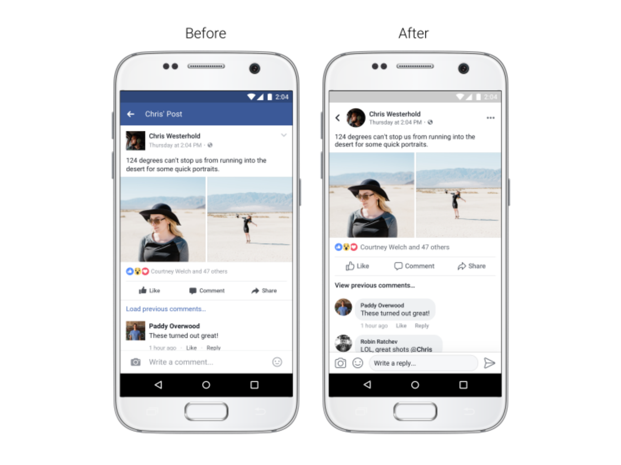
The most noticeable change concerns profile pictures.
Facebook has decided to make them appear circular rather than square in the News Feed.
Twitter made the same move back in June, with users predictably reacting to the change with anger.
Facebook has also tweaked the look of the Like button.
As well as subtly changing the icon, the social network has also made it larger and easier to tap, and it’s no longer filled-in black.

Both the Comment and Share icons that sit underneath posts have got the same treatment.
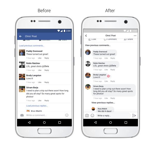
Comment threads are slightly different too, with posts now appearing inside grey bubbles so it’s “easier to see which comments are direct replies to another person”.
Facebook says it has also made link previews larger, “increased color contrast so that typography is more legible” and made it easier to return to the News Feed after you’ve clicked on a post.
There appears to be slightly less blue on show too.
“Every person’s News Feed is different and populated with a unique set of stories — from photos and videos to GIFs and links,” said Shali Nguyen, Facebook’s product design manager and Ryan Freitas, the site’s design director.
“And with so many types of stories available, each feed is more complex than ever. In order to make News Feed more conversational and easier to read and navigate, we’ll be making a few updates to its design over the coming weeks.”
Join our commenting forum
Join thought-provoking conversations, follow other Independent readers and see their replies
Comments