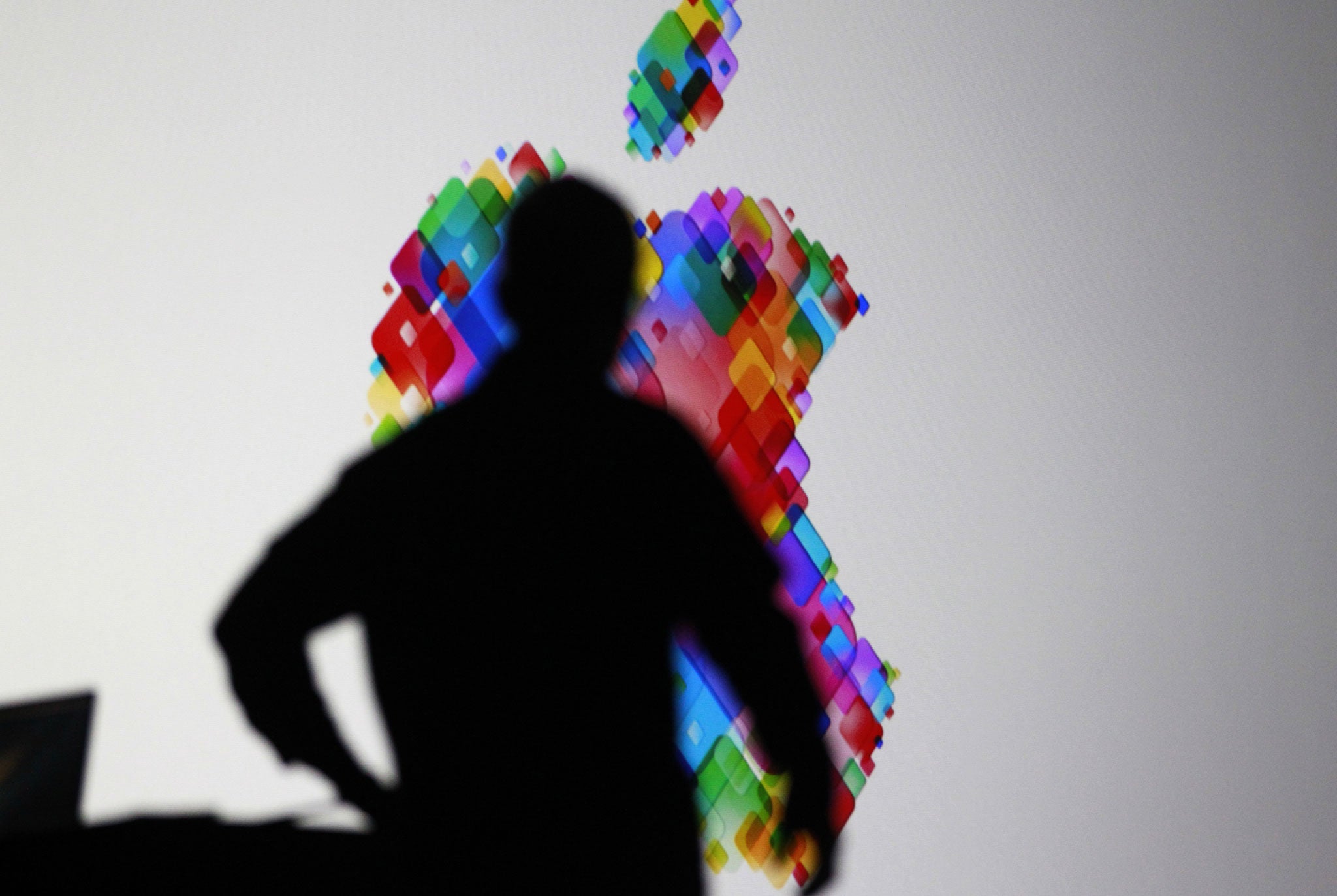
Apple WWDC 2013: Is Jony Ive's new iOS 7 an example of style over substance? Maybe, but it does make the iPhone look terrific...
David Phelan sums up the high points of the Apple World Wide Developers Conference

In one of the longest keynotes from Apple for years – two full hours – Tim Cook and colleagues tried to fight back after a tough year. Would this be enough to put the gloss back on Apple?
Apple needed to show it could innovate, have fresh and appealing ideas – and lots of them. The key to the show was the iOS reveal, the new, flatter design of iPhone and iPad software created by Jony Ive. Sir Jonathan Ive is the Brit behind the iconic designs for the iPhone, iPod and more. But could he change the existing software into something classier?
The problem with iPhone and Apple Mac software is that it pretended to be something else. So the calendar has a border designed to look like stitched leather, a corner of torn paper visible where last month’s calendar had been torn off. This is what’s known as skeuomorphism, where one thing is made to look like another.
The new software gets rid of all these. Time and again at the keynote, presenters went out of their way to decry the current styling – “No virtual cows were killed in the making of this software” was followed by “Even thought there’s no stitching on the calendar, it still stays in place”.
And the results for the Mac software looked good. This will be released in the autumn and be called OSX Mavericks in a move away from names of big cats and towards Californian locations.
But the transformation of iOS was stunning. There were eye-popping effects that made the background images seem to sit behind the app icons, so that when you tip the phone, the two move separately.
The redesign is absolutely from the ground up and looks as fresh as paint. It may not mean that the Apple system is far ahead of its rivals but it’s definitely better-looking.
This is all it needed to be. Windows Phone and BlackBerry offer radically more modern interfaces but nobody is buying into them because they have smaller, less comprehensive app stores. If Apple users looked longingly at other operating systems, they won’t any more. In a few months they will have the familiarity of their current phones with gorgeous new effects.
Style over substance? Maybe so but with this much style, who cares? And there will be plenty of innovations when the software launches, including features from the Mac moving to the iPhone and vice versa.
There was lots more announced, from the sneak peek at the professional quality hardware, the Mac Pro to new versions of the MacBook Air with exceptional battery life.
But the biggest cheers of the show and the most eye-catching looks were the iOS redesigns from Jony Ive, Craig Federighi and their teams. These will be enough to keep Apple iPhone users loyal when the next handset is released later in the year.
Join our commenting forum
Join thought-provoking conversations, follow other Independent readers and see their replies
Comments
Bookmark popover
Removed from bookmarks