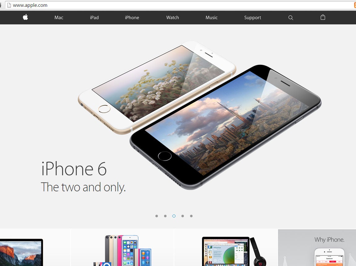
Apple Store website redesigned, finally makes sense
Users no longer have to research and buy their products in different places

Your support helps us to tell the story
From reproductive rights to climate change to Big Tech, The Independent is on the ground when the story is developing. Whether it's investigating the financials of Elon Musk's pro-Trump PAC or producing our latest documentary, 'The A Word', which shines a light on the American women fighting for reproductive rights, we know how important it is to parse out the facts from the messaging.
At such a critical moment in US history, we need reporters on the ground. Your donation allows us to keep sending journalists to speak to both sides of the story.
The Independent is trusted by Americans across the entire political spectrum. And unlike many other quality news outlets, we choose not to lock Americans out of our reporting and analysis with paywalls. We believe quality journalism should be available to everyone, paid for by those who can afford it.
Your support makes all the difference.Apple has launched a major redesign of the Apple Store, finally unifying the area where people look at the company’s products and the place that they go to buy them.
Before, users could research and look at products in one page, and then have to click over to the store to actually buy them. But Apple has dropped the “Store” tab and instead all of the pages work for buying things.
The company has also changed the look of many of the pages, including big roundups that
“We redesigned Apple.com knowing that our customers want to explore, research and shop in one place,” an Apple spokesperson said in a statement. “The new Apple.com takes the very best of our existing site and our online store to give customers one simple destination to learn and buy without navigating between two different sites.
“We’ve also improved several of the site’s features to make shopping easier than ever for our customers.”
The Apple store website is especially picked over because it has long been taken down whenever a new product is about to launch. It’s unclear whether that tradition — which is rumoured to be a result of the way that the store was built — will continue on the new page.
Apple pundit John Gruber praised the change, saying that it had taken a huge amount of technical work but was in fact just bringing the online store more in line with the actual shops. He likened the old site to a shop that had a showroom in the front and a sales room in the back, pointing out that the two had now been stuck together.
“Knowing what I know about the old online store, this was a massive behind-the-scenes undertaking, but the result looks and works like what most people would have expected all along,” he wrote on Daring Fireball.
More than 1 billion people visit the Apple website each year, according to Techcrunch. All of the 40 countries that can use it are seeing the update.
Join our commenting forum
Join thought-provoking conversations, follow other Independent readers and see their replies
Comments