Apple just redesigned the Windows logo and made it worse
Apple replaced the Microsoft Windows logo with... a picture of a window
Your support helps us to tell the story
From reproductive rights to climate change to Big Tech, The Independent is on the ground when the story is developing. Whether it's investigating the financials of Elon Musk's pro-Trump PAC or producing our latest documentary, 'The A Word', which shines a light on the American women fighting for reproductive rights, we know how important it is to parse out the facts from the messaging.
At such a critical moment in US history, we need reporters on the ground. Your donation allows us to keep sending journalists to speak to both sides of the story.
The Independent is trusted by Americans across the entire political spectrum. And unlike many other quality news outlets, we choose not to lock Americans out of our reporting and analysis with paywalls. We believe quality journalism should be available to everyone, paid for by those who can afford it.
Your support makes all the difference.In a masterful piece of (possibly unintentional) corporate shade-throwing, Apple appears to have redesigned Microsoft's logo on its website.
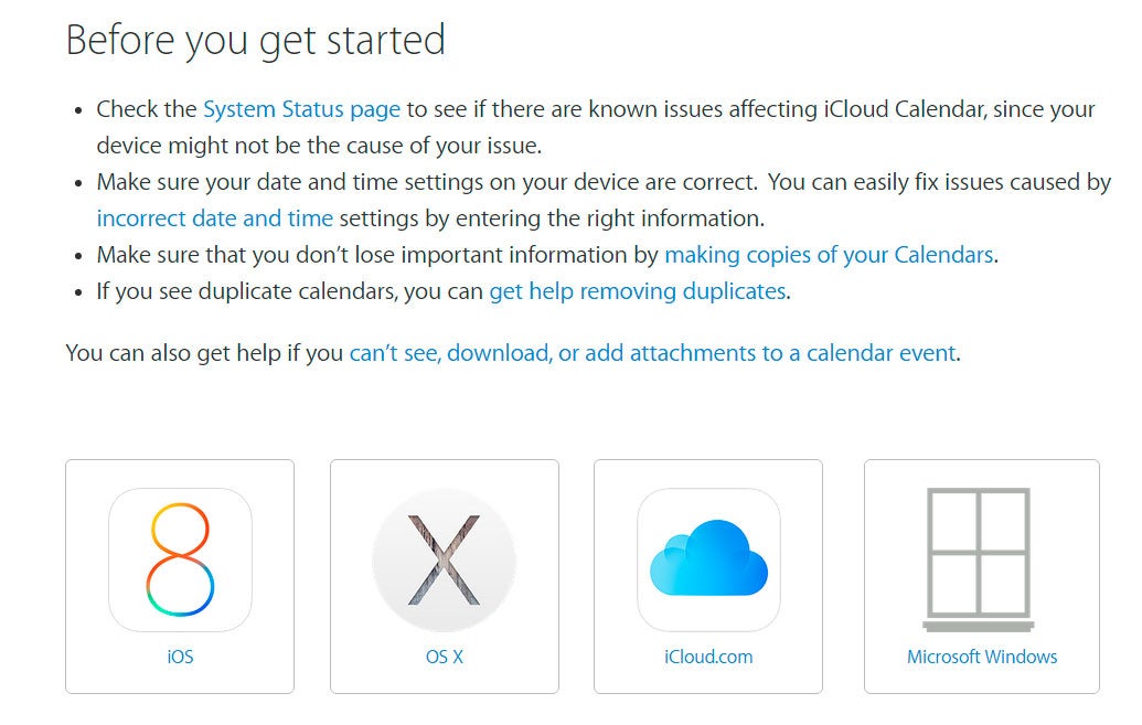
On the Apple Support website for iCloud Calendar, users have to choose which device they are using to get help.
The iOS, OS X and iCloud logos are all correct, but Apple appears to have replaced Microsoft's famous Windows logo with... a drawing of a window.
The two companies have long been rivals, but relations have warmed a little recently, as they realise that most of their customers typically use both systems for different things.
At a San Francisco tech conference in September, Apple CEO Tim Cook said: "Apple and Microsoft still compete, but we can partner on more things that we compete on. And that's what customers want."
"[Apple users] love Office, and they want it to work on Mac better than it works on Windows, and it should."
Even though a new era of love and understanding is beginning to develop between the two mega-corporations, it seems like the Apple website designers couldn't manage to find a picture of the Windows logo.
The Apple logo has always been a little sleeker than Windows, but an unsolicited redesign probably isn't the solution.
Join our commenting forum
Join thought-provoking conversations, follow other Independent readers and see their replies
Comments