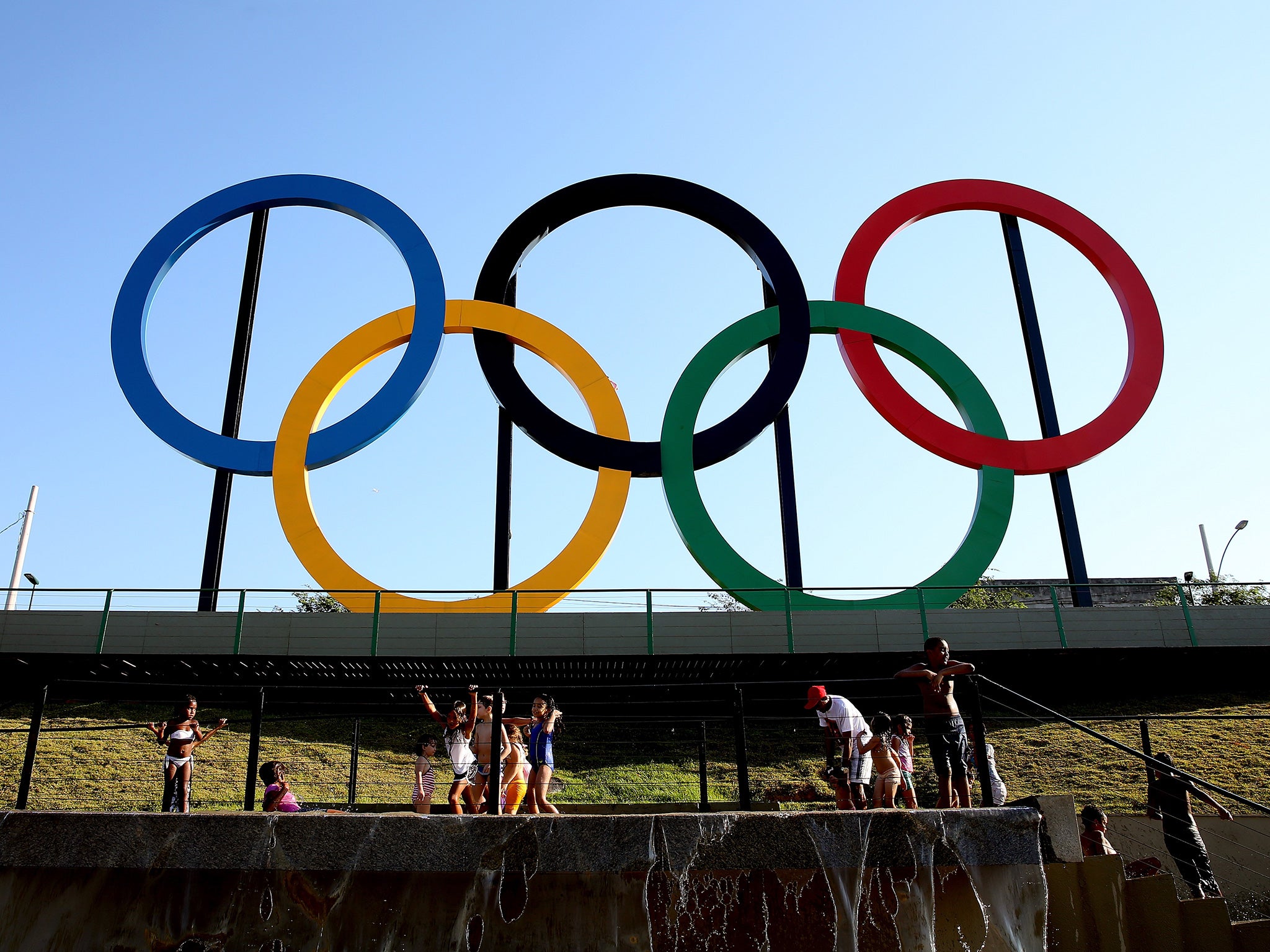
Rio 2016: What does the Olympics logo mean?
Everything you need to know about the Olympics rings

Your support helps us to tell the story
From reproductive rights to climate change to Big Tech, The Independent is on the ground when the story is developing. Whether it's investigating the financials of Elon Musk's pro-Trump PAC or producing our latest documentary, 'The A Word', which shines a light on the American women fighting for reproductive rights, we know how important it is to parse out the facts from the messaging.
At such a critical moment in US history, we need reporters on the ground. Your donation allows us to keep sending journalists to speak to both sides of the story.
The Independent is trusted by Americans across the entire political spectrum. And unlike many other quality news outlets, we choose not to lock Americans out of our reporting and analysis with paywalls. We believe quality journalism should be available to everyone, paid for by those who can afford it.
Your support makes all the difference.What’s the origin of the logo?
After the birth of the International Olympics Committee at the 1896 Sports Congress, one of its founders, Baron Pierre de Coubertin, proposed the idea for a unified motto and symbol to reflect the unified International Olympic Community.
The famous five interlocking rings were displayed in 1914 accompanied by the Latin ‘Citius, altius, fortius’ (meaning ‘faster, higher, stronger).
What does it represent?
The interlocking nature of the rings are seen as emblematic of unity between the participating countries.
However, De Coubertin attached more significance to the blue, green, black, yellow and red colours.
He believed that, combined with the white background, they formed the colours of every nation’s flag.
What about each Games’ logo?
They must precisely balance boldness with elegance and, just as Star Wars' new crossguard lightsaber provoked a maelstrom of excitement and rage from the dedicated fan base and ‘Wookieepedians’, each new iteration is subjected to intense scrutiny.
Several have provoked significant criticism.
This was true with the London 2012 logo, which took a year to design. However, the jagged, fragmented design was initially declared the ‘Oh no logo’ as well as the ‘emblem of controversy’ and even triggered a petition calling for a redesign.
Join our commenting forum
Join thought-provoking conversations, follow other Independent readers and see their replies
Comments