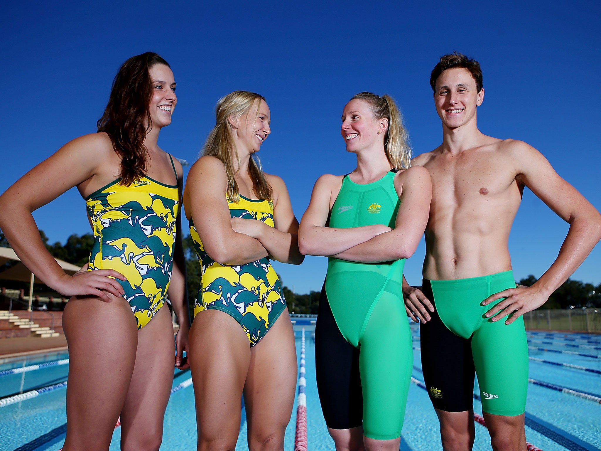
Commonwealth Games 2014: Australia launch Glasgow swimwear - but are criticised for drawing attention to the 'crotch' area
The new range by Speedo have drawn criticism Down Under for drawing the eyes to 'the wrong place'

Your support helps us to tell the story
From reproductive rights to climate change to Big Tech, The Independent is on the ground when the story is developing. Whether it's investigating the financials of Elon Musk's pro-Trump PAC or producing our latest documentary, 'The A Word', which shines a light on the American women fighting for reproductive rights, we know how important it is to parse out the facts from the messaging.
At such a critical moment in US history, we need reporters on the ground. Your donation allows us to keep sending journalists to speak to both sides of the story.
The Independent is trusted by Americans across the entire political spectrum. And unlike many other quality news outlets, we choose not to lock Americans out of our reporting and analysis with paywalls. We believe quality journalism should be available to everyone, paid for by those who can afford it.
Your support makes all the difference.The Commonwealth Games have not even begun yet, but the Australian national team are causing a stir Down Under after critics slammed their latest swimsuit kit for drawing attention to the “crotch” area.
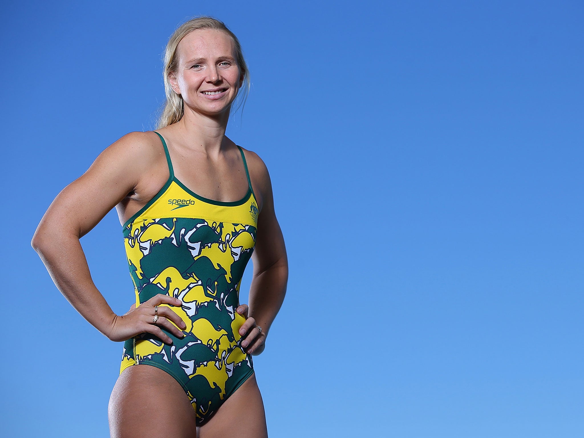
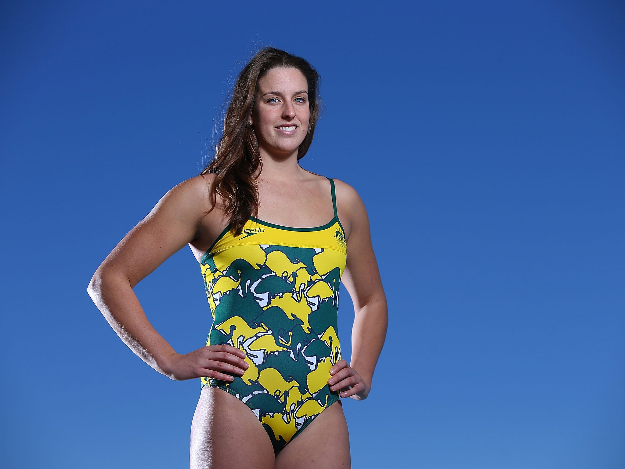
With Glasgow 2014 set to get underway next month, the swimsuits are gaining a lot of attention for their newest design, which have also been labelled “confusing” due to the new green and yellow patterns used to represent the country’s official colours.
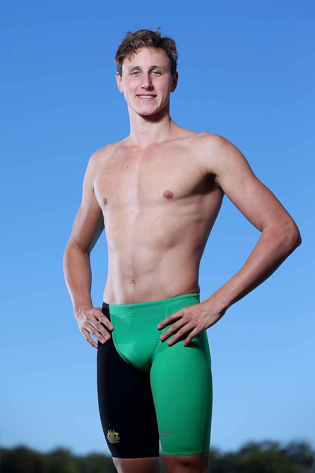
Both the men’s and women’s outfits have been slammed for being particularly unbecoming and guiding the eye “to the wrong place”, according to Scottish newspaper The Scotsman.
Swimwear giants Speedo unveiled the new outfits on Wednesday ahead of the Games, with one featuring a print of kangaroos, emus and maps of Australia laid out in green and gold.

Brisbane stylist Di Cant claimed that her main issues lies with the shaping of the outfits – in particular the green and black one – and how the colours meet.
“My main issue is with the green and black suits and the emphasis on the crotch,” said Cant. “The shaping in the crotch and with the black leg, something is not quite flattering.
“It is drawing the eye to the wrong place, rather than to the athletic body and the overall look.”

Mark Ferguson, director of Australian men’s tailoring firm Wil Valor, added: “It looks like they have tried too hard. They have tried to be ‘out there’ and different, and it has not paid off.”
But both were critical of the design and claimed that they look “busy” and “terribly obvious”.
“I don’t like it at all,” Ferguson continued. “It’s a really busy pattern – you don’t know where to look. It looks incomplete.”
Cant added: “I think it is terribly obvious, with kangaroos and the map of Australia.”

However, freestyle swimmer Bronte Barratt believes the new designs are “great” and feels it does the right job in representing Australia.
“Yeah, really happy. They’re basic and sort of the same as we’ve had for the last year or so,” said Barratt. “The colours seem good. They’re majority green instead of majority black, which is really good because that represents Australia. We have the gold cap as well so it will look great.”
Team-mate Melanie Schlanger posted a photo on her Twitter account with the message: “This is what our @SwimmingAUS team will be wearing in Glasgow! @SpeedoAUS vintage print and bright colours. Love it!”
Join our commenting forum
Join thought-provoking conversations, follow other Independent readers and see their replies
Comments