The Insider: How to do brights (and not get a headache)

I'm still scarred by the sitting-room I painted slightly the wrong orange a decade ago. Things went white for a long time – that was the noughties for you – but encouraged by good vibes from my Yves Klein-blue kitchen wall, I'm ready for more. To sidestep previous eye ache, I sought the expertise of prop stylist Will Taylor, who runs the brilliant brightbazaar.blogspot.com, devoted to all things, well, bright...
Take it slow
"Introduce colour by layering bolder hues in gently," says Taylor, "a few bright accessories to break up the neutral base without dominating. Only then should you think about bolder statements such as skirting boards or colour around a door frame."
Quality time
Bad paint was my mistake. "Use cheaper brands only for complementary neutral shades where quality is less noticeable," advises Taylor. For bigger spaces, he rates Kevin McCloud's new Fired Earth shades. Also – shock – Farrow and Ball's surprisingly bright 1950s orange, "Charlotte's Locks".
Colour me trad
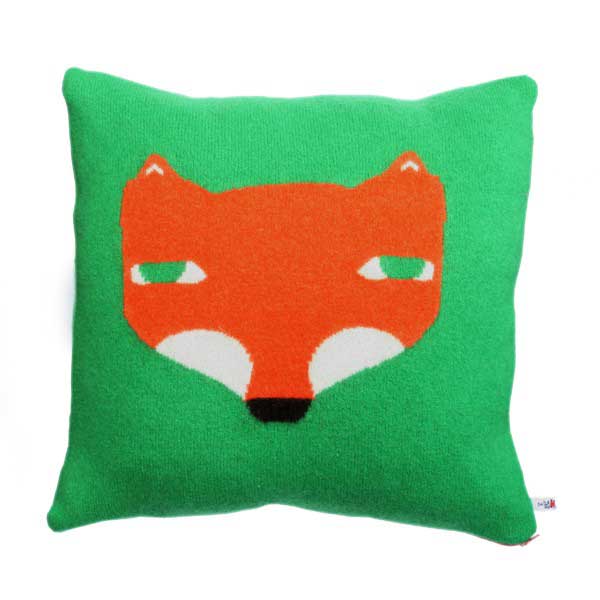
It doesn't need to be drastic: accessorise with michellemason. co.uk or donnawilson.com's colourful cushions, throws and tea towels. In London? Try Rice in Covent Garden "for bright melamine or quirky patchwork textiles. Zara Home, M&S and John Lewis are also bursting with colour." (And I love Katy Binks's heartily hued paintings at howkapow.com.)
Clash test dummy
Google the Dulux Colour Studio's "mouse painter" and upload a photo of your room to try before you buy.
Altered image
Use two complementary base colours – say, navy and orange – big, then add a third, contrasting, colour as a surprise element in a textile or piece of art. "Clashy but not garish," advises Taylor.
Find Kate's blog on affordable interiors at yourhomeislovely.blogspot.com
Join our commenting forum
Join thought-provoking conversations, follow other Independent readers and see their replies
Comments
Bookmark popover
Removed from bookmarks