Downsizing doesn’t have to be boring: moving off to a small, practical new home
Your sixties are an adventure: a London couple designed their show-stopping dream home when the kids flew the nest

Your support helps us to tell the story
From reproductive rights to climate change to Big Tech, The Independent is on the ground when the story is developing. Whether it's investigating the financials of Elon Musk's pro-Trump PAC or producing our latest documentary, 'The A Word', which shines a light on the American women fighting for reproductive rights, we know how important it is to parse out the facts from the messaging.
At such a critical moment in US history, we need reporters on the ground. Your donation allows us to keep sending journalists to speak to both sides of the story.
The Independent is trusted by Americans across the entire political spectrum. And unlike many other quality news outlets, we choose not to lock Americans out of our reporting and analysis with paywalls. We believe quality journalism should be available to everyone, paid for by those who can afford it.
Your support makes all the difference.Downsizing can be a scary business — one that many people associate with packing up the old family home and moving off to a small, practical and, quite possibly, less inspiring new property.
Not so for Frances Middleton and her husband, Ian. As they approached their sixties they made a conscious decision that this was their chance to be bold with design.
And, sitting in the kitchen looking out over the show-stopping outside decking area with sunlight streaming through the huge four by two-metre glass roof panel, this 60-year-old psychotherapist hopes the look, feel and location of their new home will reassure others that downsizing can be a liberating experience.

“Moving to a smaller property can be difficult for a lot of people. But I hope we have shown with this home that it can be an exciting change. It does not mean having to move away from town centres and into retirement villages.
“We have created something that surprises people. You would not believe the number who walk in and stop in their tracks, open-mouthed.”
It’s not hard to see why. A small, unassuming front door in a traditional terrace in Islington, north London, opens to uninterrupted views through the entire ground floor with its raised living room, kitchen area and out to the bright, white outdoor space with ceramic, wood lookalike decking.
It bears almost no resemblance to the original interior of the three-bedroom house, which was for sale at £1.5 million in 2013 when the Middletons put in their offer. They knew they wanted something that required a complete refurbishment. They also knew exactly who they wanted to mastermind the design.

HEIRLOOMS MEET CONTEMPORARY DESIGN
“We’d heard of Phil Coffey and Coffey Architects www.coffeyarchitects.com and we knew he specialised in making the most of small terrace houses. We moved out of a large five-bedroom family home in High Barnet to one less than half its size, so it was a proper downsize. But it doesn’t feel anywhere near that small. Much of that is down to the clever design.”
Coffey and contractor Woods London Ltd (07939 591334) started work in July 2014 based on the couple’s £320,000 budget and finished in February 2015.
Frances had some vision and design ideas of her own, including introducing a fresh, bright turquoise injection of colour through artwork and soft furnishings, but says the professional expertise was invaluable.
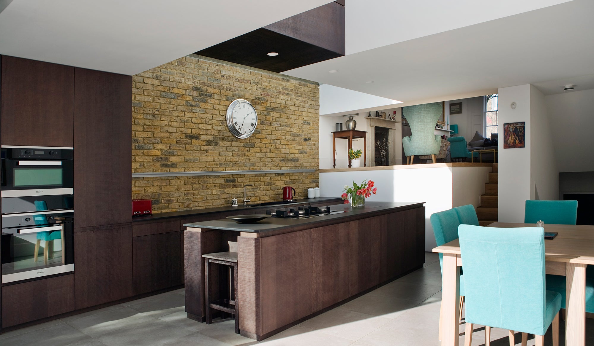
The base colour scheme, most prevalent in the kitchen, is a prime example. A mix of white and dark, tobacco-stained sawn oak creates a unique chequerboard look. Paying homage to this, the architects gave the house the unofficial moniker of Capablanca House — Capablanca, a variant of chess, was invented in the Twenties.
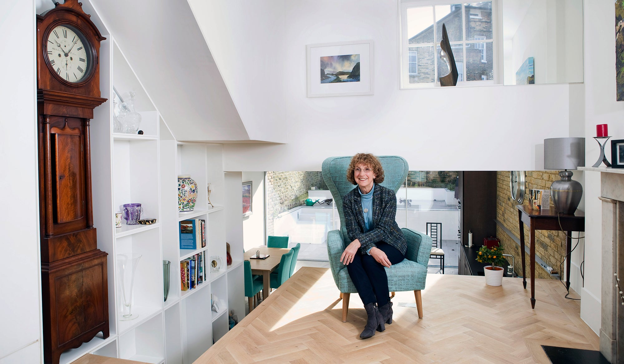
Other clever design features include incorporating personal items into the sleek, contemporary style. A bookshelf built into the side of the stairs to save space was designed around a family heirloom — the old grandfather clock.
“We gave the architects the measurements of the clock and they built the bookcase around that as the central feature,” says Frances. “That is what makes the modern style work. It encompasses our history. And there were definitely parts of our old life that we wanted to bring with us here.” Another Coffey special are the hollowed-out handles along the staircases instead of a cumbersome rail. This smart fix is a real space saver.
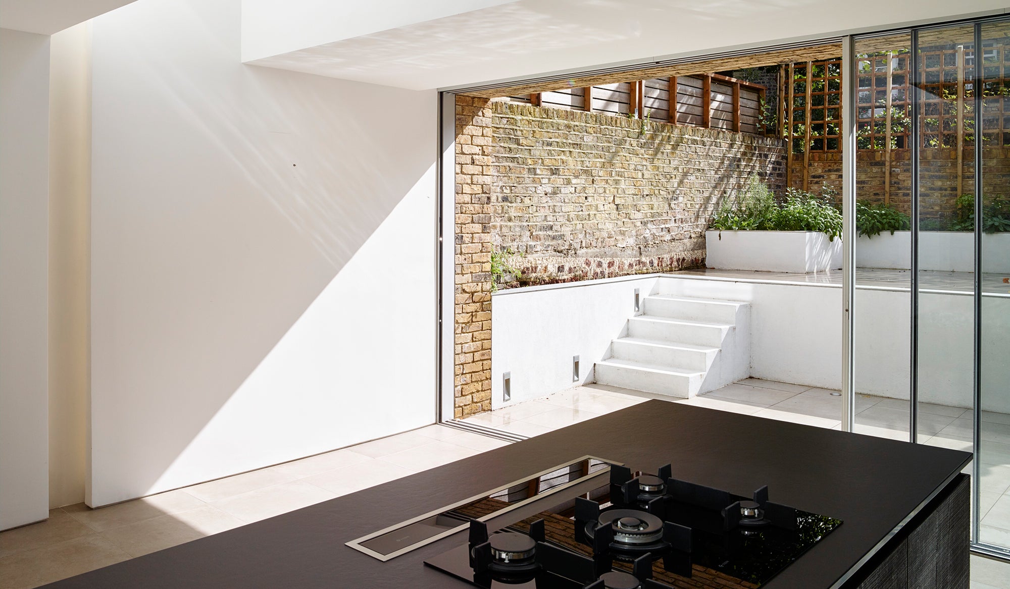
While the master bedroom, stylish bathrooms and a rooftop terrace with views out over north London are all fresh and exciting, there is no getting away from the fact that the real show stopper in this property is the inside/outside kitchen. Apart from a striking island unit and the glass roof panel, the fact that the floor surfaces match means the kitchen and outside space can become one huge “room” simply by pushing back the glass partitions. It’s ingenious.

“We had a party last month and we opened the glass doors, put up a marquee and seated 45 people for a meal,” says Frances. “So we don’t even have to wait until the summer to make use of the outside space. The house is a joy. Our adult children are here all the time, we are close to shops, culture and an active life. The doctor here on the NHS is way better than the one we had further out.”
Frances feels the nature of downsizing is changing. “I think we are seeing a big shift. The silver pound is ready to spend in central locations and that includes central London. The perception that this is the sort of style only younger people want is entirely untrue. Actually, it is not something they are likely to be able to afford.
“A lot of twenty and thirtysomethings visit and say, ‘Wow, this is amazing.’ But people in their sixties now are nothing like the last generation at this age. We are healthier, very able and tech savvy. We designed the home we wanted and couldn’t be happier with the result.”
Simply stunning
The bathroom feels spacious, yet the house is smaller than the one the couple left behind
Bringing in a bit of history
Staircase shelving was designed around the family’s old grandfather clock
“We couldn’t be happier”
Frances Middleton loves the look and location of her downsized home
Show stopper
The kitchen and garden, with matching floors, become one big room when the glass doors are pushed back. The base colour scheme uses sawn oak, stained in a light and dark mixture for a chessboard look
Fresh and modern
The master bedroom opens to the sleek en suite bathroom
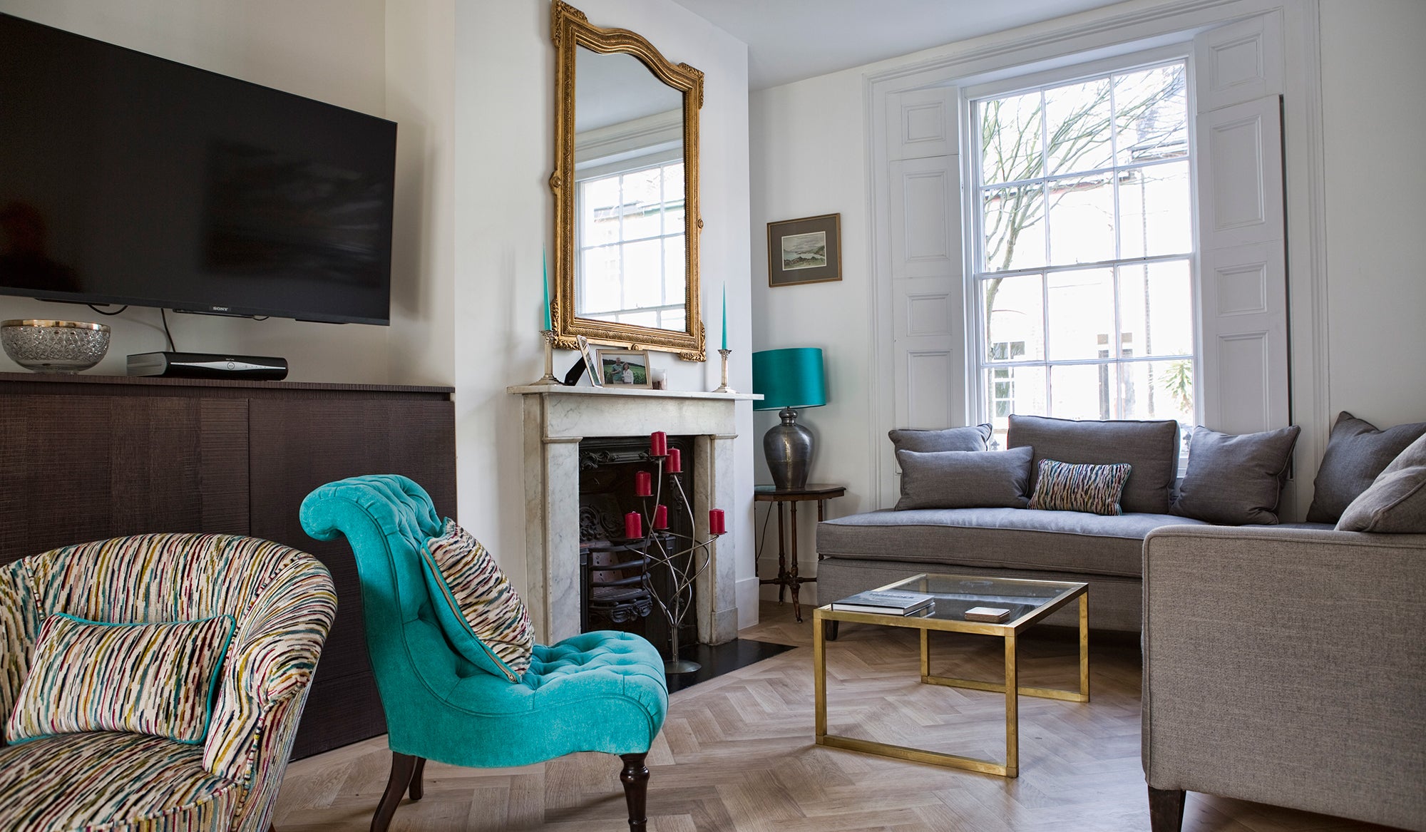
Contemporary design with classic terrace touches
The raised living area is bright and welcoming. Frances injects colour with turquoise soft furnishings
Wow factor
The way the Middletons redesigned their home appeals to visiting twentysomethings, while the couple’s grown-up children “are here all the time”
Join our commenting forum
Join thought-provoking conversations, follow other Independent readers and see their replies
Comments