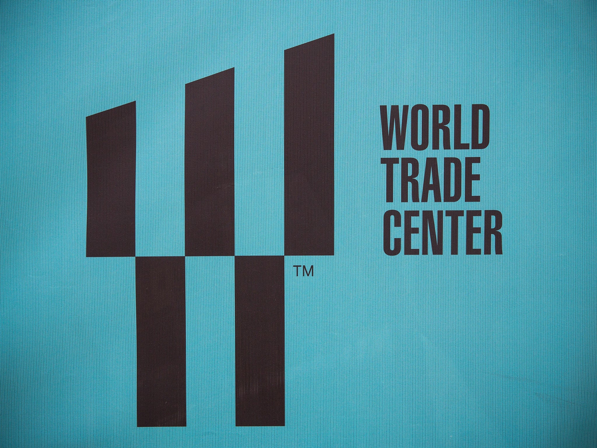
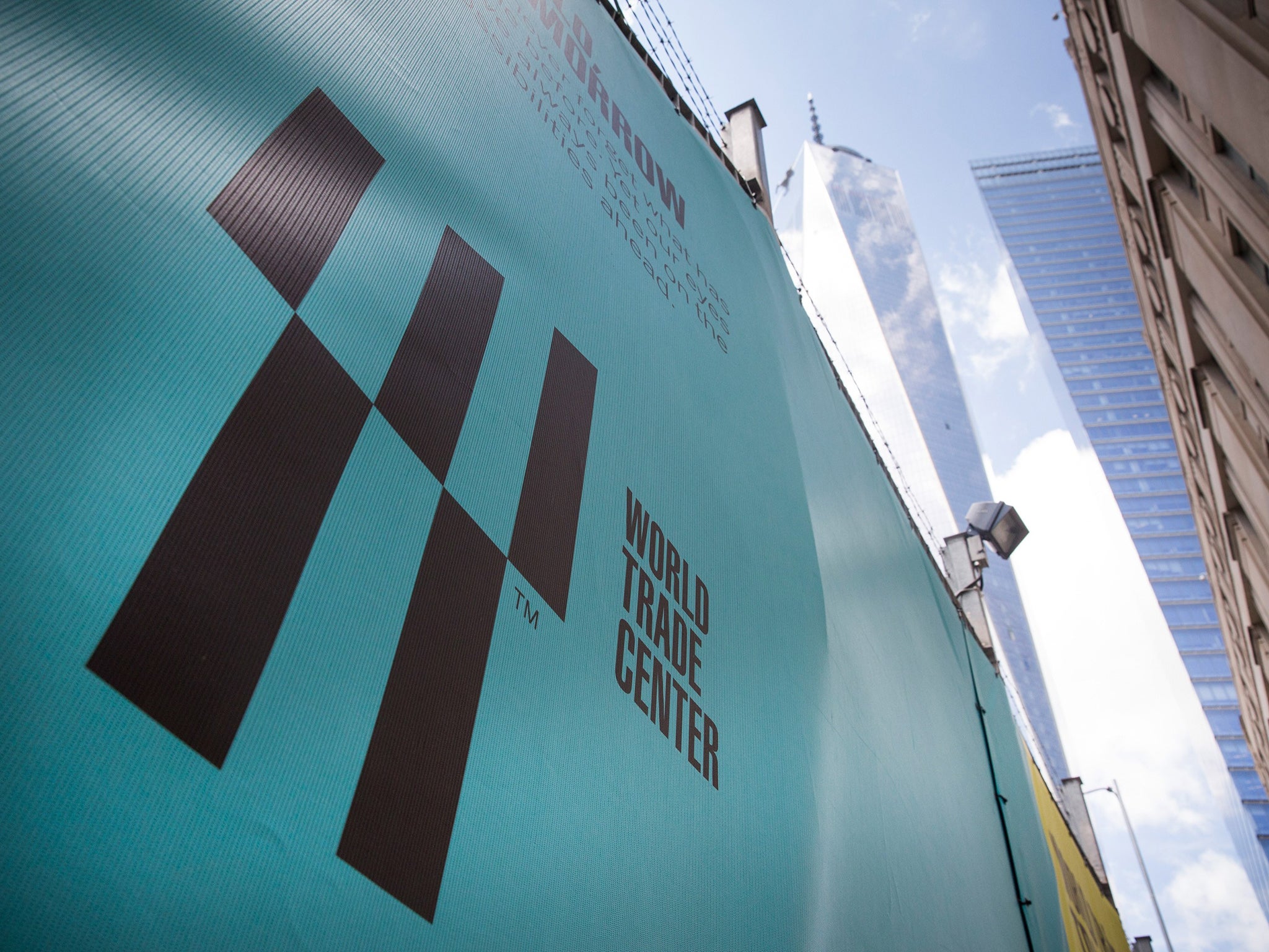
The World Trade Center's new logo is a confusing mix of allusions
Symbol references 9/11 and soon-to-open luxury shopping mall

Your support helps us to tell the story
From reproductive rights to climate change to Big Tech, The Independent is on the ground when the story is developing. Whether it's investigating the financials of Elon Musk's pro-Trump PAC or producing our latest documentary, 'The A Word', which shines a light on the American women fighting for reproductive rights, we know how important it is to parse out the facts from the messaging.
At such a critical moment in US history, we need reporters on the ground. Your donation allows us to keep sending journalists to speak to both sides of the story.
The Independent is trusted by Americans across the entire political spectrum. And unlike many other quality news outlets, we choose not to lock Americans out of our reporting and analysis with paywalls. We believe quality journalism should be available to everyone, paid for by those who can afford it.
Your support makes all the difference.Given the unenviable task of trying to fuse corporate strength, architectural shapes, the mourning of tragedies past and the promise of consumerism, an advertising firm has come up with a new logo for the World Trade Center, and it’s a bit baffling.
The 'W' sign comes as part of a $3.5 million rebranding for the centre by Landor Associates, and, as Co.Design notes, plays on negative space in a similar way to the Rubin vase.
The five bars in the logo represent the five towers that will form the 16-acre World Trade Center, with the downward-facing bottom two referencing the pools of the September 11 Memorial and the empty spaces in between the top three bars alluding to the fallen Twin Towers and the Tribute in Light that marks them each year.
It's an almost poetic, if a little dizzying logo, though it is soured somewhat by the fact it can also be seen as an advert for a luxury shopping mall.

In addition to standing for 'World Trade Center', the W is also a nod to the 'Westfield World Trade Center' which is due to open next year.
Like it or loathe it, the logo is a fair representation of the disparate and competing interests that have been involved in the development of the site since the 2001 attacks.
Join our commenting forum
Join thought-provoking conversations, follow other Independent readers and see their replies
Comments