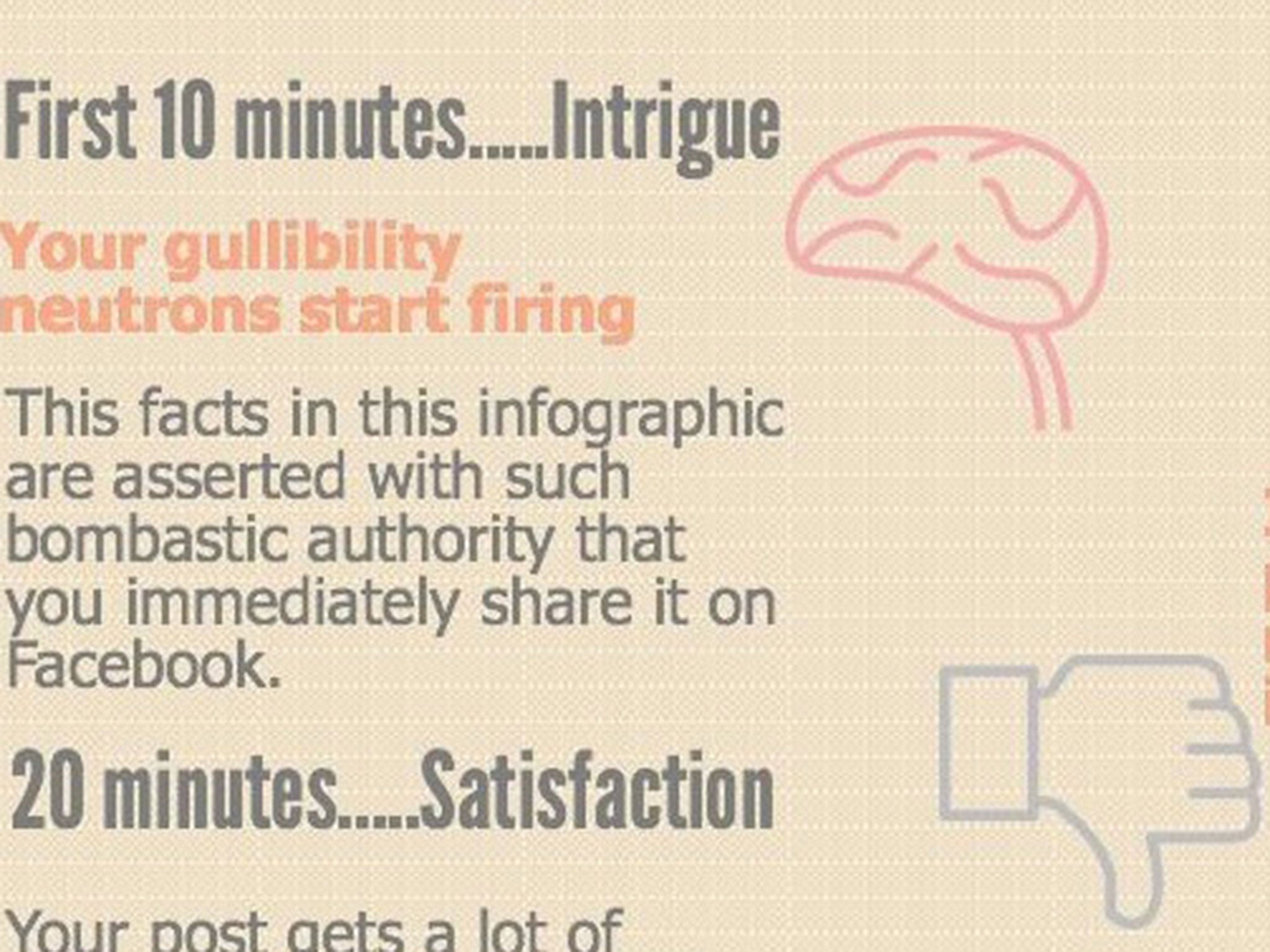
Infographic shows what happens to the brain in 60 minutes after seeing a dodgy infographic
Recent infographics have gone viral - despite making unchecked claims
Your support helps us to tell the story
From reproductive rights to climate change to Big Tech, The Independent is on the ground when the story is developing. Whether it's investigating the financials of Elon Musk's pro-Trump PAC or producing our latest documentary, 'The A Word', which shines a light on the American women fighting for reproductive rights, we know how important it is to parse out the facts from the messaging.
At such a critical moment in US history, we need reporters on the ground. Your donation allows us to keep sending journalists to speak to both sides of the story.
The Independent is trusted by Americans across the entire political spectrum. And unlike many other quality news outlets, we choose not to lock Americans out of our reporting and analysis with paywalls. We believe quality journalism should be available to everyone, paid for by those who can afford it.
Your support makes all the difference.Infographics can be a great way to convey lots of information in an interesting way – but looks can be deceiving.
Recent viral infographics that ended up not being quite as they seemed have prompted one online agency to act.
Sean O’Mara, founder of marketing agency Essential Content, created an infographic to show what happens to the brain in the 60 minutes after seeing a dodgy infographic.
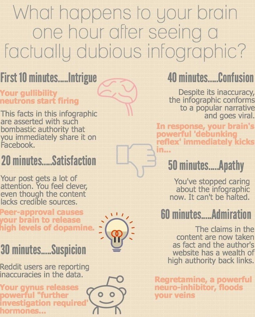
The basic principle is that some visualisations can be so eye-catching that you’ve shared it on social media before thinking to check out the claims it makes.
It’s also an issue that most sacrifice solid references to sources in favour of a cleaner design or simpler wording.
“Infographics are a great way to present complex information in an easy-to-understand format,” Mr O’Mara said. “The London Tube Map and The Periodical Table are two fine examples of this. Unfortunately, they're also a great way to mislead web users into believing something that may not actually be true using un-attributed exaggerations.
“It's a shame, data journalism is brilliant but the more we use it for factually-questionable scaremongering, the less people will like it.”
See if you can spot the unchecked claims made in Mr O’Mara’s own infographic.
Join our commenting forum
Join thought-provoking conversations, follow other Independent readers and see their replies
Comments