The 12 best optical illusions that went viral and stumped the internet
Your support helps us to tell the story
From reproductive rights to climate change to Big Tech, The Independent is on the ground when the story is developing. Whether it's investigating the financials of Elon Musk's pro-Trump PAC or producing our latest documentary, 'The A Word', which shines a light on the American women fighting for reproductive rights, we know how important it is to parse out the facts from the messaging.
At such a critical moment in US history, we need reporters on the ground. Your donation allows us to keep sending journalists to speak to both sides of the story.
The Independent is trusted by Americans across the entire political spectrum. And unlike many other quality news outlets, we choose not to lock Americans out of our reporting and analysis with paywalls. We believe quality journalism should be available to everyone, paid for by those who can afford it.
Your support makes all the difference.The internet is filled with optical illusions, both intentional and accidental.
The most famous one is The Dress, a photo that made a dress seem possibly black and blue or possibly white and gold, depending on who saw it and under what conditions. It ignited a firestorm of controversy around the web.
Here are 12 of the most puzzling optical illusions that have gone viral in the past few years, along with some explanations of how they work.
Kendall Jenner seems to be missing a leg.

Earlier this year, InStyle magazine posted an Instagram photo of Kendall Jenner, Kylie Jenner, and Hailey Baldwin hanging out together after the Golden Globes.
They are all very leggy. So it's odd that one went missing. Kendall's left leg is nowhere to be seen. Where'd it go?
It's under her dress.

Eventually, the internet figured it out. It was under her dress all along! If you look really closely, you can see the horizontal top of her leg. She's pointing her knee to her right and twisting her body forward to be more prominent in the picture.
This illusion of six girls with five pairs of legs flummoxed the internet.
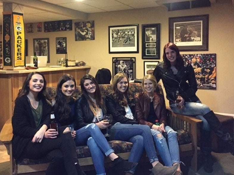
Legless women are a staple of the viral optical illusion genre. This photo that went around Reddit in late 2016 showed six women sitting on a couch.
But -- yet again -- a leg was missing. The person sitting in the middle of the couch seems to have no legs at all.
What's really going on is a little more tricky.
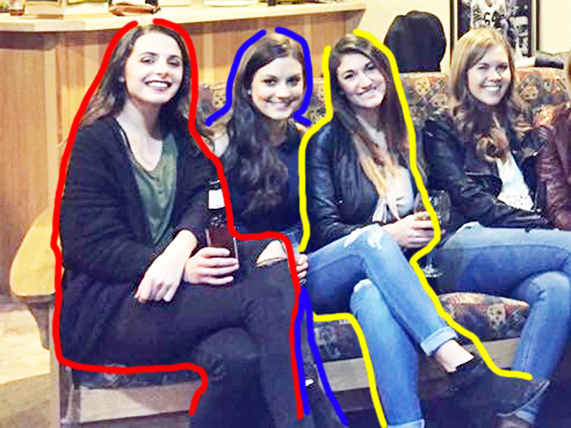
If you look closer, you'll see what's really going on.
The woman in the middle of the couch does, in fact, have legs. She's leaning her torso to her left and her head to the right. So it's hard to tell that those legs on the viewer's left are hers.
The legs of the woman all the way on the left are also pretty clear. She's wearing black jeans.
So that leaves the person second from the furthermost left. If you look closely, you can see that she's also wearing black jeans. One of her legs is simply completely behind the other woman's legs. You can see a sliver of the other one in the image. It helps if you adjust the photo's lighting.
There's something off about this viral photo. Can you spot it?
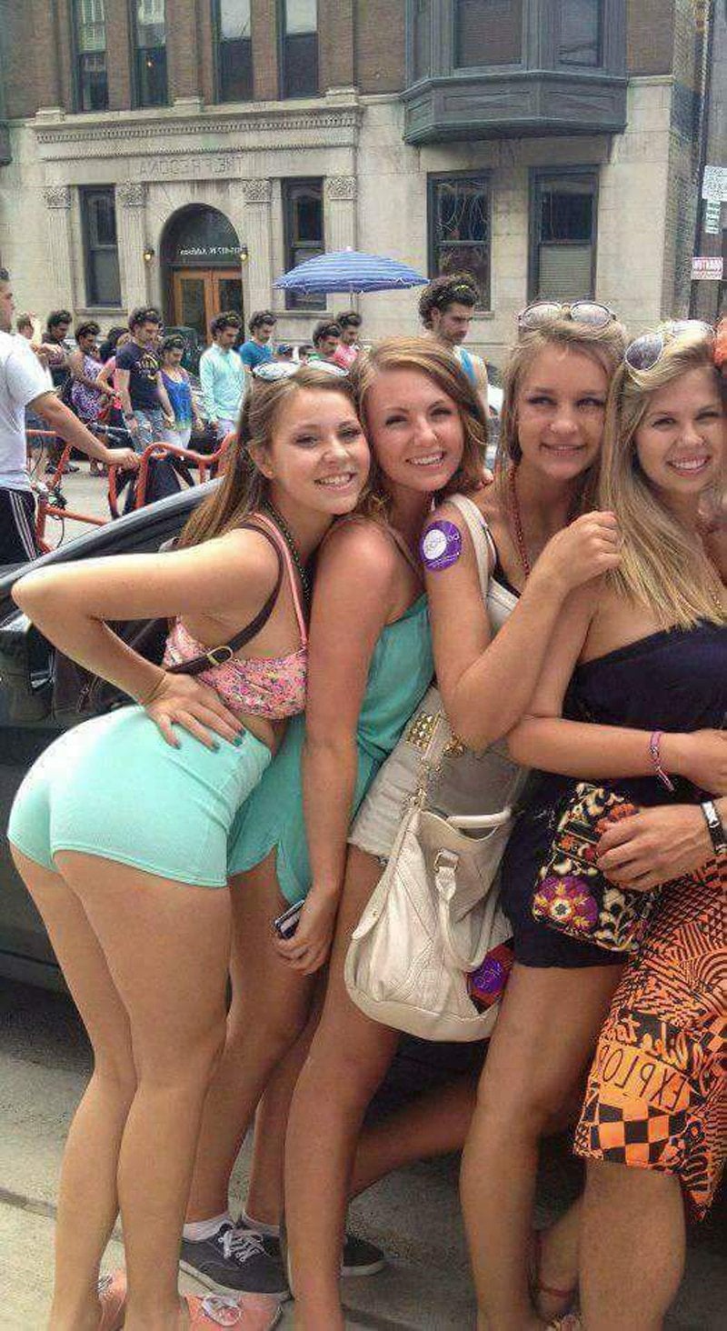
This particular image went viral on Imgur, uploaded by a user going by the name of what047. It has the caption "It took me forever to find what was wrong here..."
Do you see it?
All the faces in the background are the same.
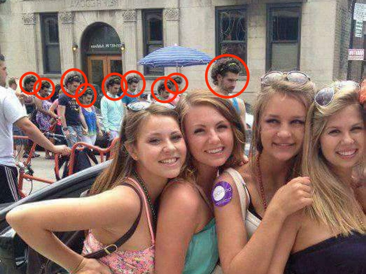
You may have been looking to closely at the women in the foreground. Nothing is off about them.
But in the background, everyone has the same head. Someone edited the image so that everyone's head was replaced with one belonging to a curly-haired guy looking down.
The image's trick is a good reminder that the details you're looking for aren't always in the foreground. Sometimes they're in unexpected places.
Do these legs look oily to you?
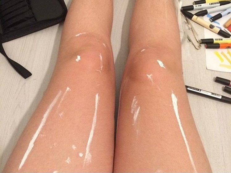
This image went viral in October of 2016 after Hunter Culverhouse, an art student, posted it on Instagram. It looks like Culverhouse's legs are covered in oil.
It's actually just streaks of white paint.

With the image cropped, it's a little easier to tell what's really going on: streaks of white paint make it look like a glare of light is coming off of Culverhouse's legs. They're actually dry.
Culverhouse told INSIDER that the effect was completely unintentional. They took the photo after finishing up some homework for an art class.
"[I] had some white paint left on my brush and put random lines on my legs," Culverhouse wrote in an email. "Turned out to be a completely confusing picture for everyone on the internet."
Is this dress blue and black or white and gold?
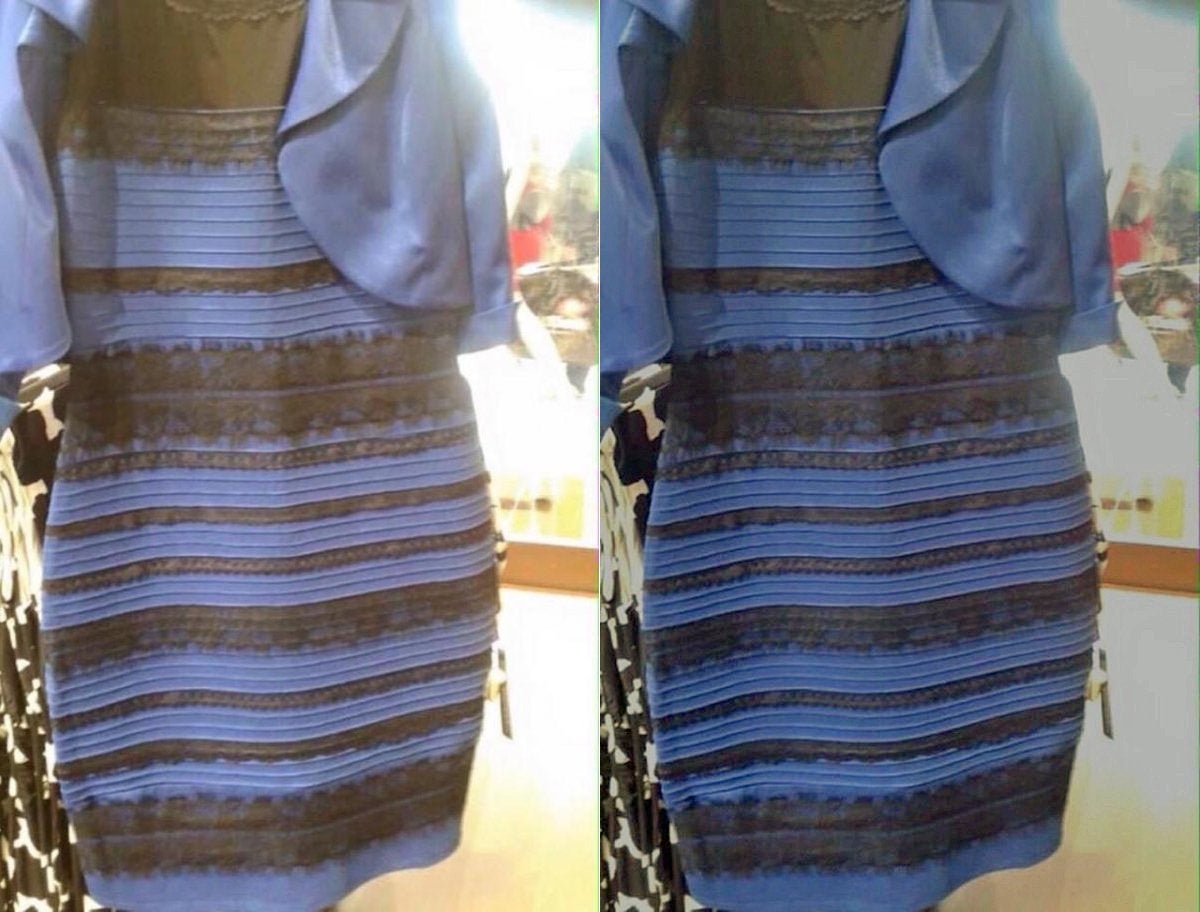
The dress! How can anyone forget the dress? black and blue? white and gold? Why does it look different to everyone?
The original image was posted on Tumblr by a woman named Caitlin McNeill, a singer-songwriter from Scotland, after she sent the picture to her friends, who disagreed on the color.
It's black and blue. Here's the science behind why it looks different for different people.
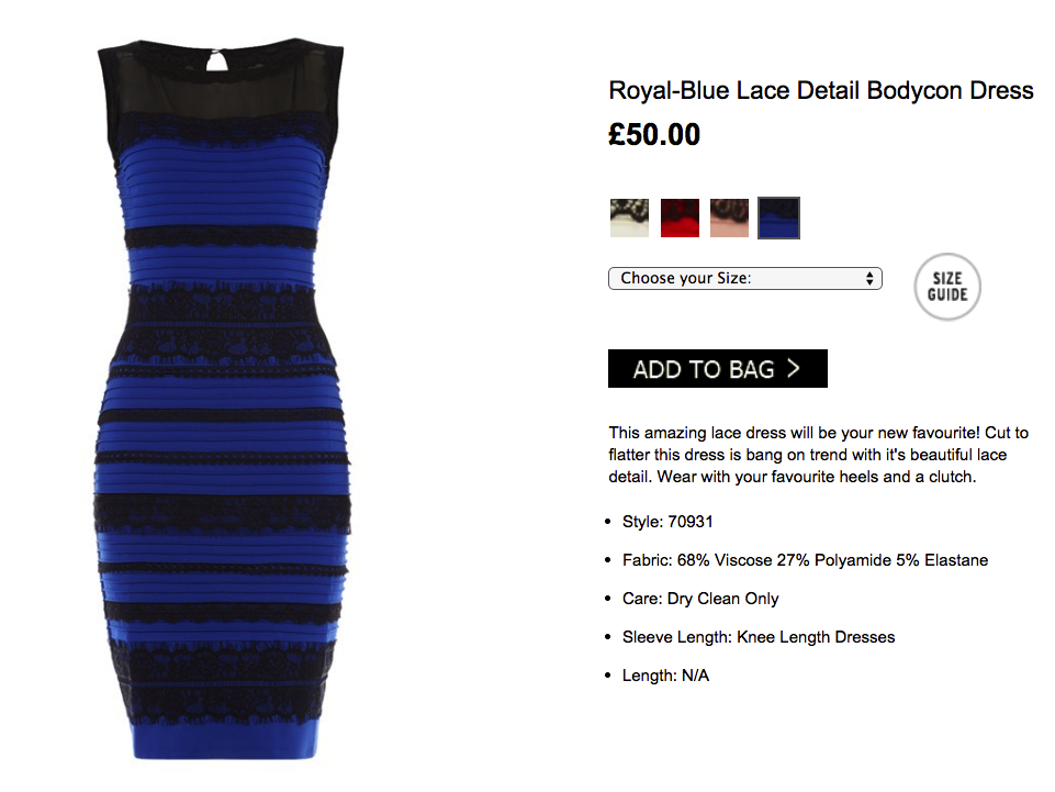
It's black and blue.
The science of why people saw the dress differently is a little complicated, and scientists offer different explanations for some of the details. The peer-reviewed Journal of Vision even published several articles about it.
Stated plainly, the way your brain determines color relies on two things: the color of the object you're seeing and the color of the light source. The image was overexposed, meaning the light in the image overwhelmed the color of the subject. Parts of the dress were also in shadow. This all implies that the dress had a partial light makeup of bluish shadow, reflecting off the dress itself, and yellow light, from the store's bad lighting. Parts of the image also seem to indicate that the dress is backlit.
Depending on whether your brain saw the dress more in shadow or more in a direct light, you'd see the colors differently.
These strawberries aren't red.
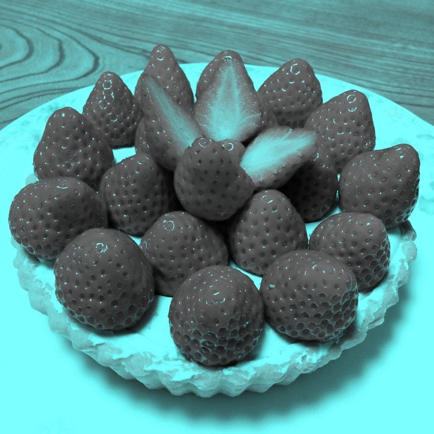
The image was made and posted on Twitter by Akiyoshi Kitaoka, a professor of psychology at Ritsumeikan University who studies visual perception. This pixels have been completely drained of any red. So why do so many people still see red strawberries?
It's because of a phenomenon called colour constancy.
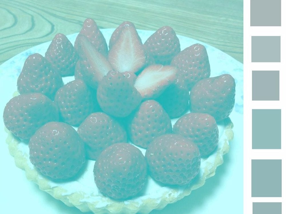
The image above, posted by "Silicon Valley" writer Carson Mell, separates specific pixels to show that they are, in fact, grey and green. They're not red.
Your brain may think they're red because of a phenomenon called color constancy. It's related to the science behind The Dress: Your brain looks at the color of the object and the color of the light to determine the color presented to you.
But the brain also knows that the color of the object is more useful than the color of the light for actually determining the color of the object. So it's trained to ignore information from the color of the light.
In this manipulated images, the color of the light has been manipulated so there's no red whatsoever in the image. But your mind recognizes the objects as strawberries, and it knows that strawberries (at least as most people know them) are red, so it understands the strawberries to be red even if the image has no red in it.
"You brain says, 'the light source that I'm viewing these strawberries under has some blue component to it, so I'm going to subtract that automatically from every pixel,'" Bevil Conway, a neuroscientist at the National Eye Institute, told Motherboard. "When you take grey pixels and subtract out this blue bias, you end up with red."
These shapes are mirror images of each other.
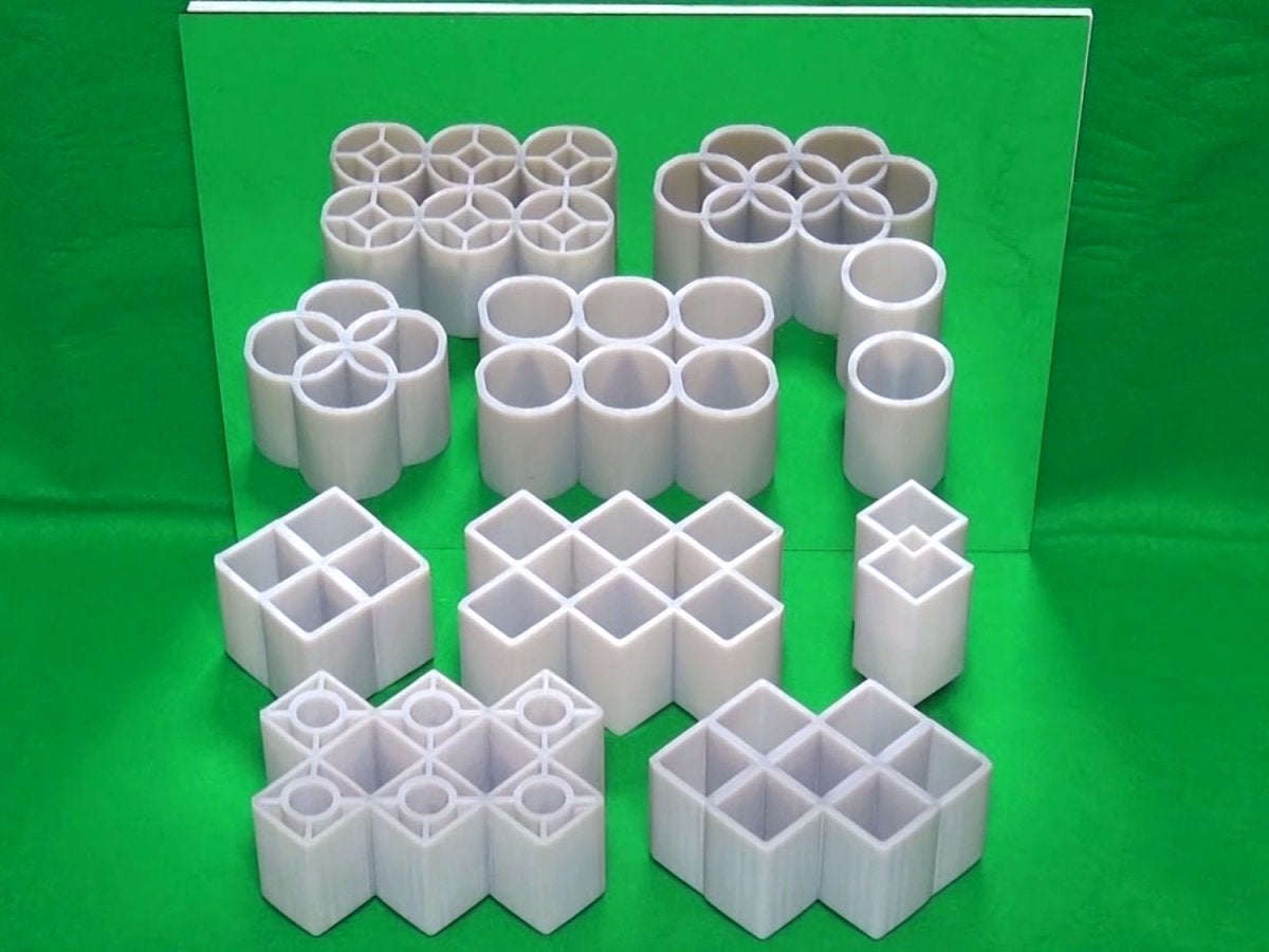
This illusion is called the "Ambiguous Cylinder Illusion." Developed by Meiji University professor Kokichi Sugihara, it won the "Best Illusion of the Year" contest in 2016 from the Neural Correlate Society.
If you watch the full video, you can see Sugihara placing the shapes and rotating them -- only for entirely different shapes to appear in the mirror. It's really cool.
"Ambiguous cylinders" are somewhere between a circle and a square.
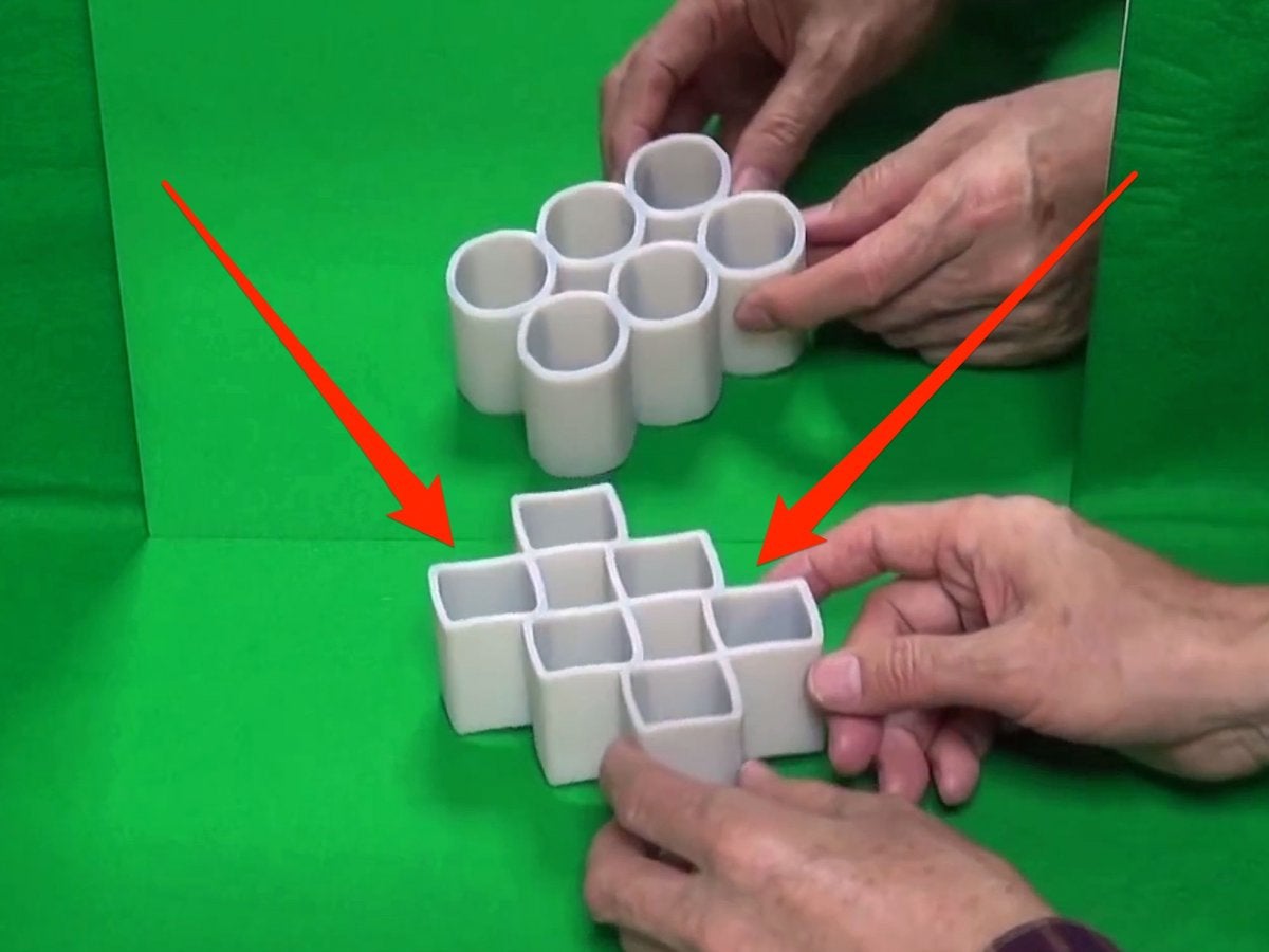
If you pause the video at around the 15 second mark, mid-rotation, you'll see the object's "true" shape.
Ambiguous cylinders, Sugihara writes in a paper cited by Motherboard, are somewhere between a square and a circle. In this case, the shape also has wavy top edges. Depending on your perspective, your brain corrects the shape of the image to appear as a circle or a square. You can create the same illusion with more elaborate shapes that are made up of circles and squares, which is what Sugihara did with the other objects.
There are 12 dots in this image. Can you see them all at once?
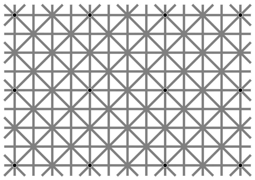
This particular illusion comes from an academic paper published in 2000 in the journal Perception by Jacques Ninio and Kent A. Stevens. If you have access, you can read the paper through here.
It went viral online when Akiyoshi Kitaoka posted it on Facebook and game designer Will Kerslake reposted it on Twitter.
There are 12 black circles in the image, but most people can't see them all at once.
Your peripheral vision sucks.
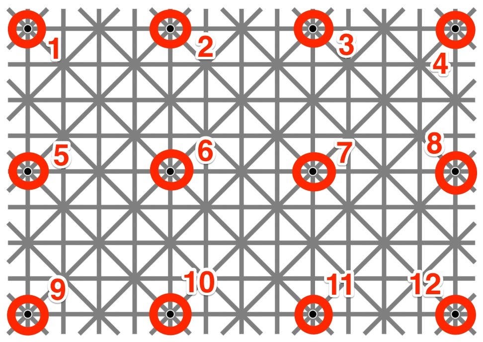
You should be able to see any dot you look at directly. But the ones in your peripheral vision pop in and out.
That's because humans simply don't have very good peripheral vision, as vision scientist Derek Arnold explained to The Verge. For something like this -- black dots against grey lines -- your brain simply makes the best guess it can to fill in the information. In this case, it just guesses the dots aren't there. The white in between the grey lines makes your brain think the dots are lighter than they really are. Thus, it just sees more grey.
"That can counteract the blurry black dot that is actually, physically there," Arnold told The Verge.
What does this look like to you?
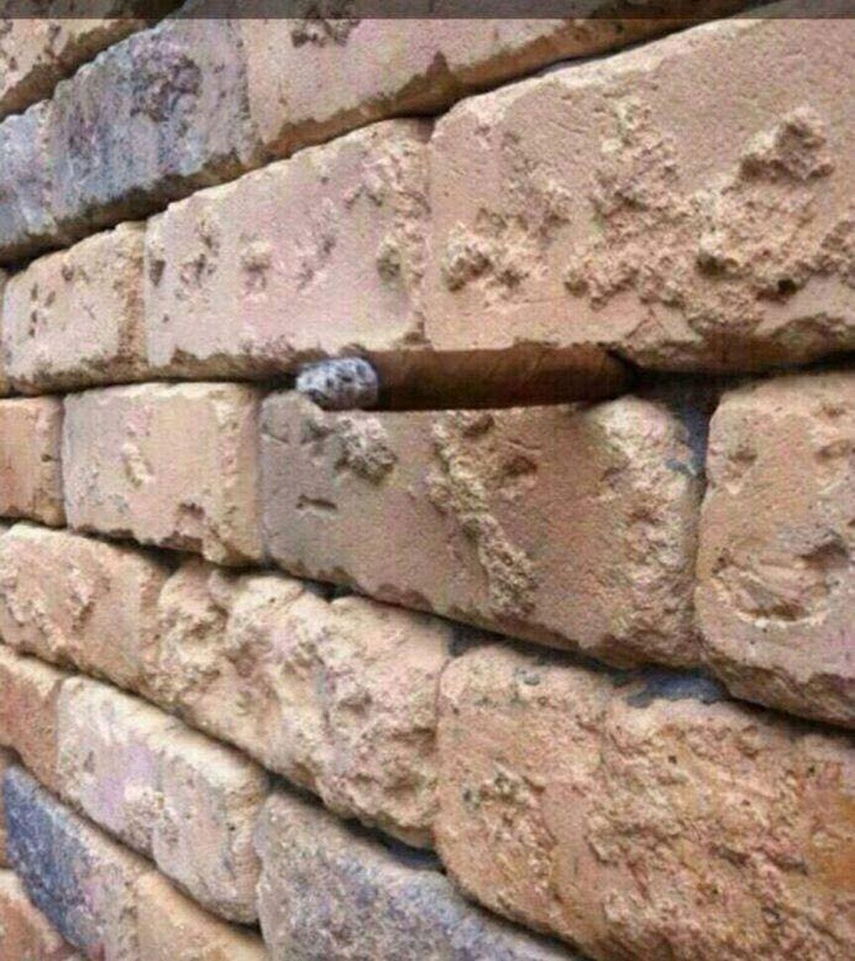
Just a brick wall, right?
Wrong.
There's a cigar in there.
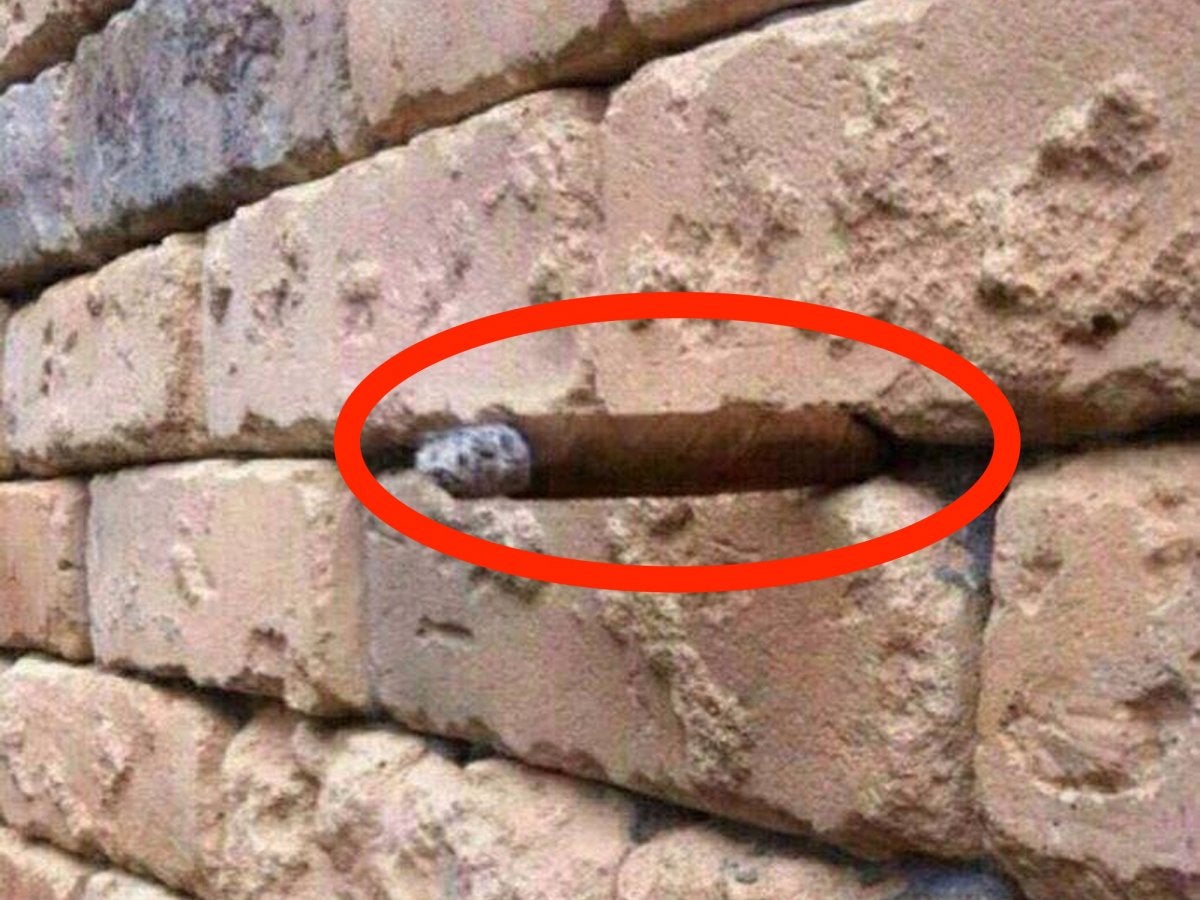
Close, but also a cigar.Arron Bevin/Facebook
The photo went viral when U.K. resident Arron Bevin posted it to Facebook. He said it took him "a good 5 minutes" to figure it out.
There's a cigar wedged between the bricks, blending into the shadows. The ashy end of the cigar looks like a grey stone.
Is she underwater or not?

In 2015, a debate raged on Reddit over whether the girl in this photo was underwater or not. It was originally posted on Imgur by the user maskari.
She looks like she's underwater already because it seems that she's under filtered light and because air bubbles seem to be floating up. But she also looks like she's just jumping into the water.
She's definitely not underwater.

For one, you can't be both underwater and splashing into water at the same time. That makes no sense.
Furthermore, her hair is dry and her ponytail isn't floating around, which it would if she were underwater. The "air bubbles" are just drops.
Either overexposure or a digitally added filter makes the lighting look like she's underwater. But she's not, really.
These two train track segments are the same size.

One example of the illusion went viral when BBC presenter Marc Blank-Settle posted a video of it on Twitter, using his son's train set.
Both curves in the track are the same size, but one the one on the left appears larger than the one on the right when they're next to each other.
Yes, really. The illusion is called the Jastrow illusion.

There are a few different theories for how the Jastrow effect works. But basically, your brain compares the two sides of the respective track pieces that are next to each other. So instead of comparing the right side of one piece to the right side of the other, it compares the right side of the left track to the left side of the right track, because those two sides are next to each other.
These are supposed to be sand dunes.

While flying a few hundred kilometers over a desert in 2013, European Space Agency astronaut Luca Parmitano took a photo of some sand dunes.
"Like an Escher painting, sand dunes seem to reproduce the same shape indefinitely," he wrote.
A lot of people didn't see it. The photo looks like a bunch of pits, not hills. What's going on?
Flip it over and you'll see what they really are.

As Phil Plait pointed out on the blog Bad Astronomy, the image makes more sense when you look at it upside-down.
The illusion is pretty simple. Your brain thought the sun was in the 1:00 position, meaning they were casting shadows from the upper-right. In fact, the sun was casting shadows from the upper-left. Turning the image upside-down puts the image into a format we're more used to.
Read more:
• This chart is easy to interpret: It says we're screwed
• How Uber became the world's most valuable startup
• These 4 things could trigger the next crisis in Europe
Read the original article on INSIDER. © 2016. Follow Business Insider UK on Twitter.
Join our commenting forum
Join thought-provoking conversations, follow other Independent readers and see their replies
Comments