Rebranding the UK’s largest co-operative: how Suma uses design to promote its values
Suma is the UK’s largest co-operative. A redesign sets out to show that to consumers

When Sheree Hatton started working at the whole foods distributor Suma six years ago, she knew it was different to anywhere else she’d ever worked.
Hatton lives in Halifax with her husband and young daughter. In her previous job in advertising and sales for a newspaper, she was used to a hierarchical business with targets for workers. Suma, a worker’s co-op where each employee owns a share of the business, offered her a chance to have a say in everything from overall strategy to day-to-day operations.
“I knew Suma was different from what I had been used to,” Hatton says. “But the more I learned about co-ops, the more I realised that by feeding into business decisions you have an equal opportunity to say how the business should be run.”
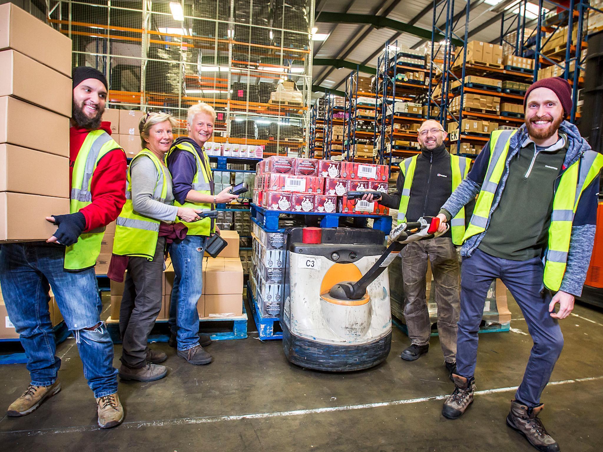
Suma is known as the largest whole food distributor in the UK. But fewer people know that Suma is also Britain’s biggest workers co-operative, with an annual turnover of £55m. More than 200 people now work at Suma after rapid growth in the last few years.
All of them are considered equal. Every worker at Suma is paid the same salary of £33,000. They get the opportunity to work in every part of the business – including the canteen kitchen – on rotation at the company offices in Elland, Yorkshire. And they get to vote on business decisions. “We are an equal business and we’re very proud of what we’re doing here,” Hatton says.
But customers, like Hatton, often aren’t instantly aware of Suma’s co-operative status or what that means, according to a survey they commissioned in 2017. “One of the embarrassing points was that not everyone knew that we are a co-op,” Hatton says. So in 2017, Suma workers decided it was time for a rebrand.

Suma was started over 40 years ago in the kitchen of a house in Leeds. Reg Taylor, owner of a small retail shop, proposed at a meeting attended by other wholefood shops in the north of England that they set up a wholesaling co-operative, to supply to each other, in 1975.
The name Suma was first used when the business moved to a lock-up garage in Leeds. In 1977, the business was sold to seven employees who became the founder members of the Triangle Wholefoods Collective Ltd, trading as Suma.
Suma has recently benefited as consumers have become more conscious of their health and the ethics of food, plus the growing popularity of veganism. The business introduced its own vegan line in September 2017. New vegan products, including the 2018 introductions of meat-free mini-burgers in tins, have helped sales grow in the last decade.
Suma now sells over 7,000 products. The branding has evolved haphazardly as lines have been added. Workers knew from customer feedback that they needed a redesign to create a single identity across all ranges, including essential, body and home. Designers also wanted to position Suma at the forefront of the new movement for sustainability and contemporary food.
“We really wanted to show off that it was a co-op,” says Harriet Ferguson, senior designer at Pearlfisher, the agency commissioned to do the work. “The existing identity didn’t really do that.” Pearlfisher designers added a tagline to the logo “Cooperative since 1977” to make Suma distinctive against competition from younger brands. Then they designed a logo out of different shapes to show the different personalities in the co-op.

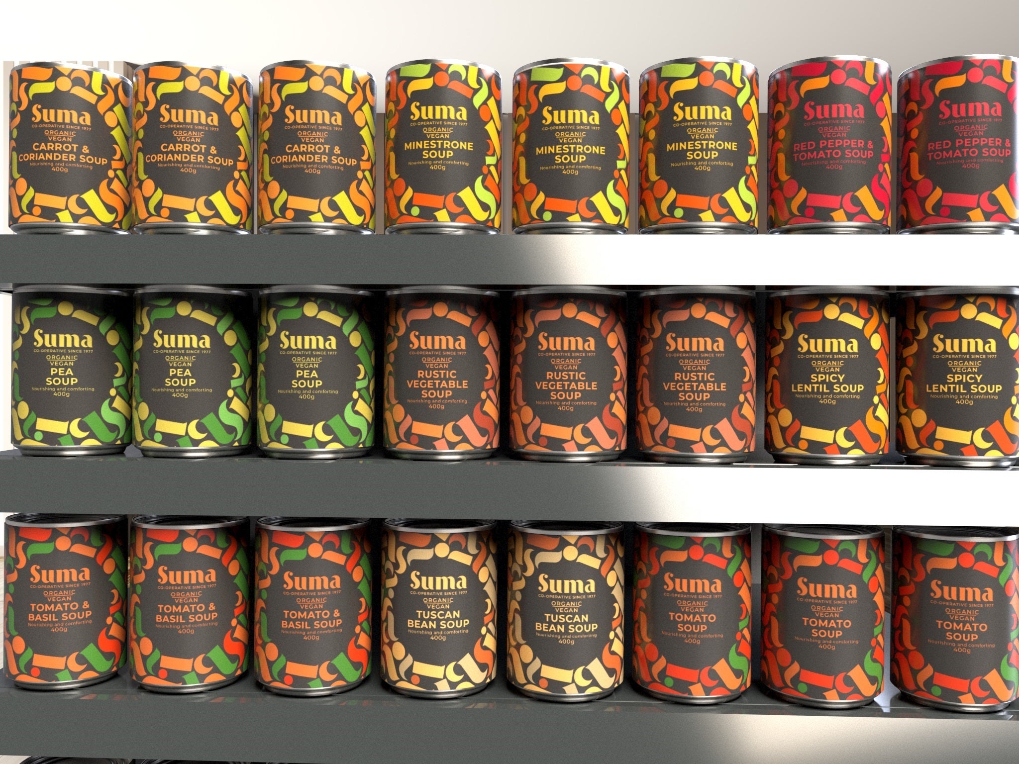
“We called this our Suma of parts and used these shapes to create the logo type. This dynamic pattern can be used on the packaging at different levels,” Ferguson says.
Suma’s inhouse design team picked some of the trickiest products for Pearlfisher to work on in the redesign, including fiddly products with small labels, like pate tubes, and some that didn’t obviously fit into one range, like coconut products.
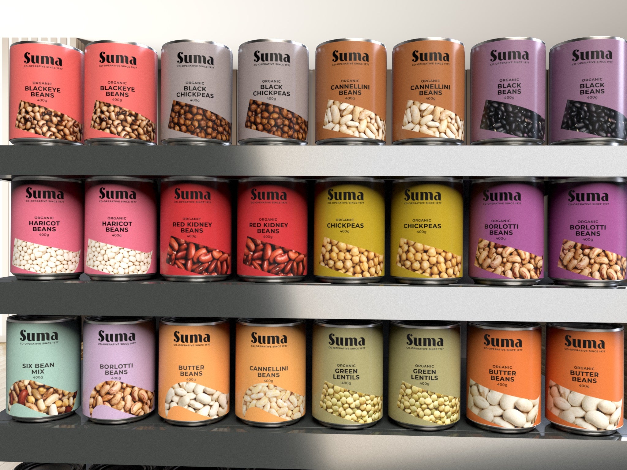
Pearlfisher turned their designs into a set of packs for Suma’s inhouse designers to roll out across old and new lines. The agency also introduced colour palettes to make different products more identifiable. They used earthy tones for the basic products, simple colours for unprocessed food and bright, natural colours for processed pastas and peanut butter. For the premium products, like speciality coffee, they used a charcoal colour palette with pops of colour.
The most important thing, says David Jenkinson, creative designer at Pearlfisher, was creating a sense of the collective in all the elements. “The new identity embodies the idea that this is a collective of individuals,” he says. “They are aligned, they sing from the same hymn sheet, but they are different.”
The new colourful logo, with its tessellating shapes, will be seen on lorries up and down the country and on tins and tubes of Suma products in wholefood stockists from January.
A key part of Hatton’s job has been communicating the new design to staff internally. In a company where 200 people can vote on every small change, Suma needed a process to make sure the redesign wasn’t delayed by disagreements. “We didn’t want 200 people deciding what colours to use!” says Hatton. Instead the branding team built a case for the rebrand and wrote a business plan. They took the plan to workers, who voted it through. Then the designers were free to make decisions, with in-house work making sure workers were happy with the results.
“It’s probably been a little slower, just generally because we’re trying to get consensus and make sure people are behind everything before we proceed,” Hatton says. Some longstanding members wanted to stick with the existing designs, because they saw that it had worked. Hatton and other Suma members listened to them and tried to alleviate any concerns. “In a typical commercial industry people just get told what is happening,” she says. “The difference is that we want people to be passionate about it.”
Join our commenting forum
Join thought-provoking conversations, follow other Independent readers and see their replies
Comments