Zara has a new logo and people are not impressed
The logo features overlapping letters
Your support helps us to tell the story
From reproductive rights to climate change to Big Tech, The Independent is on the ground when the story is developing. Whether it's investigating the financials of Elon Musk's pro-Trump PAC or producing our latest documentary, 'The A Word', which shines a light on the American women fighting for reproductive rights, we know how important it is to parse out the facts from the messaging.
At such a critical moment in US history, we need reporters on the ground. Your donation allows us to keep sending journalists to speak to both sides of the story.
The Independent is trusted by Americans across the entire political spectrum. And unlike many other quality news outlets, we choose not to lock Americans out of our reporting and analysis with paywalls. We believe quality journalism should be available to everyone, paid for by those who can afford it.
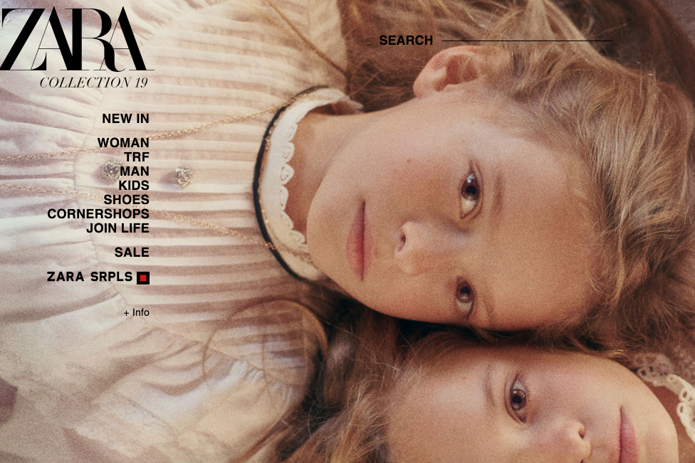
Your support makes all the difference.Zara has unveiled a new, curvier logo - but not everyone is a fan.
The fast-fashion retailer recently revealed the updated logo, which replaced its former easily-recognised logo, on its website and social media accounts.
Unfortunately, consumers are less-than-impressed with the new branding, designed by the Baron & Baron agency - as the letters are quite cramped.
In addition to overlapping all of the letters, a curve has been added to the bottom of the Z and the R, making for text slightly difficult to read.
The style is also not unique - as HypeBeast pointed out it is the signature typography of artistic director and Baron & Baron founder Fabien Baron.
On Twitter, people mocked the brand’s latest appearance - and questioned who approved the crowded design.
“Whoever is responsible for the new Zara logo, I just want to talk,” one person wrote.
Another said: “This new Zara logo is wrong in so many aspects that it’s hard to synthesise in one tweet. Nonsense kerning, absurd letter spacing, lack of uniqueness.”
Designer Erik Spiekermann also expressed his distaste for the new logo.
“That is the worst piece of type I’ve seen in years,” he tweeted. “Was this done by one of those new robots that will replace humans?”
The Inditex-owned retailer changed its logo once before in 2010. However, that update was more readily accepted by consumers as it was similar to the 44-year-old brand’s previous one.
Zara isn’t the only company to introduce a new questionable logo in 2019.
Office messaging tool Slack recently unveiled a new design as well to the dismay of users.
The Independent has contacted Zara for comment.
Join our commenting forum
Join thought-provoking conversations, follow other Independent readers and see their replies
Comments