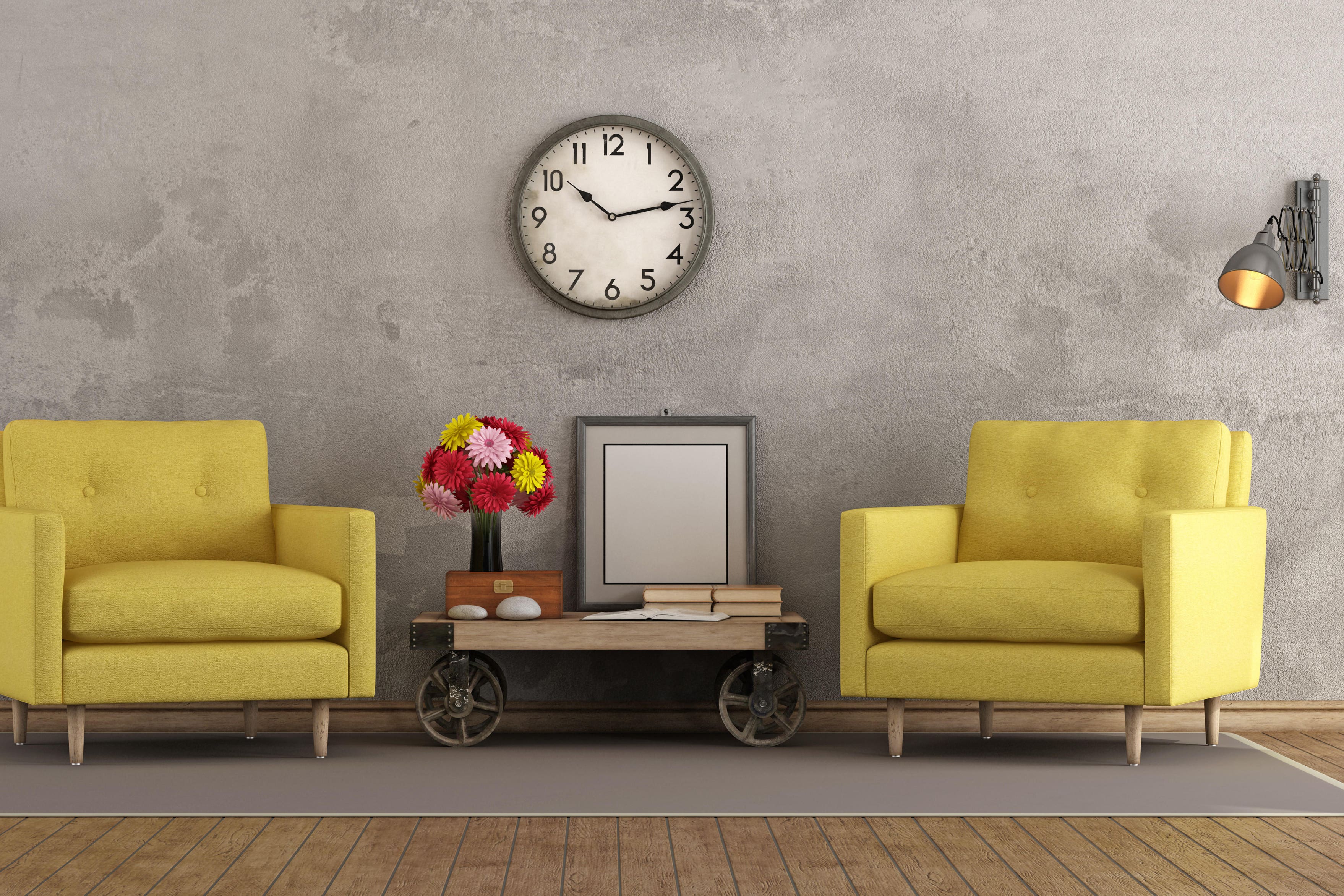
How vintage paint colours are making a comeback
Retro style makes a signature statement, says Sam Wylie-Harris.

Trends come and go but if we cast our eye back, it’s the classics which stand the test of time – namely our love affair with all things retro.
Moreover, the shades which come to mind… mustard yellow, earthy brown, amber, sienna and pastel blue. Inspired by nature and the spirited vibe of the Seventies era.
“Colour is a powerful time machine when it comes to sparking memories and emotion, says Marianne Shillingford, creative director and colour expert at Dulux.
“So it’s natural we gravitate towards those we associate with happy moments from the past, because they are familiar and comforting.”
Indeed, grey has reigned supreme as the modern go-to colour for years, but our love for all-things retro is seeing vintage colours making a comeback.
As she points out, with noughties fashion influences reappearing and avocado bathrooms being revived, people are turning to nostalgic hues with ‘Seventies interior design’ at the core, and very current.
“I don’t think there’s a more nostalgic time than Christmas and New Year,” highlights Shillingford. “So, it’s inevitable we’ll tap into colour schemes that keep that sentimental holiday feeling alive.
“Vintage design and décor will always hold a place in our hearts simply because it’s a way to connect us with the well-loved and timeless looks our parents and grandparents lovingly gifted us.”
For those wanting to turn back time, Shillingford highlights five essential vintage colours to get on board with…
Yellow
“Yellow is one of the original vintage colours due to its feel-good factor that people tapped into during hard times,” underlines Shillingford. “Using bright yellows is a way of getting an instant mood boost.
“The modern ‘dopamine decorating’ is no different, inspired by maximalism and playful colour chaos. Everyone has an inner desire to be a bit rebellious – it’s way more fun than feeling like an adult with a never-ending list of responsibilities!”
She says yellow is bold and unexpected, which makes it so enjoyable to decorate with. “It forces you to let your hair down and embrace feeling free.”
Green
“Green transports us to the Seventies where warm muted shades that linked to nature were all the craze in interiors and fashion,” opines Shillingford.
“Avocado green was the epitome of that decade. Whether you lived through the Seventies or not, everyone can picture the green bathtubs, toilets and sinks.
We’re drawn to green today, for the same reason we were in the Seventies, explains Shillingford. “It’s a humble colour.
“We feel comfortable around green because we see it a lot in nature, so it has a unique ability to reassure us, by bringing a familiar sight into our homes that isn’t neutral, yet not-in-your-face either.”
Orange
“Orange is the middle ground to yellow’s optimism and red’s fearless energy – two things we tend to associate and admire in our older generations,” notes Shillingford.
So, shades in the orange colour family tend to have a sentimental nostalgia, as if receiving words of wisdom from your grandparents, suggests Shillingford.
“Although, like being told what to do as a kid, it can be quite like Marmite and not to everyone’s taste,” she quips.
Blue
“Blue is known for being the colour connected to reliability – something that always seems more appropriate to the past, because it’s happened already, we know the outcome,” outlines Shillingford.
Like a trusted pair of jeans being the timeless wardrobe essential, she says blue is a staple shade with an easy-going nature.
“Recently we’ve seen this trustworthy shade popping up in surprising places with the rise of the ‘unexpected blue’ interiors trend,” notes Shillingford.
“This sees bursts of blue appear against more neutral or contrasting colour palettes, in ways that almost shouldn’t work… but absolutely do.
“Creating a dramatic focal point – and bold, Seventies-style statement.”
Pink
“Pink that is soft and subtle, like blush pink or sorbet, offers the feeling of a caring touch, ” says Shillingford.
“These gentle hues reflect the Thirties and Forties desire for some classic glamour, as well as being the start of pink becoming seen as a feminine colour.
“As an era often romanticised for its elegance and sophistication, it’s no wonder we turn to these shades in our interiors to bring a touch of class and style.”
Bookmark popover
Removed from bookmarks