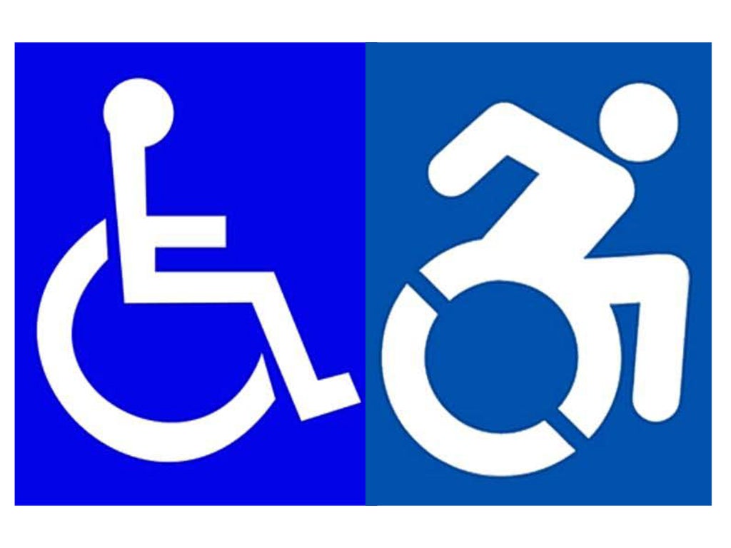
Should Britain look at introducing a more dynamic wheelchair sign?
The global symbol for disability – a straight-backed stick person in a wheelchair – is to be changed. James Moore assesses the new design

It’s the symbol for disability known the world over - the blue sign featuring a straight backed figure in a stylised wheelchair. New York State is now just one step away from banning it. Lawmakers there want to see it replaced with a more “dynamic” version, featuring a wheelchair in motion.
The term “handicapped” - widely considered to be derogatory and mercifully less common on this side of the Atlantic than in the US - would also be removed. However, the law will only apply to signs installed after its implementation, always assuming it gets passed by the Governor, Andrew Cuomo, following its approval by a Democrat controlled Assembly and now the Republican led senate.
But should Britain look at introducing a more dynamic wheelchair sign? Having a mobility impairment as a result of a cycling accident, my first reaction to the new sign was very positive. For me, the narrative it displays is more positive, and less passive, than the existing sign and it therefore challenges lazy perceptions of the disabled held by the able bodied.
It is a view broadly shared by Liz Sayce, the chief executive of Disability Rights UK, although she has an important qualification to add: “There are more than 11 million people classified as living with a disability of some sort in the UK, but the vast majority are not wheelchair users. The chase is still on for a sign that can capture a range of disabilities.”
That is an issue picked up by the writer Selina Mills, who is legally blind and whose book ,“The Life Unseen - The Story of Blindness” , comes out next year. Mills, too, likes the idea of a sign featuring a figure that is not static, but says that there is a widespread, and unhelpful, perception that you must need a wheelchair if you have an impairment, perhaps encouraged by the universal use of the blue wheelchair sign.
“I just came back from Chicago Airport where they weren’t prepared to give me any assistance unless I was prepared to go in a chair,” she says. “That’s something you come across a lot in airports. It’s like I’m a liability if I happen to be walking around with a disability. I have to be contained.”
Mills, however, does point out that there are increasingly signs available to depict impairments to functions other than mobility, such as the eye symbol for blind people, and an ear for the hearing impaired. The eye symbol itself is a more inclusive replacement for the sign featuring a male figure with a cane, or a dog, that was its predecessor.
The dynamic wheelchair does not, however, find favour with everyone. Ricky Cahill, a team mate of mine from the Frenford Falcons Wheelchair Basketball Club, thinks replacing the existing symbol is a waste of time. “I can’t see why you’d want to change it,” he says. “The old one works fine, everyone knows it and what it means. It’s purely a symbol. Leave it as it is. If it’s changed everyone will have an opinion on what it should be now and you’ll never find a middle ground. It’s just not possible.”
John Thornton, an activist with Transport for All, which campaigns for accessible transport, designed his own “dynamic” chair, which featured on a map of disability-friendly Tube stations (there weren’t many) that he produced to put pressure on Transport For London during the 2012 Paralympics. He tried to make his figure less male, and later found that a Canadian designer had come up with a similar idea.
But Thornton, too, has misgivings about a wholesale move towards a dynamic chair sign. He points out that not all wheelchair users can self propel their chairs. The new sign, he argues, could be seen as weighted to the more active people at the top of “the hierarchy of disability”. “There are some good arguments not to adopt the dynamic wheelchair symbol,” he says. “And, anyway, it’s meaningless unless it is backed up by positive attitudes towards disabled people.”
Nonetheless, it looks as if those visiting New York State over the coming years will get the chance to see the new sign in action, and make their own minds up. On balance, I still favour it. But Thornton’s point about attitudes is extremely well made.
Join our commenting forum
Join thought-provoking conversations, follow other Independent readers and see their replies
Comments
Bookmark popover
Removed from bookmarks