Windows 10: Key features of Microsoft's new operating system
Better interface, built for business, and the return of the start menu

Your support helps us to tell the story
From reproductive rights to climate change to Big Tech, The Independent is on the ground when the story is developing. Whether it's investigating the financials of Elon Musk's pro-Trump PAC or producing our latest documentary, 'The A Word', which shines a light on the American women fighting for reproductive rights, we know how important it is to parse out the facts from the messaging.
At such a critical moment in US history, we need reporters on the ground. Your donation allows us to keep sending journalists to speak to both sides of the story.
The Independent is trusted by Americans across the entire political spectrum. And unlike many other quality news outlets, we choose not to lock Americans out of our reporting and analysis with paywalls. We believe quality journalism should be available to everyone, paid for by those who can afford it.
Your support makes all the difference.The enduring unpopularity of Windows 8 meant it was vital that Microsoft nail its next OS to prove that it was an aberration.
Windows 10, not Windows 9 as you and arithmetic would expect, looks to be a marked improvement.
Instead of adding a host of new complicated features, Windows 10 was designed to simplify - so much that it could work on screens ranging from 4 to 80 inches.
That’s the central conceit of Windows 10; creating a shared user interface for smartphones to tablets all the way up to PCs.
What are the key lessons from the launch of Windows 10?
Microsoft knows Windows 8 was a disaster
So keen was Microsoft to distance itself from the abomination of Windows 8 that they defied logic and skipped number 9. Their official explanation was vague: “This product, when you see the product in your fullness I think you'll agree with us that it's a more appropriate name.”
Everything else about Tuesday’s press conference was an admission that Windows 8 was a dud, and that the new OS will not be much like it.
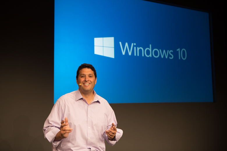
Microsoft OS Chief Terry Myerson said: "It gives the familiarity of Windows 7 with some of the elements of Windows 8."
Touch is the main thing they’ll keep roughly the same, and the Charms bar will stay, though it will be fiddled with.
Microsoft pretty much came out and said that the user experience of Windows 8 was a lesson in what not to do.
Windows 10, on the other hand, will transition keyboard use with touch use, with the device’s interface changing depending on what the user has input.
The new Windows 10 Start Menu
Start menu makes a comeback
Windows 10 has put the Start Menu back at the front and left of the Microsoft user interface. When opened, the menu splits into two columns – one the traditional list, the other app-style icons.
Users can also manipulate the size and shape of the Start Menu and applications for which it is a doorway.
And there’s now universal search from the Start menu, including web results. All in all, it was a good day for Start.
Improved command prompt for computer geeks
Joe Belfiore, the man behind Windows Phone, confessed that this was a “geeky” function. Command prompt is not much used except by those who know what to do with it.
For those technology enthusiasts, command prompting got a whole lot easier with Windows 10. Whereas before you would have to open a context menu and hit paste, now you can use Ctrl+V as you do anywhere else.
Microsoft wants feedback
That’s what the Windows Insider Program is for. Myerson said: “We’re inviting our enthusiastic fans to evaluate [Windows 10] with us. We know they’re a vocal bunch.”
For those who know that “DLL is not the new OMG” or that “BIOS is not a plant-based fuel,” Microsoft is asking for your thoughts on the OS. Forums will be set up, as will discussions with Microsoft engineers.
Multi-desktops for multi-tasking
Task view allows users to access multiple desktop screens where multiple apps are in use. These mini-screens (kind of like windows) crop up at the bottom of the interface.
Using the new “Snap Assist” UI at the side of the screen, you can grab apps from these other desktops. This is for power users who use lots of programmes all at once and for extended periods of time.
In a lot of ways, this feature puts Microsoft back in the desktop game as opposed to smartphones, tablets etc.
Built for business
Enterprise was the buzzword at the California conference, with this OS a direct appeal to major businesses to opt again for Microsoft.
It’s familiar, they said. It’s compatible with all the modern management systems, the said. And productivity is squarely at the heart of the product.
I’m not sure what the customised Microsoft store does to entice industry, but Microsoft listed it as one of their four enterprise values.
The final value, and probably the most interesting, is the separation of personal and corporate data. This will allow for varying levels of security, and should keep your top-secret business information under wraps.
Join our commenting forum
Join thought-provoking conversations, follow other Independent readers and see their replies
Comments