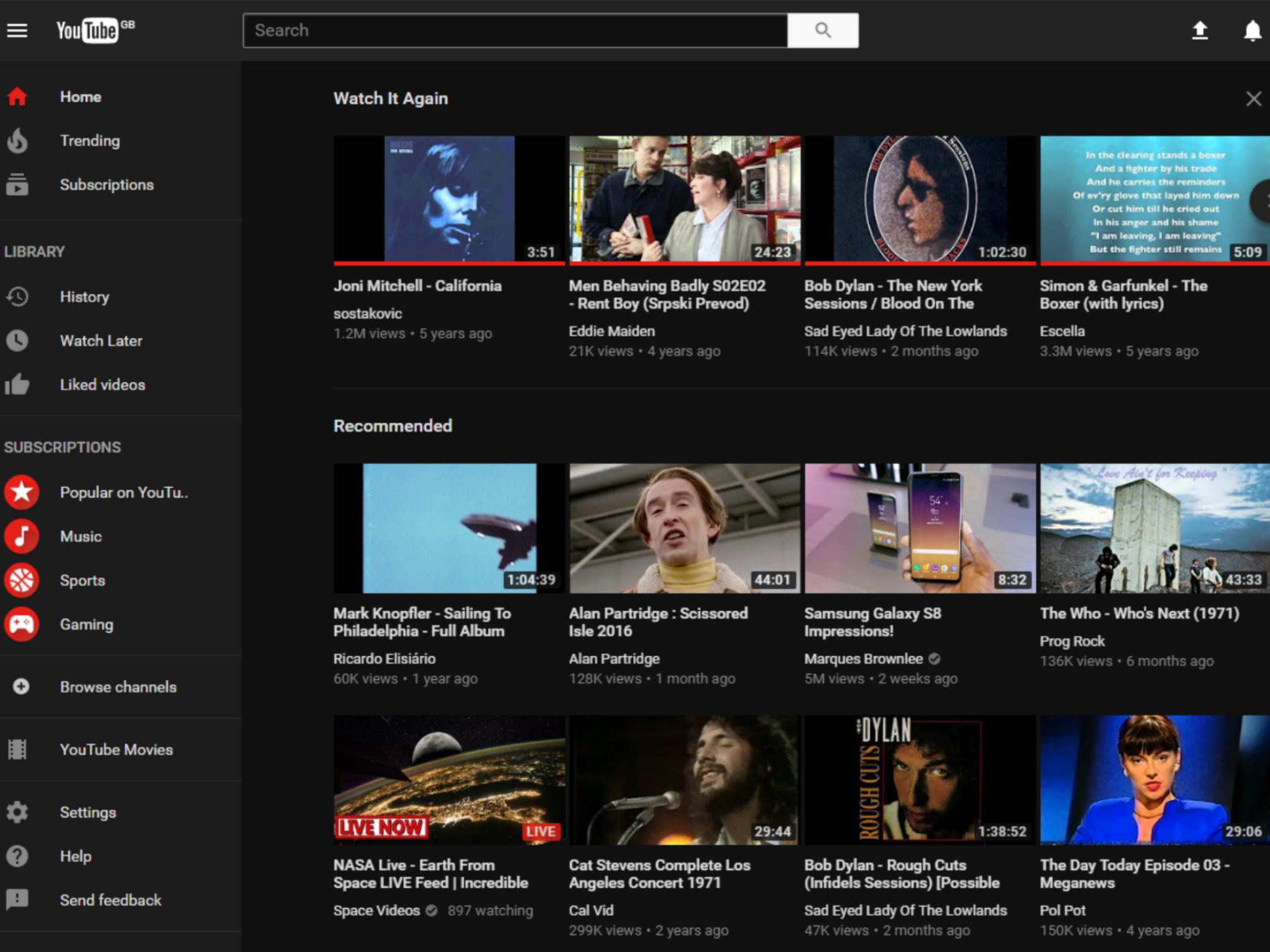
YouTube Dark Theme: Video site undergoes major redesign
It's useful, as well as aesthetically appealing

Your support helps us to tell the story
From reproductive rights to climate change to Big Tech, The Independent is on the ground when the story is developing. Whether it's investigating the financials of Elon Musk's pro-Trump PAC or producing our latest documentary, 'The A Word', which shines a light on the American women fighting for reproductive rights, we know how important it is to parse out the facts from the messaging.
At such a critical moment in US history, we need reporters on the ground. Your donation allows us to keep sending journalists to speak to both sides of the story.
The Independent is trusted by Americans across the entire political spectrum. And unlike many other quality news outlets, we choose not to lock Americans out of our reporting and analysis with paywalls. We believe quality journalism should be available to everyone, paid for by those who can afford it.
Your support makes all the difference.Google is experimenting with a new layout for YouTube, which users can start testing right now.
The video site says it wants to look simpler, as well as more consistent and user-friendly.
The most notable new addition is the Dark Theme.
This switches YouTube’s classic white-and-red theme for black, and it’s useful, as well as aesthetically appealing.
Browsing the regular version of the site in a darkened room at night can hurt users’ eyes, and the black theme should make for far more comfortable viewing.
YouTube’s Dark Theme was actually discovered last month, though it took some fiddling to activate.
Google has only said that the desktop version of YouTube is in line for the redesign, but it’s likely that the app will receive the same treatment in the near future.
“Starting today, we’re opening up a preview of the new design to a small group of people from all around the world so we can get feedback,” reads a post on the YouTube blog.
“While we hope you'll love what we’ve been working on, we’re also really excited to involve the YouTube community so we can make the site even better before sharing it more broadly.”
The new design looks much cleaner too, thanks in part to the shrunken navigation bar.
Google has also introduced infinite scrolling, in order to keep users engaged.
Numerous social media sites use a continuous scroll because it encourages users to try to find an update worth looking at, and thus keeps them around for longer.
The new layout is a work in progress, and users can access it here.
Join our commenting forum
Join thought-provoking conversations, follow other Independent readers and see their replies
Comments