Uber launches new logo... but Twitter users say it is 'ugly' and 'confusing'
CEO Travis Kalanick announced the company's new look in a blogpost
Your support helps us to tell the story
From reproductive rights to climate change to Big Tech, The Independent is on the ground when the story is developing. Whether it's investigating the financials of Elon Musk's pro-Trump PAC or producing our latest documentary, 'The A Word', which shines a light on the American women fighting for reproductive rights, we know how important it is to parse out the facts from the messaging.
At such a critical moment in US history, we need reporters on the ground. Your donation allows us to keep sending journalists to speak to both sides of the story.
The Independent is trusted by Americans across the entire political spectrum. And unlike many other quality news outlets, we choose not to lock Americans out of our reporting and analysis with paywalls. We believe quality journalism should be available to everyone, paid for by those who can afford it.
Your support makes all the difference.Ride-sharing app Uber has unveiled a new logo and brand - and Twitter users are not happy.
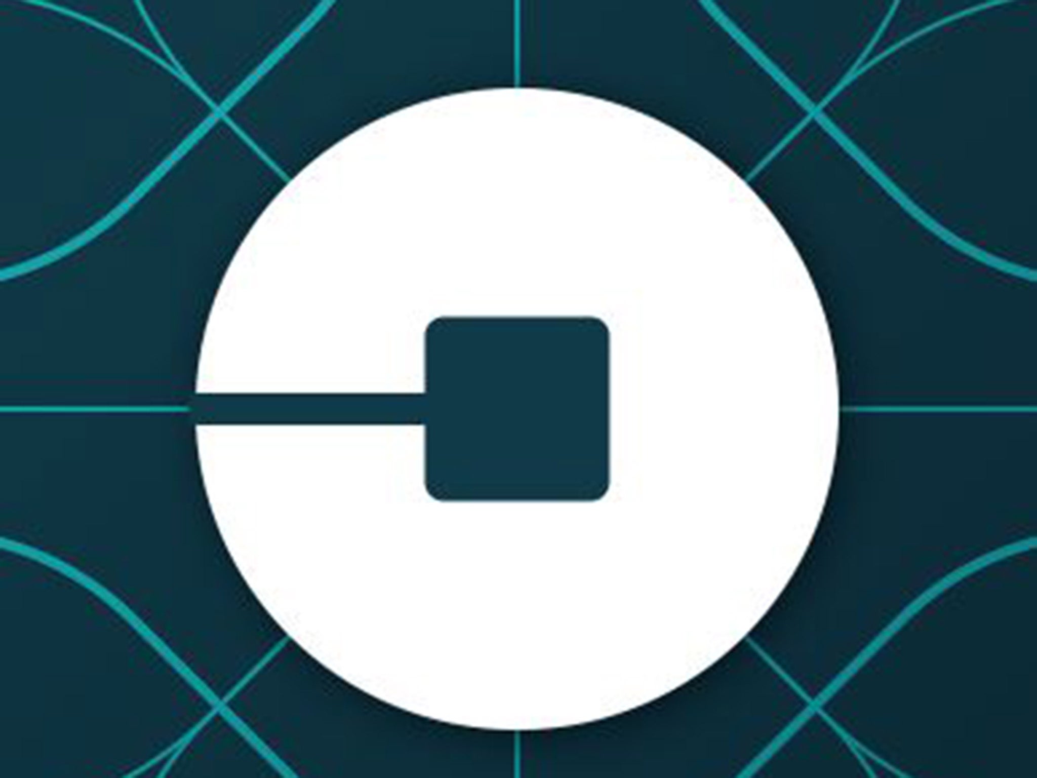
The app has launched a new look to replace its U logo and black and white branding with either a circle for riders and a hectagon for drivers, both with a “bit” inside.
Announcing the change in a blogpost on the company’s website, Uber CEO Travis Kalanick said the “bit” would be a key part of the new design.
He wrote: “With the potential for many apps with many app icons, we needed one approach that connected them all. So we came back to our story of bits and atoms.
“You’ll see that both rider and driver icons have the bit at the center, and then the local colours and patterns in the background. This is a framework that will also make it easy to develop different icons for new products over time”.
He said the old logo was too "distant and cold" so they wanted to overhaul it using different colours in different cities around the world.
The bit will remain the same throughout the website and on the app but the colours and shapes will change depending on where you are in the world and whether you are a driver or a user.
Mr Kalanick said: “Every city has its own character and our long term goal is to have unique designs for cities as well as countries. This will mean adding hundreds more colour palettes and patterns overtime.”
He said the design team were inspired by “the Georgian architecture and lush greens” in Ireland and the “pink and the pattern of the local tiles” in Mexico.
But Twitter users have branded the new logo “ugly” and expressed confusion about why they had made a change “for changes sake”:
The new logo comes as Uber announces plans to move into other industries.
Last year it launched a separate food delivery service in Toronto, Canada for iPhone users called UberEats.
Join our commenting forum
Join thought-provoking conversations, follow other Independent readers and see their replies
Comments