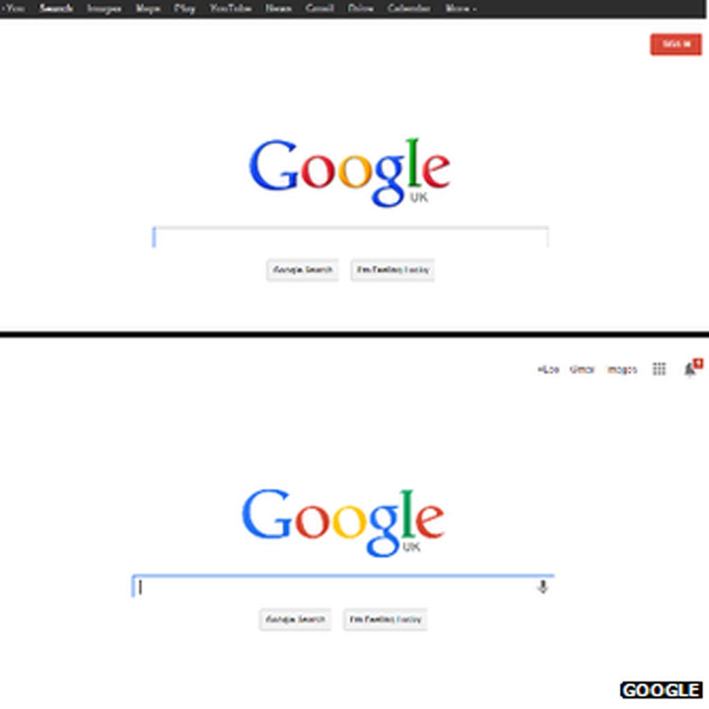
Google redesigns its logo and home page
The most visited site on the whole world wide web hasn’t changed its logo in three years

Your support helps us to tell the story
From reproductive rights to climate change to Big Tech, The Independent is on the ground when the story is developing. Whether it's investigating the financials of Elon Musk's pro-Trump PAC or producing our latest documentary, 'The A Word', which shines a light on the American women fighting for reproductive rights, we know how important it is to parse out the facts from the messaging.
At such a critical moment in US history, we need reporters on the ground. Your donation allows us to keep sending journalists to speak to both sides of the story.
The Independent is trusted by Americans across the entire political spectrum. And unlike many other quality news outlets, we choose not to lock Americans out of our reporting and analysis with paywalls. We believe quality journalism should be available to everyone, paid for by those who can afford it.
Your support makes all the difference.Google is set to roll out a redesign of its logo across all major products, revamping the appearance of the most visited website in the world.
The changes to the search giant’s definitive home page – which is ranked the number 1 site in the world and receives around 15 billion page visits a day – will also include an updated system of links to get to the other products and types of search Google offers.
The Google lettering itself has been flattened, given a refined colour palette and slightly altered letter shapes. It is the first change to the logo since 2010, but not all users will be able to see the changes yet.
The company said it was “rolling out this update across most Google products over the next few weeks”.
In a blog post announcing the full extent of the changes, Google’s tech lead Eddie Kessler said: “If you're anything like me, you move among devices and Google products on a regular basis. You might check Gmail on your phone, for instance, then organize your Calendar via laptop, then browse Google+ photos from your tablet.
“Regardless of your routine, getting around Google should be seamless, and once you're inside an app, you don't want any distractions. So we're introducing an updated Google bar that streamlines your experience across products and devices.”
The announcement from Google comes just two days after Microsoft rolled out a redesign of its search service Bing. And the flatter logo look appears to be something of a trend – with Yahoo similarly revamping its appearance only a few weeks ago.
Join our commenting forum
Join thought-provoking conversations, follow other Independent readers and see their replies
Comments