Mulberry and McQueen: the return of two British greats to London Fashion Week
A pair of Great British greats return to London to showcase their winter wares. The differences? Night and day, commercial and not so, reports fashion editor Alexander Fury

Your support helps us to tell the story
From reproductive rights to climate change to Big Tech, The Independent is on the ground when the story is developing. Whether it's investigating the financials of Elon Musk's pro-Trump PAC or producing our latest documentary, 'The A Word', which shines a light on the American women fighting for reproductive rights, we know how important it is to parse out the facts from the messaging.
At such a critical moment in US history, we need reporters on the ground. Your donation allows us to keep sending journalists to speak to both sides of the story.
The Independent is trusted by Americans across the entire political spectrum. And unlike many other quality news outlets, we choose not to lock Americans out of our reporting and analysis with paywalls. We believe quality journalism should be available to everyone, paid for by those who can afford it.
Your support makes all the difference.If thus far an overriding theme or aesthetic mood is yet to emerge from the London collections, it’s true to state that autumn/winter 2016 is a season of comebacks. First there was the return of Mulberry, absent from the London fashion week calendar since 2013; and also the homecoming, of sorts, of the Alexander McQueen label after 15 years showing womenswear in Paris.
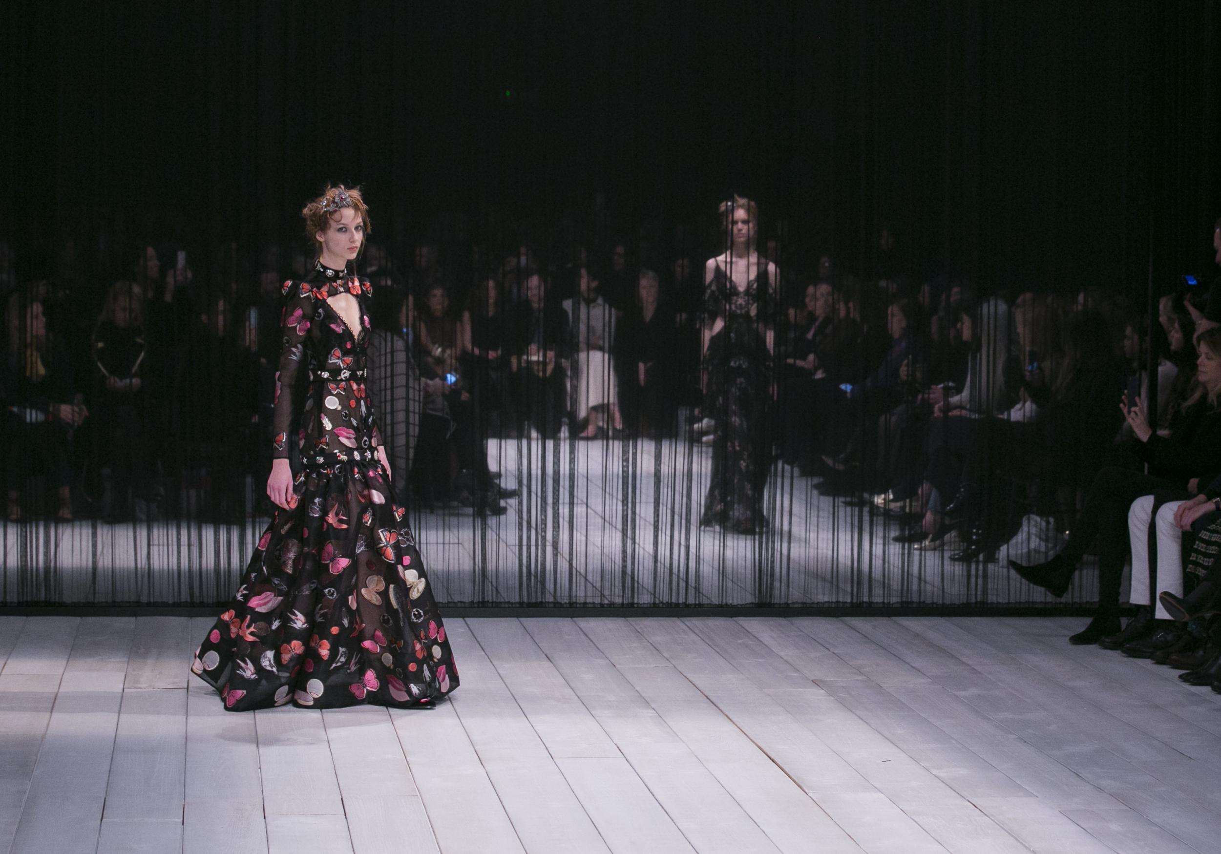
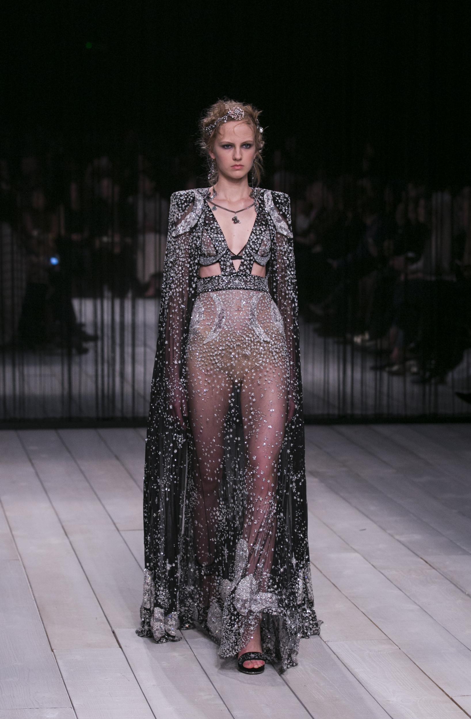
No official reason was given, but designer Sarah Burton is heavily pregnant, which possibly forced the brand’s hand. Back in 2013, Burton’s first pregnancy resulted in a scaled-back show of just ten looks. This time, it was a full compliment of 42 outfits, but the show nevertheless felt scaled-back, creatively. Burton’s motifs of vainglorious lipsticks, compact mirrors and vanities butterflies embroidered and woven into gauzy dresses, felt like something familiar and safe. There was a surrealist bent, but deeper symbolisms of vanity were, ironically, subjugated by their superficial prettiness. Likewise, those observers who saw Burton’s pearl-edged clock-faces and perceived a sly wink at time ticking away - perhaps for Burton to depart McQueen, as rumoured, for Dior - were probably reading too much into a bit of embroidery. Nighttime was another inspiration for the collection, evidenced directly in embroideries of starry skies and moons across chiffon evening capes and diaphanous dresses, and obliquely in the fact that this collection’s focus was resolutely after dark.
Which is fine - it’s tough to imagine many women wearing Burton’s McQueen during the day, even when she shows it. Her coats and suits, even for day, tend towards the grand, habitually fur-trimmed and embroidery-bedecked, with dubious practical applications. There were a few this time, wide-cut and embellished with more of those lips and lepidoptera, marred with the same sense of impracticality. That’s not always an issue, of course: plenty of women lead lives and bank cheques that allow for the impractical, if it’s attractive enough. More worrying is that these kind of day clothes don’t feel especially contemporary; they hung heavy, both physically and with effort. Contrast that with the dozen or so outstanding gossamer evening gowns, nudie-look stuff flecked with exquisite embroidered mythological animals, a pair in silver and gold draped with narrow capes and yet more glitter, and you knew where Burton’s heart was.

There’s nothing wrong with that kind of focus, of course - women would fight to wear these dresses, although whether they’ll be celebrity endorsement of paid-up customers is open to debate. As a chapter in McQueen’s history, thought, this felt more like treading water than breaking new ground.
Was Mulberry’s staid brand profile reinvigorated by the arrival of new designer Johnny Coca? Sort of. A transplant from the remarkably successful team built by Phoebe Philo at Céline, Coca has turned attention onto Mulberry like never before in recent history. Namely, positively - Mulberry’s press has recently focussed on the brands botched corporate leadership, its value dropping from around £1.5 billion to something closer to £400 million. The company’s pretax profit for the year to March 31 2015 stood at £4.5 million — in 2012, it was £36 million. So there’s no quibbling about what to do - stop the rot, sell more stuff. The real question is: how?

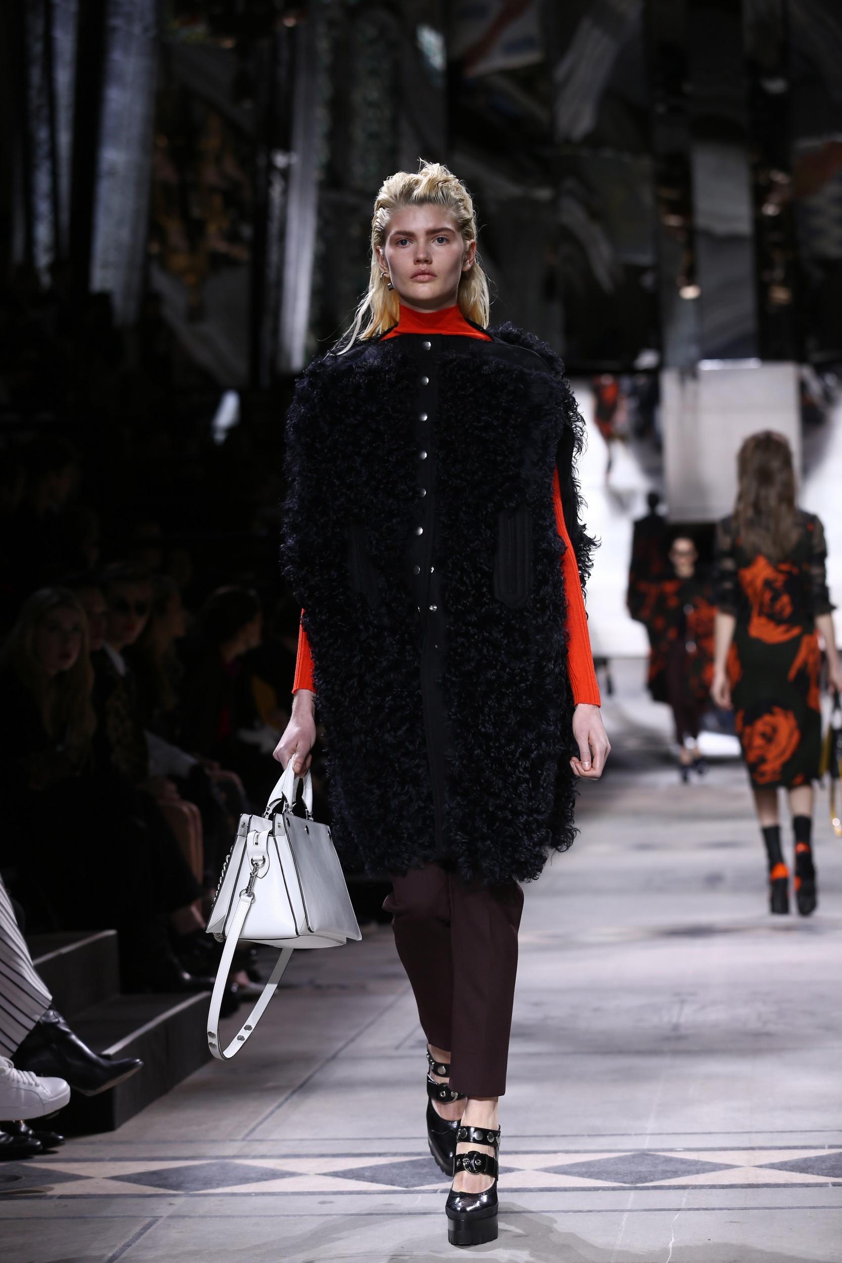
Mulberry brass are hoping Coca is the answer, with a string of Céline hits under his studded, chain-slung belt. Coca likes studs, and chains, and sprinkled both liberally over his first collection of chunky bags, including reconfigured Mulberry classics like the best-selling Bayswater (press-studded down the side, so the whole thing can be pulled apart) and a host of new designs. A table backstage fairly heaved with bags before the show: the clothes, however, were still at the studio being finished. Coca laughed affably and shrugged. He was under no illusions that Mulberry’s clothes are a small cog in a giant machine - and indeed, Coca’s previous experience has focussed on accessories. How to focus an entire fashion show on that is trickier. While backstage Coca’s attention was on the reconfigured bags - many snapping open to cleverly lie flat (great for storage and packing) - front of house it became more about the total look. And while that worked for day, with Coca’s neat line in military capes and loden or navy melton-wool coats, clattering stud-embellished kilts and bikers, it fell apart at night. The slipping strap of one of far-too-many far-too-short baby-doll dresses exposed a model’s nipple - it felt like, as opposed to McQueen, the whole after-dark proposition was a bit of a boob.
Coca has redesigned Mulberry’s label - he’s revived a styling of the name he found in the archive, from 1971. He said it looked honest. I think his clothes are honest too, as is his attempt to bring back the lustre lacking from the Mulberry name. It’ll take more than a change of typeface, but Coca’s show was a step in the right direction. Even if it’s just the first of many needed.
Join our commenting forum
Join thought-provoking conversations, follow other Independent readers and see their replies
Comments