Spring/summer 2016: As fashion brands unveil their ad campaigns, we decode the images
This spring sees an explosion of smart fashion ads, seducing us with everything from rock-dynasty scions to simple typography. Alexander Fury analyses the best
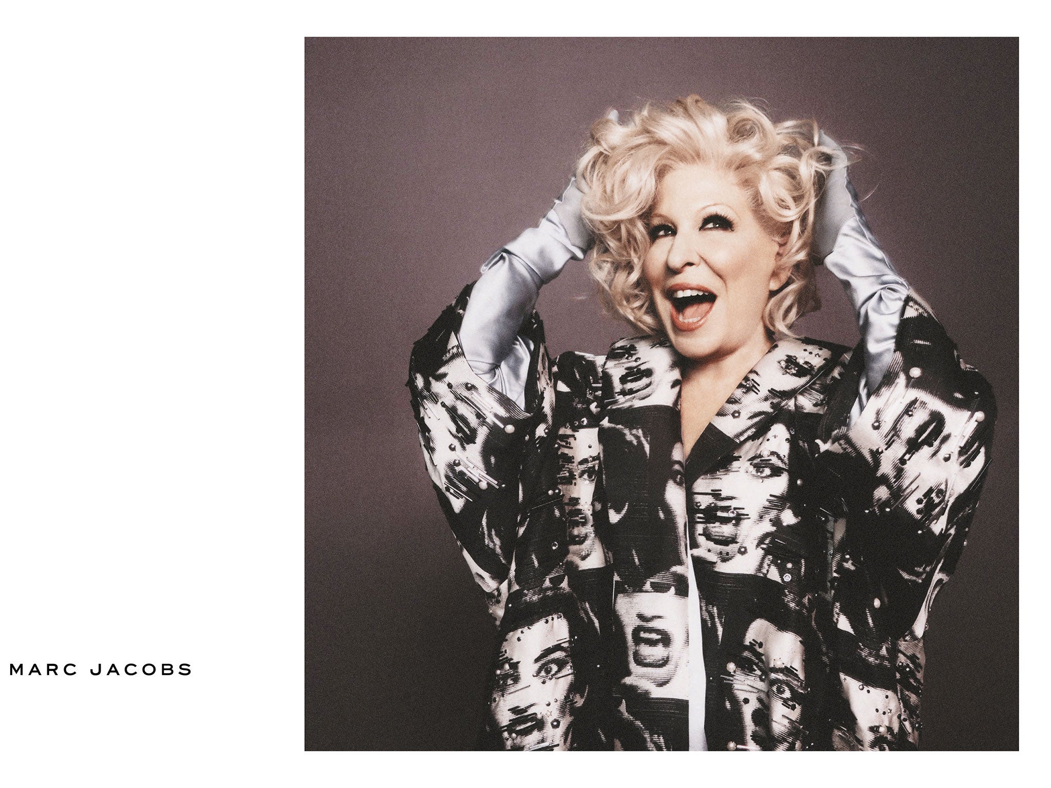
Marc Jacobs
How do you top Cher? How about Bette Midler, who gives the former a run in the gay-icon stakes and features prominently in Marc Jacobs' spring/summer 2016 campaign. Jacobs' campaigns have always been personality-led – the first, in 1998, featured Kim Gordon of Sonic Youth – but the current season is impressive for its variety. "My America" was the ambitious theme Jacobs professed, hence an array of characters as varied as gallery owner Andrea Rosen, actress Christina Ricci, comedienne Sandra Bernhard, RuPaul's Drag Race alumnus Milk, Beth Ditto, and The Divine Miss M in a "Scream Queen" dress. They're all photographed by David Sims, which is the only link in their seeming disparity, bar Jacobs's own relationship with them – as friend, occasionally as fan. This campaign isn't impressive for the litany of celebrity names involved – a common fashion tactic, signifying the significance and weight of the label, and the megabucks pumped into an advertisement's creation – but because they all fit so perfectly into Jacobs' world and evoke his aesthetic and design identity.
Vivienne Westwood
It's telling that Juergen Teller can photograph two instantly recognisable yet utterly different advertising campaigns, for two designers – Vivienne Westwood and Sonia Rykiel – whose aesthetics are diametric opposites. While Rykiel was exporting skinny-sweatered French chic, Westwood was shredding mohair and piercing the Queen's face with a safety pin. Today, while he's shooting rock-dynasty scions for one, the other features the gay porn star Colby Keller, shot in Venice – a city that's famously sinking – to underline Westwood's protest against politics around climate change. That's a lot to pack into an advertising campaign. The resulting imagery, featuring Westwood herself, her clothes, her husband, Andreas, and Keller's penis, is arresting, to say the least.
Sonia Rykiel
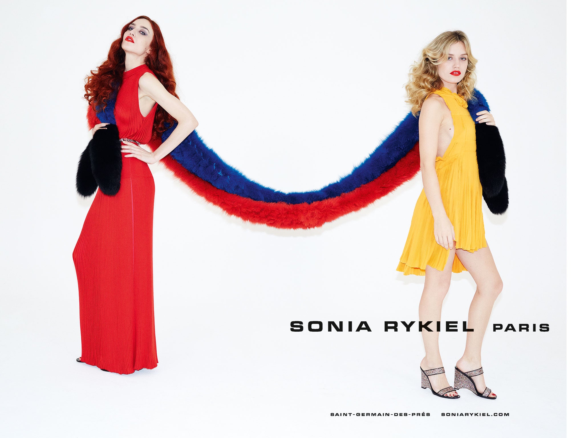
In the 1970s, Sonia Rykiel made her name as an easy-to-wear, ready-to-wear label focused on real women having a really great time. After pragmatic debut and sophomore collections focusing on daywear, the label's artistic director, Julie de Libran, decided to go out at night. The same idea is evoked by Lizzy and Georgia May Jagger, who return for their third successive Rykiel campaign turn photographed by Juergen Teller. His signature flash-heavy style evokes Antonio Lopez's Instamatic shots of the 1970s, while Georgia and Lizzy are contemporary reincarnations of the era's nightlife queens such as their mother, Jerry Hall, and indeed Rykiel herself, given Lizzy's kinked auburn hair. This campaign works because it's tapping into both brand-specific heritage and universally evocative imagery of a hedonistic Paris 40 years ago.
Balmain
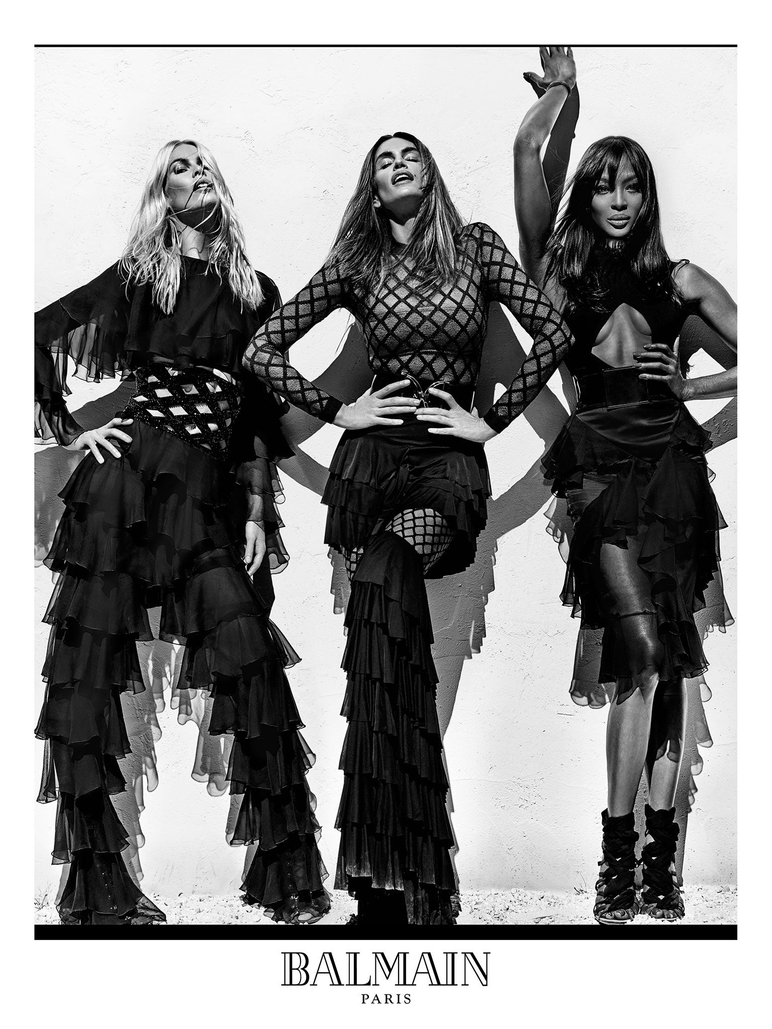
Remember when models were super? Olivier Rousteing does, just about. He is only 30, after all, but recruited the original trinity of Naomi Campbell, Cindy Crawford and Claudia Schiffer to front his spring Balmain campaign, shot by Steven Klein with a nod to Peter Lindbergh's editorials of the early 1990s.
Nostalgia has a powerful punch: this campaign perhaps elevates Balmain's collection, which on the catwalk looked flashy, occasionally even vulgar. There is also an aspirational impossibility to it all – the glossy imagery, the supermodels' super bodies, the heinously expensive, demandingly contoured clothes – that's still seductive.
Paco Rabanne
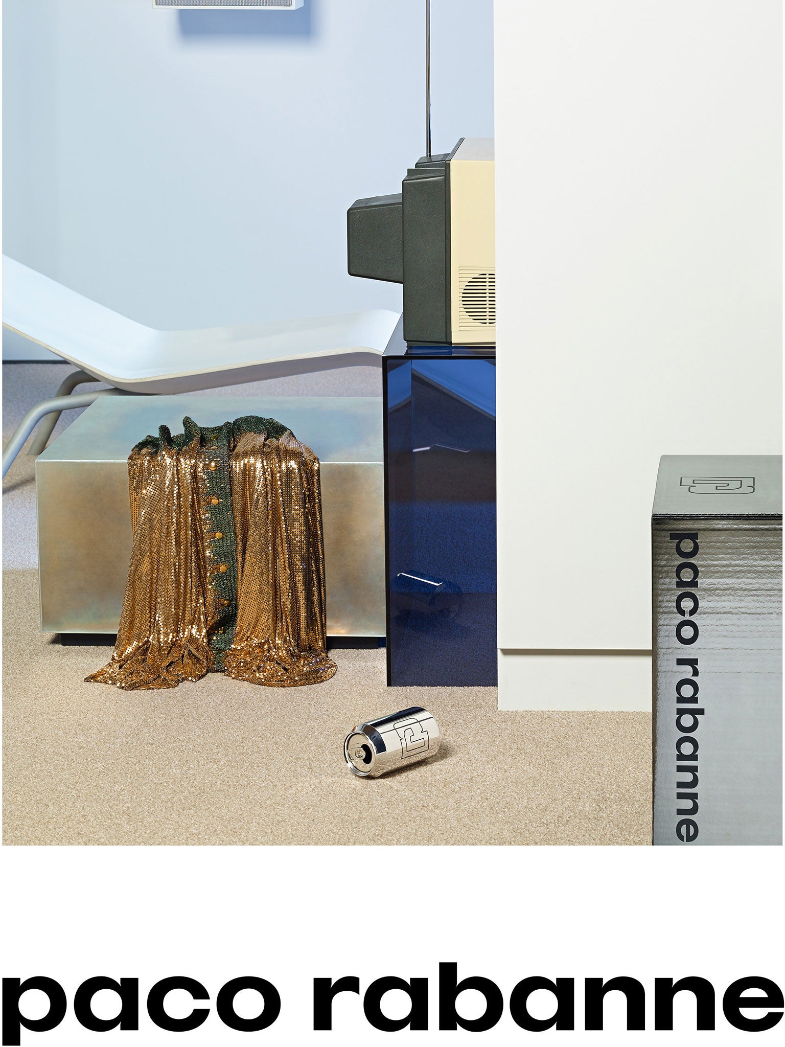
From supermodels, to no models. Paco Rabanne's first advertising campaign under its new(ish) creative director, Julien Dossena, is a brave, bold riposte to the It-girls and celebutantes of his contemporaries. Still-life photographers Scheltens & Abbenes captured discarded Rabanne clothing – here, a glimmer of the label's signature metallic mesh – in odd retro-futuristic environments. They're not the easiest campaigns to decipher – are they selling us the dress, or the interior? Nevertheless, how long has it been since a fashion campaign actually made you use your little grey cells to figure out what's going on? The remaining imagery is similarly obtuse. There's one where you barely see a sweater slung over a screen in the background. Pretentious. Artistic. Fantastic.
Courrèges
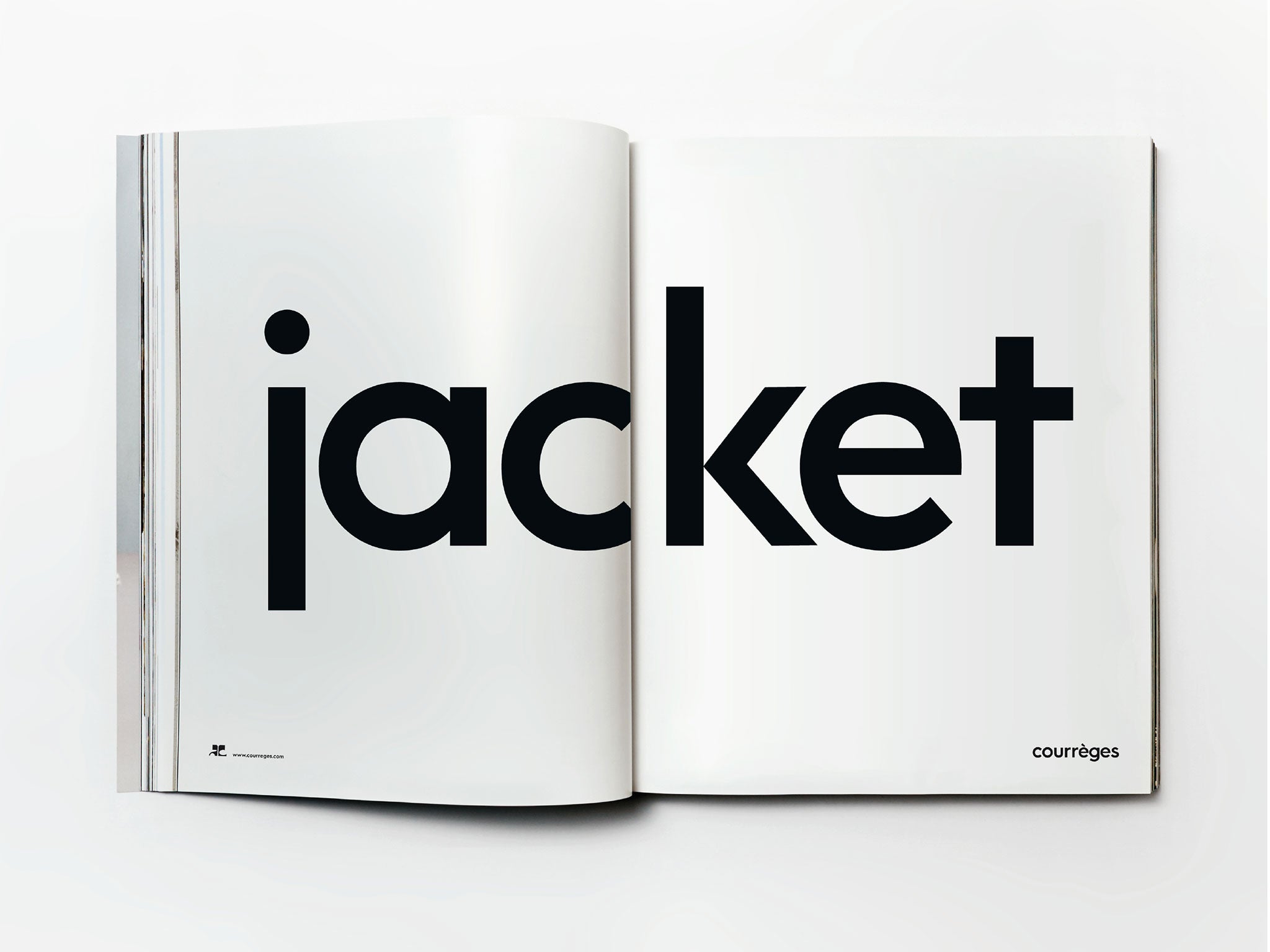
A picture, they say, is worth a thousand words. But how about just a single word – in this case "jacket"? There are two others, "dress" and "skirt", that make up the Courrèges advertising portfolio, reflecting how the debut collection by Sébastien Meyer and Arnaud Vaillant was presented. The first 17 looks, you see, were just jackets – a focus on the "components" of a wardrobe. Against the jostling imagery of other brands, the reductive simplicity of typography – in black on a terribly Courrèges shade of optic white – has an impact. Minimal input, maximum output. You can't help but feel the late Monsieur André Courrèges himself (who died only last month, aged 92) would have approved. Quietly, mind.
Join our commenting forum
Join thought-provoking conversations, follow other Independent readers and see their replies
Comments
Bookmark popover
Removed from bookmarks