Nothing Phone (2) review: A weird and wonderful mid-range Android
The flashy follow-up to Nothing’s debut phone gets a bigger display, faster chip and improved cameras
Your support helps us to tell the story
From reproductive rights to climate change to Big Tech, The Independent is on the ground when the story is developing. Whether it's investigating the financials of Elon Musk's pro-Trump PAC or producing our latest documentary, 'The A Word', which shines a light on the American women fighting for reproductive rights, we know how important it is to parse out the facts from the messaging.
At such a critical moment in US history, we need reporters on the ground. Your donation allows us to keep sending journalists to speak to both sides of the story.
The Independent is trusted by Americans across the entire political spectrum. And unlike many other quality news outlets, we choose not to lock Americans out of our reporting and analysis with paywalls. We believe quality journalism should be available to everyone, paid for by those who can afford it.
Your support makes all the difference.The Nothing Phone (2) launched in the UK on 17 July and, following a brief exclusivity at Nothing’s official store, the challenger tech brand’s second phone is now available SIM-free at Amazon and four major UK retailers.
Argos, and Carphone Warehouse are carrying the 256GB and 512GB versions of the Nothing Phone (2), which cost £629 and £699, respectively. Amazon also stocks both models of the Nothing Phone (2). You can also find a 20 per cent discount on the original Nothing Phone (1) (was £399, now £319.99, Amazon.co.uk). Currys and Very will be adding stock later today (21 July).
Right now there are no contract deals on the Nothing Phone (2), though O2 still carries the original Nothing Phone (1) on a 36-month plan for £31.20 per month and a £10 up-front fee.
So, where’s the cheapest place to buy the Nothing Phone (2)? You can still find the 128GB model exclusively at Nothing.tech for £579, which not only has a smaller capacity but reduced RAM. We reviewed the 256GB model, which you can find out more about below.
How we tested
We tested the Nothing Phone (2) in the weeks leading up to the phone’s launch. We paid close attention to its marquee features and custom Android software, testing the camera in a range of lighting conditions and putting the battery through its paces, using high-drain gaming apps.
Nothing Phone (2): From £629, Amazon.co.uk
- Rating: 8/10
- Dimensions: 161.1mm x 76.4mm x 8.6mm
- Weight: 201.2g
- Display: 6.7in OLED, 120Hz
- CPU: Snapdragon Gen 8+ Gen 1
- RAM: 8GB / 12GB
- Storage: 128GB / 256GB / 512GB
- Cameras: 50MP wide, 50MP ultra-wide, 32MP selfie
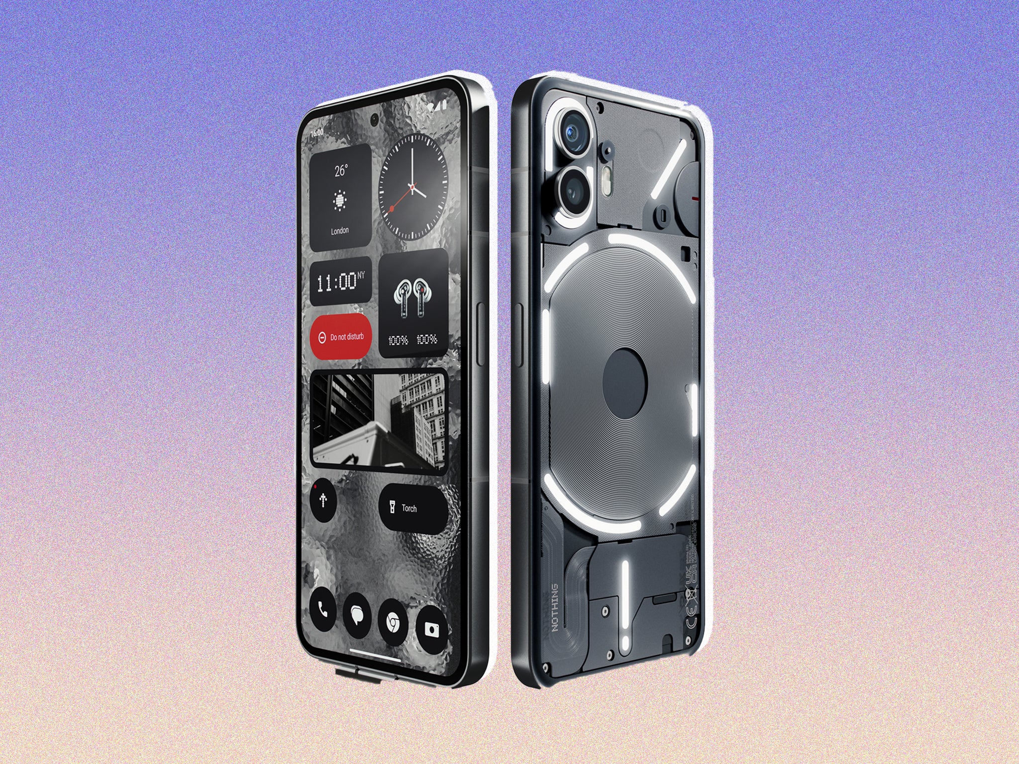
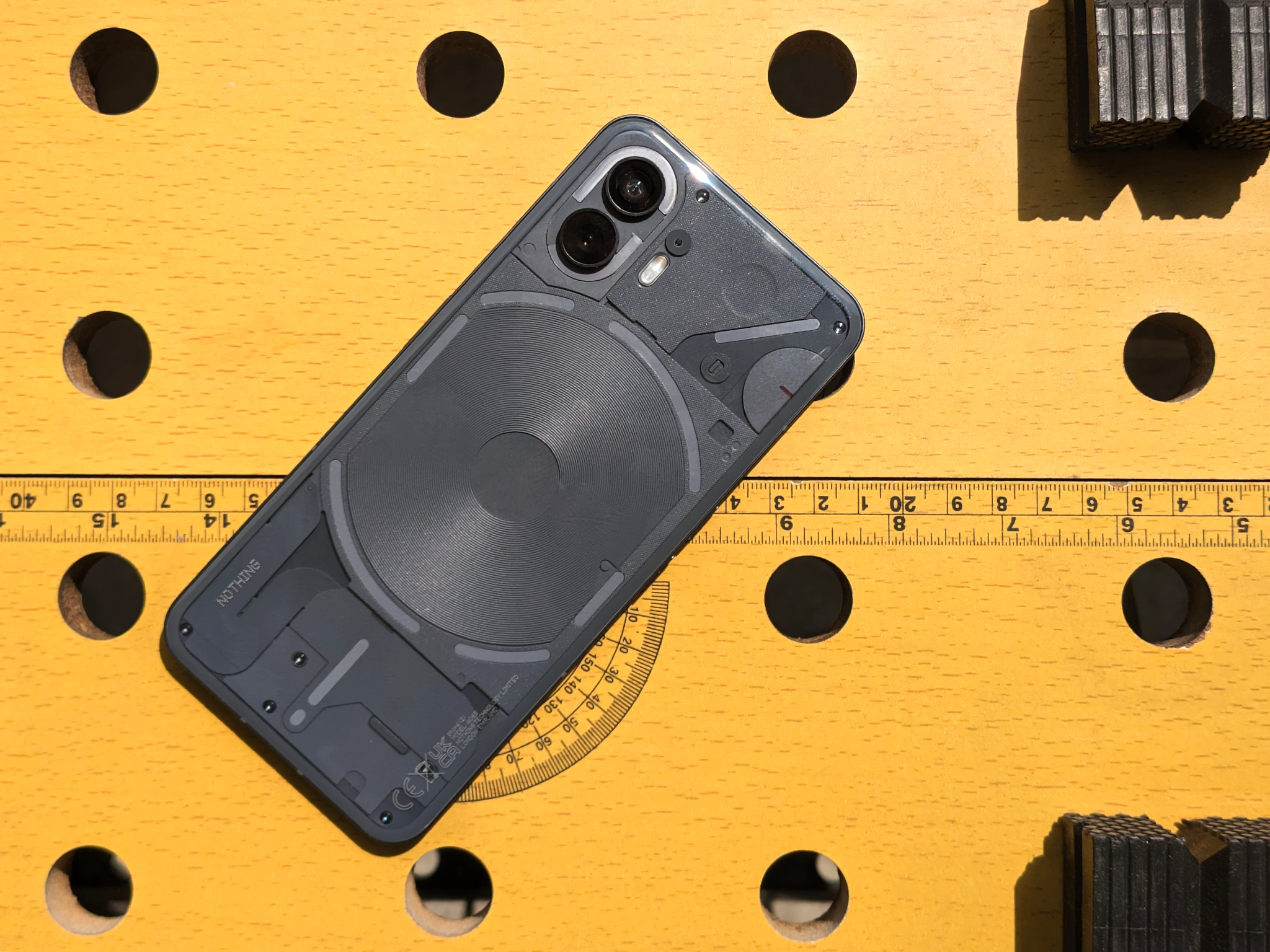
The original Nothing Phone (1) stood out from the competition with its striking transparent casing and trippy glyph interface, a series of LED striplights decorating the back of the phone, which flash and pulsate in response to incoming calls and notifications.
As well as that attention-grabbing aesthetic, the Nothing Phone (1) was also an excellent mid-range phone for the price, running on a heavily streamlined and minimalist version of Android, stripped of unnecessary apps and tuned for performance.
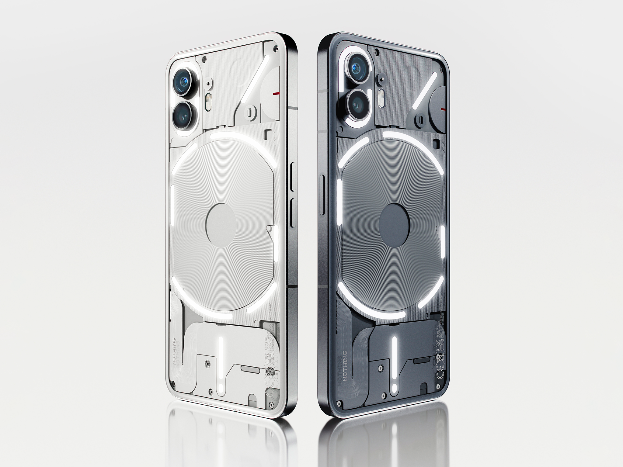
So, what’s new about the Nothing Phone (2)? On the face of things, it’s a familiar proposition. Those distinctive, flashing, pulsing lights are back again, though, this time, they’re more granular, with more controllable zones allowing for a lot more customisation around how they look and how they respond to certain notifications. They can also get much dimmer, which makes using the phone in the dark a bit less dazzling.
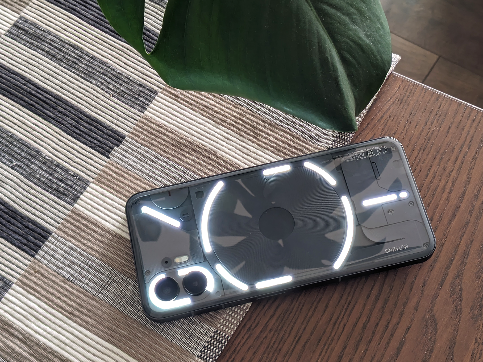
For example, one of the rear glyphs can now smoothly fill up or count down like a progress bar. This can be used as a timer while the phone is face down on a desk – useful for fans of the Pomodoro technique – or to show things such as the phone’s battery level or volume. Nothing is also planning to let apps such as Uber use the glyph interface to show you how long you’ve got until your ride arrives. A novelty for sure, but still fun.
Glyph lights can now be assigned to certain contacts, apps and notification types, so, with your phone face down, you’ll be able to tell at a glance if you’ve received a message from somebody important enough for you to stop what you’re doing, flip it over and pick it up.
There’s also a new glyph composer, reminiscent of old-school ringtone composers (we’re ancient, sorry), so you can build a custom pattern of lights and assign it to your dog sitter, for example. Swedish House Mafia provides a ringtone sound pack to play around with, just in case you were in any doubt about how achingly cool the Nothing Phone (2) is.
Coding all sorts of useful information to the glyph interface ties into one of Nothing’s stated goals of designing a distraction-free phone. Helping to achieve that, the newest version of Nothing OS can strip the colour out of your app icons to make the home screen less kaleidoscopic and attention-grabbing. Is it science? Who knows. It probably has something to do with dopamine, and it certainly looks nice.
Read more: Nothing Phone (1) review
The Pixel phones tried something very similar with the Material You interface, which matches all of your app icon colours to your wallpaper and theme, but this relies on app developers to provide the required art assets. It took just one unsupported, garishly coloured app to spoil your homescreen, but Nothing has somehow managed to enforce the monochrome style across the board. The effect is striking – swiping over to the technicolour spectacle of the Google News feed feels like stepping back into Oz.
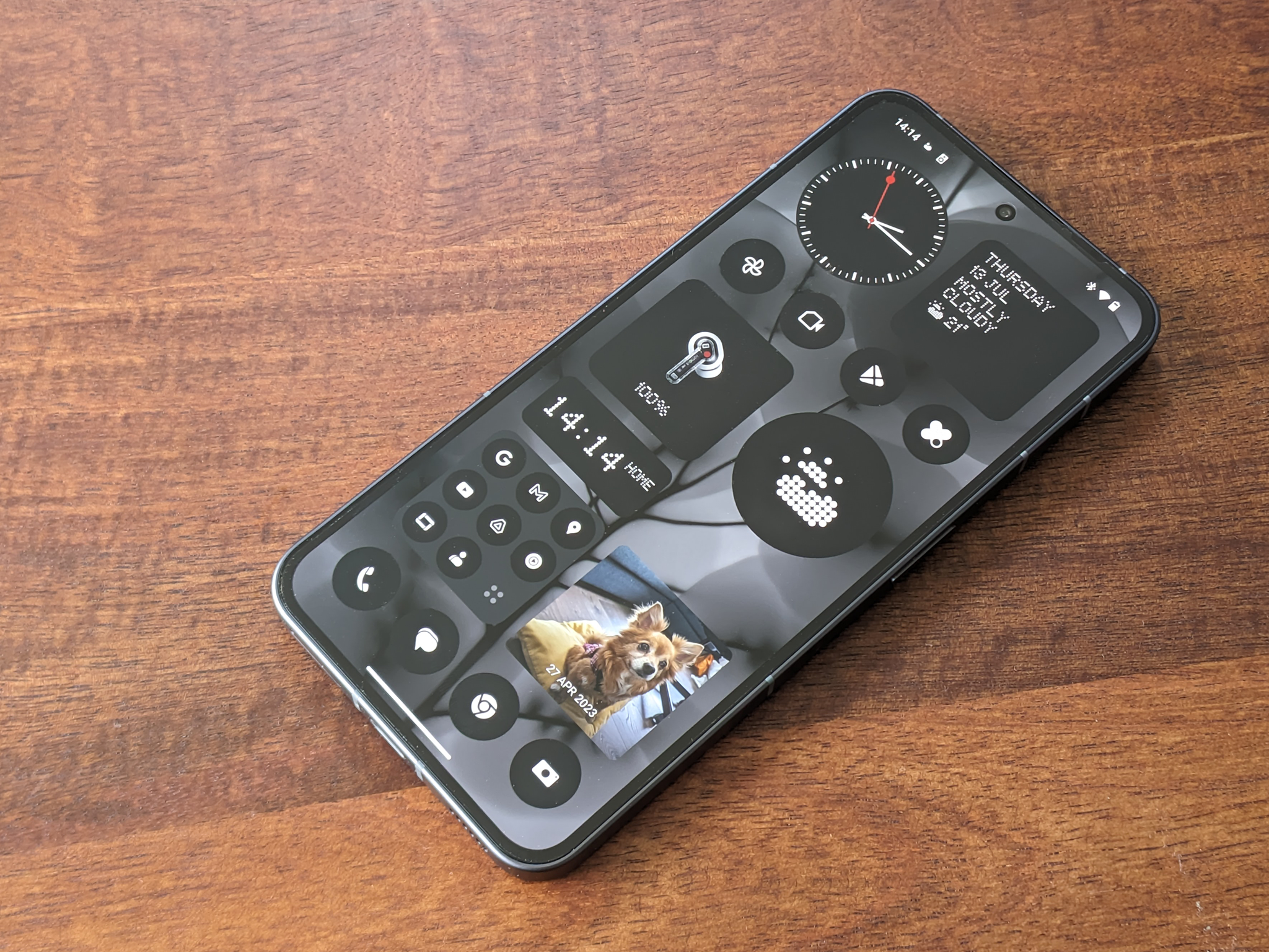
The new home screen is wildly customisable too. Nothing OS features a set of beautifully designed and minimalist widgets, which squeeze enough information into each tile to help you get just what you need from the homescreen quickly, and without getting sidetracked by your social media feeds. Some widgets can be swiped to see more information at a glance. Swipe up on the weather widget to see the current temperature. Swipe up on the Nothing X widget and you can activate noise cancellation on your earbuds.
You can organise apps into circular folders, change up their size and shape, give them an illustrated cover, or completely hide your work-related apps when you’re off the clock. Finer controls allow you to have two versions of the same app installed at the same time, enabling you to stay logged in with entirely separate accounts and, crucially, without notifications from both spilling into your feed. If your Instagram app is working double shifts with professional and personal accounts, you can effectively insulate them from one another.
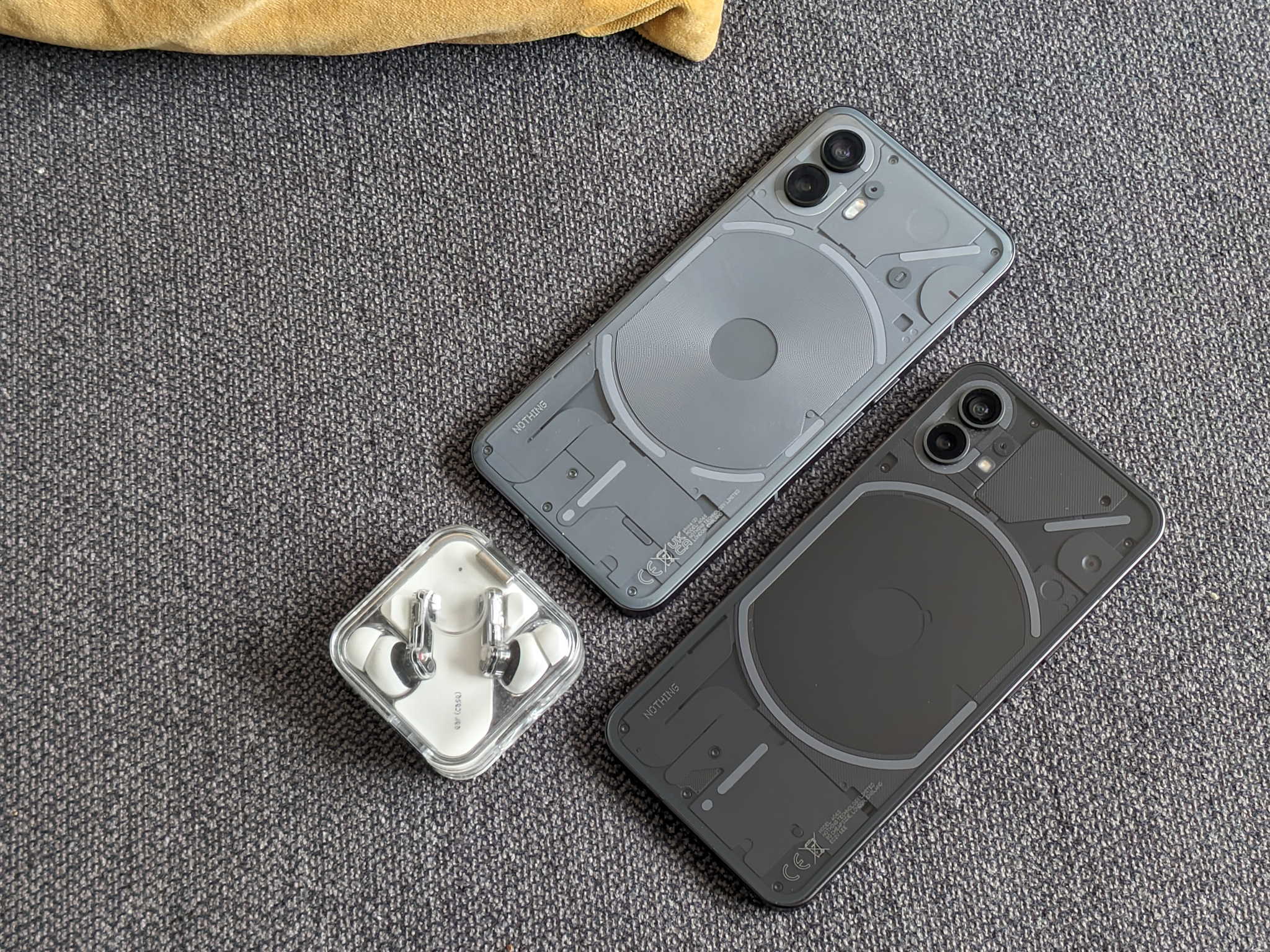
The hardware itself has been upgraded across the board. The Nothing Phone (2) runs on the Snapdragon 8 Plus Gen 1 chipset, which isn’t the newest or fastest processor available, but offers a claimed 80 per cent performance boost over the previous phone. The Nothing Phone (2) feels zippy in any case, which is helped by the display’s 120Hz adaptive refresh rate. The 6.7in screen is much brighter too, with a rated peak brightness of 1,600 nits – there’s a noticeable improvement when using the phone outdoors on a sunny day.
Camera
The biggest camera improvements have been made to the front camera, which now has a 32MP sensor rather than the 16MP sensor found on the Nothing Phone (1). The rear camera keeps the same 50MP main and ultrawide lenses, but an upgrade to the image signal processor and more HDR layering gives a boost to the phone’s photography capabilities. The rear camera can now record video in 4K and at 60fps, and a new Action Mode uses optical and electronic image stabilisation to produce impressively judder-free video.
Read more: Google Pixel 7 review
We’re impressed by the quality of the pictures this £579 phone can spit out using just two lenses. The image processing catches fine details well and doesn’t blow out shadows with too much HDR, giving shots a naturalistic tone and even exposure. Colour processing is on the more saturated side for our taste, but not to a fault.
A couple of things hold the camera back from flagship status: moving objects in a still image look nice and sharp, but they can get a blurry aura against certain backdrops – an artefact of the processing algorithm adding detail back into the picture. Portrait mode struggles with fine hair, owing to the lack of a depth sensor. Overall, these are perfectly fine cameras for a mid-range phone.
Battery life
There’s a bigger battery in the Nothing Phone (2), and battery life wasn’t a concern during testing, happily fueling an entire day of relatively intense use. The phone charges to full in less than an hour, supports wireless charging at 15W and retains the reverse charging feature. Pop your wireless earbuds on the back of the phone and you can recharge them on the go, and you better believe the glyph interface flashes enthusiastically when you do.
Nothing makes a bunch of sustainability claims about the phone, which uses recycled materials for many of the components, has an 8.6 per cent smaller carbon footprint than the Nothing Phone (1) and comes in plastic-free packaging. The phone will receive three years of Android updates and four years of security updates.
The verdict: Nothing Phone (2)
Nothing has made all the right decisions with the follow-up to its debut smartphone, focusing on an improved display, cameras and performance without compromising on the oddness that makes it so distinctive. The showy glyph interface is back and, while as much of a gimmick as it’s always been, when combined with the improvements to Nothing OS, it feels like a cohesive part of a very thoughtfully designed phone.
The Nothing Phone (2) is defiantly, adorably weird. The steep price increase means you can find similarly priced phones with faster specs and better cameras, but not one so remarkably different to everything else out there. Grab one if you’re bored of the same shiny black rectangles, or just in the market for an excellent, stylish and capable mid-range Android.
Buy now £629, Amazon.co.uk
Voucher codes
For the latest offers on smartphones and other tech buys, try the links below:
Looking for more smartphone options? Check out our Apple iPhone 14 review