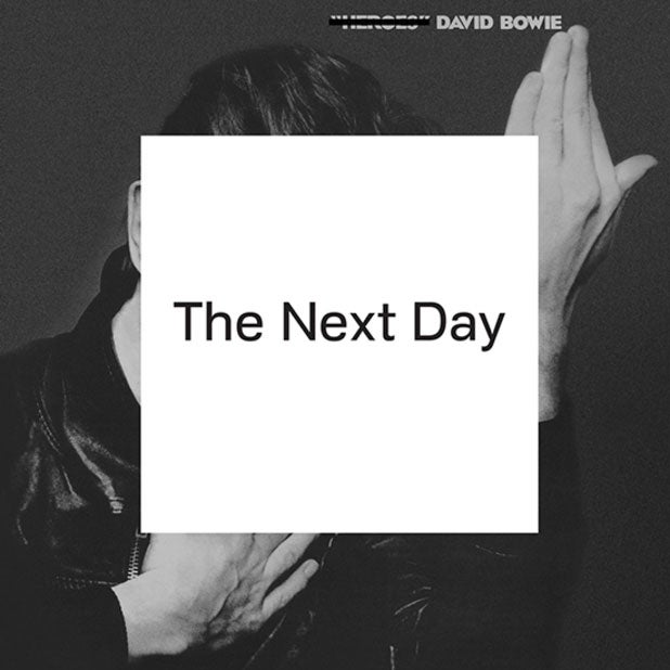
The cover art for David Bowie's The Next Day uses a font of wisdom
Alice Jones' Arts Diary

The music and videos have had the thumbs-up, but what of the cover? David Bowie’s new album The Next Day reuses the artwork from 1977’s Heroes, crossing out the title and obscuring the singer’s face with a white square featuring the new title in a specially designed font.
That font is Doctrine and is the work of Jonathan Barnbrook, who previously created the cover for Bowie’s 2002 album Heathen. He deliberately chose Heroes for shock value. “If you are going to subvert an album by David Bowie there are many to choose from but this is one of his most revered, it had to be an image that would really jar if it were subverted in some way”, he writes on his blog.
He and Bowie were inspired by Macbeth’s “Tomorrow, and tomorrow and tomorrow” speech, Waiting for Godot and the way that “no matter how much we try, we cannot break free from the past”, he says. “When you are creative… it always looms large and people will judge you always in relation to your history, no matter how much you try to escape it.”
As for the criticisms that the cover could be a case of the Emperor’s new clothes? “Yes... we know it is only an album cover with a white square on it but often the most simple ideas can be the most radical. We understand that many would have preferred a nice new picture of Bowie but we believed that would be far less interesting”.
Also in the Arts Diary
Let the Right One Into the Dundee Rep theatre
Stolen Ai Weiwei seeds sprout new exhibition; Run For Your Wife hobbles along
Join our commenting forum
Join thought-provoking conversations, follow other Independent readers and see their replies
Comments
Bookmark popover
Removed from bookmarks