Star Wars: The Force Awakens changed opening crawl's font, angering fans across the galaxy
'The font used for the episode title is wrong. Really wrong'
Think you love Star Wars? Think again. Sure, you may be interested in fan theories surrounding Rey’s parents, but you probably didn’t get frustrated that the opening crawl’s font in The Force Awakens was different to the one used in the other films.
In a very thorough essay on Medium, Fix the Crawl points out “the font used for the episode title, The Force Awakens, is wrong. Really wrong.”
The writer argues how George Lucas made a conscious effort throughout his films to make sure the iconic opening crawl looked the same each time.
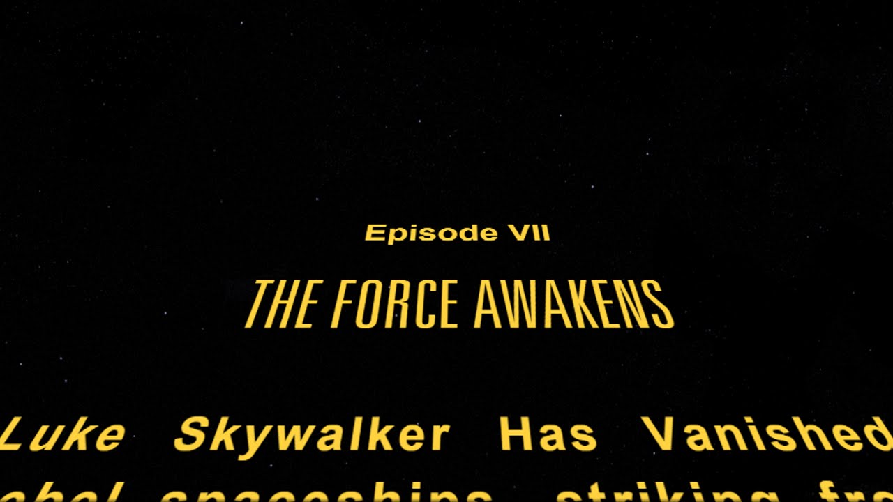
“Every main saga episode of Star Wars has contained the Episode number, typeset in the News Gothic family, and the title of the film itself, typeset in the Univers family.”
However, he describes how “Disney got it wrong”, with the episodes title being written in News Gothic, not Univers.
“News Gothic (also used for the body text) is very round, friendly, and readable, whereas Univers gives the title of the film some stately heft — telegraphing the impression that the events about to transpire are carved in the stone of destiny (or something).
“It’s subtle but noticeable. The ‘S’ and ‘R’ glyphs, in particular, are very different. Overall, it’s boxier, and feels more staid. Less urgent.”
The original Star Wars crawl creator, Dan Perri, always weighed into the situation. In a podcast for Electric Shadow, he revealed he had yet to see the new film, but when told about the new font he said: “Oh, Oh my God, thats way off. I know the New Gothic lines well and I can tell you I used it on Raging Bull because it was from the era, from the ’40s and ’50s. No, I would not have used New Gothic on Star Wars.”
Ironically, all the promotional material for The Force Awakens got the font right, including the Star Wars Crawl Creator. Why the font was changed has therefore perplexed many fans, with LucasFilm story group’s creative executive giving us the closest thing we have to an official explantation via Twitter.
Word finally got to Episode VIII’s director Rian Johnson who, unsurprisingly, did not reveal whether his film would feature the old or new font.
Whether Rogue One will even feature a crawl is anyone’s guess. Let’s just hope they don’t do too much to anger the avid fanbase. Of course, there are some people who just aren't taking this seriously enough.
In other Star Wars news, Tom hardy is said to have a cameo role in the upcoming Episode VIII.
Join our commenting forum
Join thought-provoking conversations, follow other Independent readers and see their replies
Comments
Bookmark popover
Removed from bookmarks