Pulp! The Classics: The classical canon gets pulped
Your support helps us to tell the story
From reproductive rights to climate change to Big Tech, The Independent is on the ground when the story is developing. Whether it's investigating the financials of Elon Musk's pro-Trump PAC or producing our latest documentary, 'The A Word', which shines a light on the American women fighting for reproductive rights, we know how important it is to parse out the facts from the messaging.
At such a critical moment in US history, we need reporters on the ground. Your donation allows us to keep sending journalists to speak to both sides of the story.
The Independent is trusted by Americans across the entire political spectrum. And unlike many other quality news outlets, we choose not to lock Americans out of our reporting and analysis with paywalls. We believe quality journalism should be available to everyone, paid for by those who can afford it.
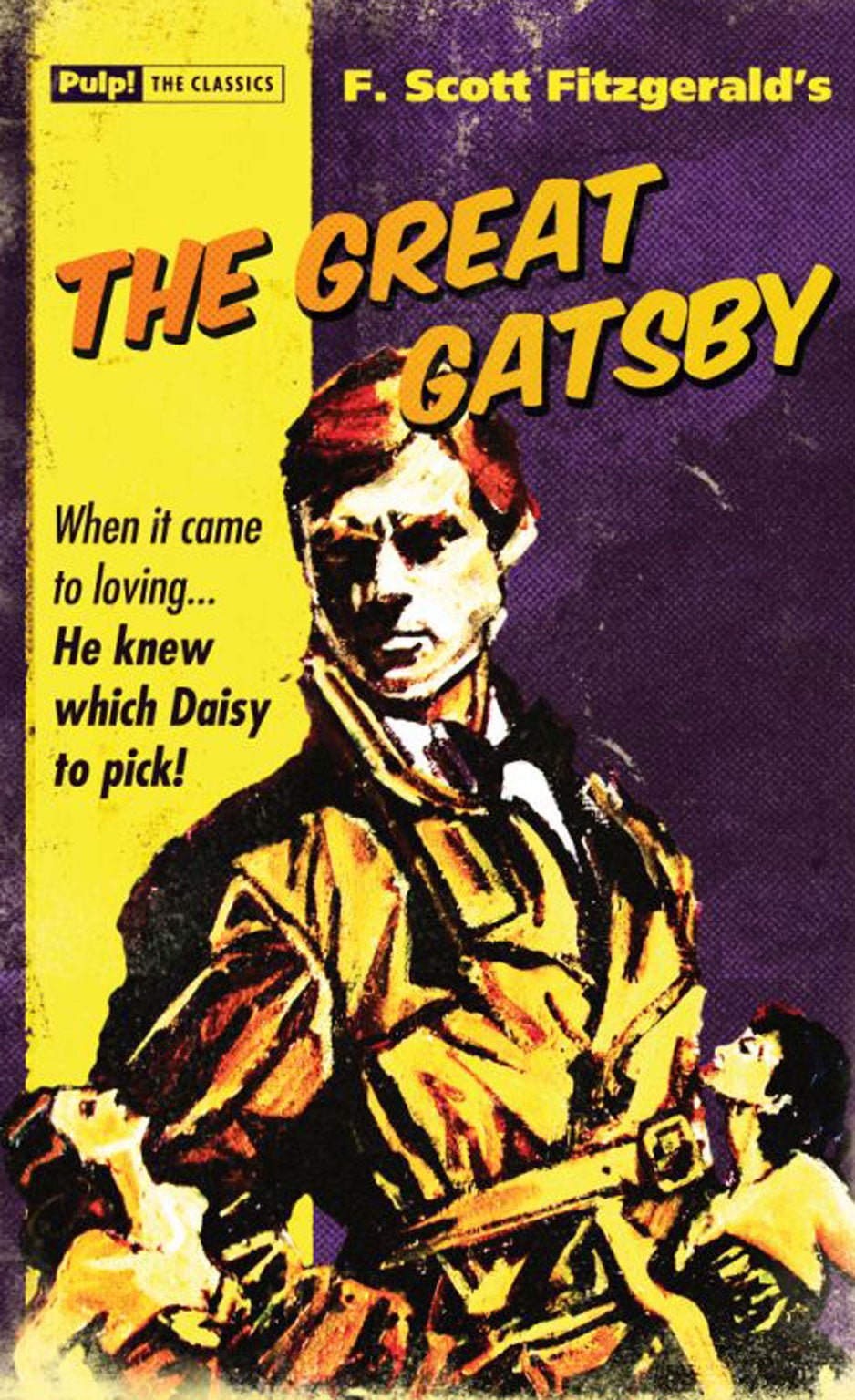
Your support makes all the difference.Is this how to sell Robinson Crusoe and Bleak House to a new generation? To package them like pulp fiction (complete with cheap-looking yellow-sprayed colour edges), give them a raunchy cover and précis the contents with a trashy tagline? Oldcastle Books thinks so. Its “Pulp! The Classics” imprint has already brought out retro versions of Pride and Prejudice (“Lock Up Your Daughters – Darcy’s In Town!”), Robinson Crusoe (“Solitude Was Driving Him Nuts!”) and The Hound of the Baskervilles (“Murder… Mystery… Walkies!”) with cover art by David Mann, and inevitably it has turned its sights on The Great Gatsby, to coincide with the movie’s release on 15 May.
On the new cover, featuring the titular hero in a trenchcoat, flanked by a brace of dames in strapless décolletage, F Scott Fitzgerald’s slender masterpiece gets the shoutline, “When it came to loving… He knew which Daisy to pick!” Purists may claim this is a reductive encapsulation of Gatsby’s hopeless longing for Daisy Buchanan and his lifelong campaign to make himself worthy of her, but it has, you must admit, a breezy appeal. It’s a long way from Germano Facetti’s 1973 Penguin Modern Classic cover design, that used a satirical detail from Montparno’s Blues by Kees Van Dongen; but it’s way better than having a movie still of Leo DiCaprio’s bland little face on the front of the book.
Not that Oldcastle Books is averse to incorporating movie-star faces. The cover of its Wuthering Heights gives us a Bogart as Heathcliff (complete with cigarette dangling from his lips), Tess of the D’Urbervilles (“She’s No Angel!”) pictures Tess as a barmaid-ish Monroe, and The Picture of Dorian Gray offers us the picture of what seems to be Ryan Gosling in a wing collar…
Join our commenting forum
Join thought-provoking conversations, follow other Independent readers and see their replies
Comments