20 Years of Penguin Essentials: How artists reimagined the book covers
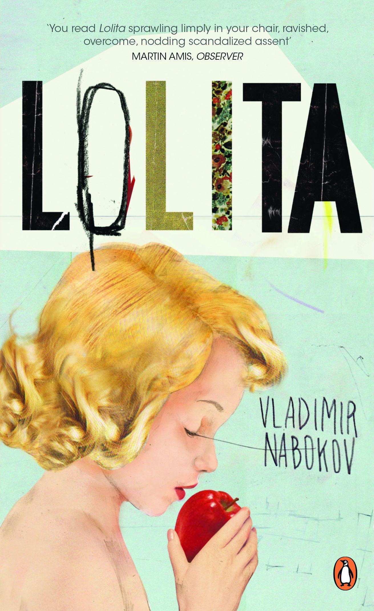
A behind-the-scenes look at how classic titles such as 'Lolita', 'A Clockwork Orange' and 'What a Carve Up!' were given a modern makeover by designers from the worlds of music, fashion and street art (including Banksy)

Your support helps us to tell the story
From reproductive rights to climate change to Big Tech, The Independent is on the ground when the story is developing. Whether it's investigating the financials of Elon Musk's pro-Trump PAC or producing our latest documentary, 'The A Word', which shines a light on the American women fighting for reproductive rights, we know how important it is to parse out the facts from the messaging.
At such a critical moment in US history, we need reporters on the ground. Your donation allows us to keep sending journalists to speak to both sides of the story.
The Independent is trusted by Americans across the entire political spectrum. And unlike many other quality news outlets, we choose not to lock Americans out of our reporting and analysis with paywalls. We believe quality journalism should be available to everyone, paid for by those who can afford it.
Your support makes all the difference.When I started at Penguin 20 years ago, as part of an entirely new team, there was a real sense that change was needed and that we had been brought in to achieve it. One of our challenges was to reinvigorate the likes of Anthony Burgess, George Orwell, James Joyce and Evelyn Waugh and appeal to a new generation by showcasing this amazing Penguin backlist in a more relevant way. The collection of re-branded classics would be called Penguin Essentials: we aimed to persuade new readers to discover these books as well as re-ignite existing readers’ love for them.
The brief from my managing director at the time was to ignore everything that had been done before and completely reinvent the covers. This was an exhilarating challenge. I was new at Penguin, full of ideas and felt like I needed to prove myself. I thought of it as a rebirth, a shake-up of a great brand with a long and respected design history.

It was also really exciting trying to capture the attention of young people who wouldn’t necessarily pick up The Dubliners or A Room with a View, redesigning the covers to convey that the stories had contemporary relevance. I started thinking about what was turning young people on, and looked everywhere for inspiration: skateboard shops, record covers, street art and fashion.
As I was personally very inspired by music I turned to designers in the music industry, people who could produce a fresh and interesting cover. The first commission I made was Intro, an agency that was doing cool design work for Manchester-based record label, Blood and Fire, creating jackets for bands such as Primal Scream. When I called them up and asked if they’d like to do a book cover they replied that they’d never done one before. I said it didn’t matter, that was the whole idea, and told them to choose whichever book they wanted from the list I gave them. My only instructions were: “Do what you want. Treat it like it’s a record.”

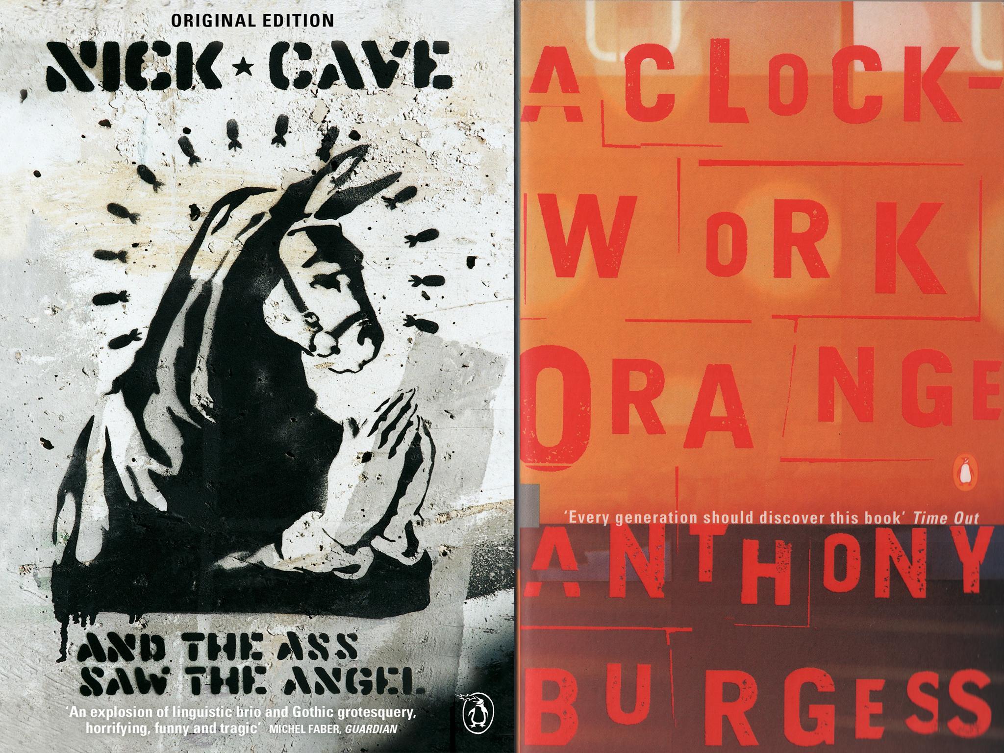
I then approached design collective Tomato and told them that Intro was doing a cover. Before I knew it, lots of people wanted to design an Essentials cover for me. I think these creatives were drawn in by the Penguin brand and that the titles up for grabs were fantastic; people were queueing up to do a George Orwell or a Jack Kerouac cover. Plus, they were all excited about having creative freedom with no boundaries. We were initially meant to publish ten but, because of the buzz, we extended it to 20 titles in the first year.
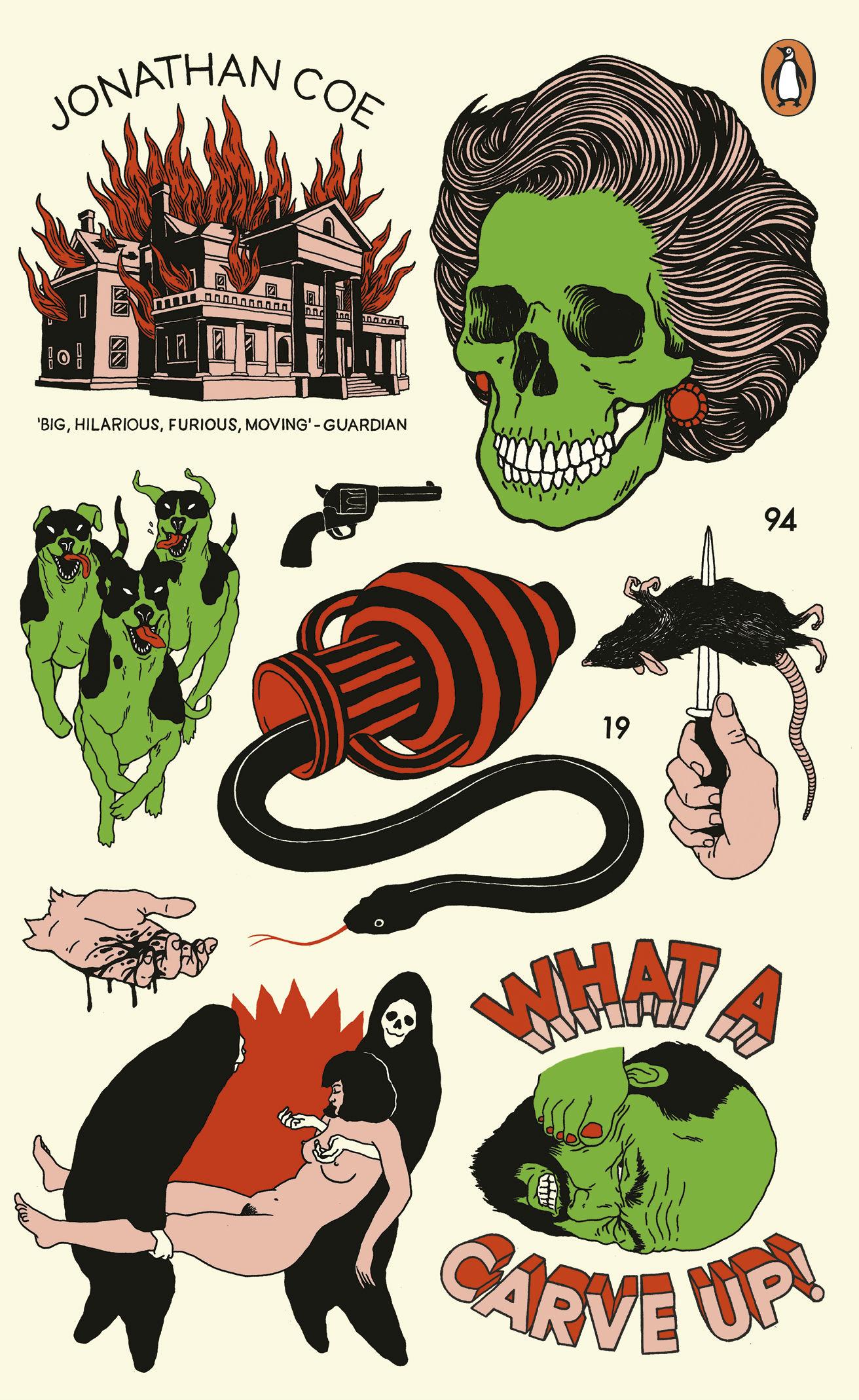
Our commissions became increasingly unexpected and brave and we started contacting up-and-coming creatives from further afield. For example, we found two Israeli skateboarders online, now known as UNGA (Broken Fingaz), and asked if they wanted to redesign the cover of Jonathan Coe’s What a Carve Up!. We had to get a synopsis translated and sent over to Israel as they couldn’t get the book in Hebrew.
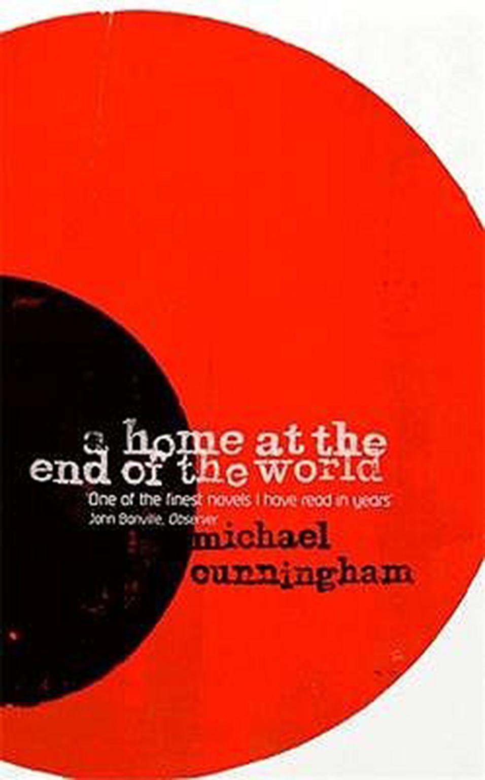
One of my highlights is Hatch Show Print’s design of A Home at the End of the World by Michael Cunningham. They are Nashville-based printers who designed Elvis Presley’s show posters in 1956 and many well-known country-western adverts. I am also thrilled that we were able to get Banksy involved, who reimagined the cover of Nick Cave’s And the Ass Saw the Angel. I approached him through a friend of a friend in a bar, and never expected he’d do a cover for us.

The Ditchling Museum of Art + Craft is steeped in design history and, as it’s not far from my home, I often visit for inspiration. When they mentioned their plans for an Elizabeth Friedlander exhibition, a designer who designed book covers for Penguin in the 1950s and 1960s, I suggested I could pull together something contemporary to tie in with the show. Friedlander’s daring approach to book design and her free spirit in going against convention reflect the energy and ingenuity of all the artists who have collaborated with us on the Essentials since 1998.

The 20 Years of Penguin Essentials exhibition is significant as the covers have never been recognised as a body of work before and it is moving to see the work of so many talented individuals displayed together. Working on the Penguin Essentials was a real career high and I am very proud that the series remains as energised and exciting as when it was first launched 20 years ago. The philosophy of the series still remains the same today: we want to continue to redesign the classics to capture the imagination of all kinds of people whilst showcasing creatives from around the world.

The diversity of the artists we’ve commissioned is quite incredible, and when we put together the exhibition and looked at the covers as a whole for the first time, it’s clear that they are standing the test of time. Designers look back all the time for inspiration – I’d like to think that in another 20 years, design students will look back at the Penguin Essentials and draw inspiration from this body of work.
John Hamilton is Art Director at Penguin Random House UK and the founder of the Penguin Essentials series. The '20 Years of Penguin Essentials' and 'Elizabeth Friedlander' exhibtions are on display at Ditchling Museum of Art + Craft, East Sussex, until 29 April (ditchlingmuseumartcraft.org.uk)
Join our commenting forum
Join thought-provoking conversations, follow other Independent readers and see their replies
Comments