Comic Sans for Cancer exhibition: It’s the font that’s openly ridiculed for its jaunty style, but figures of fun have their fans
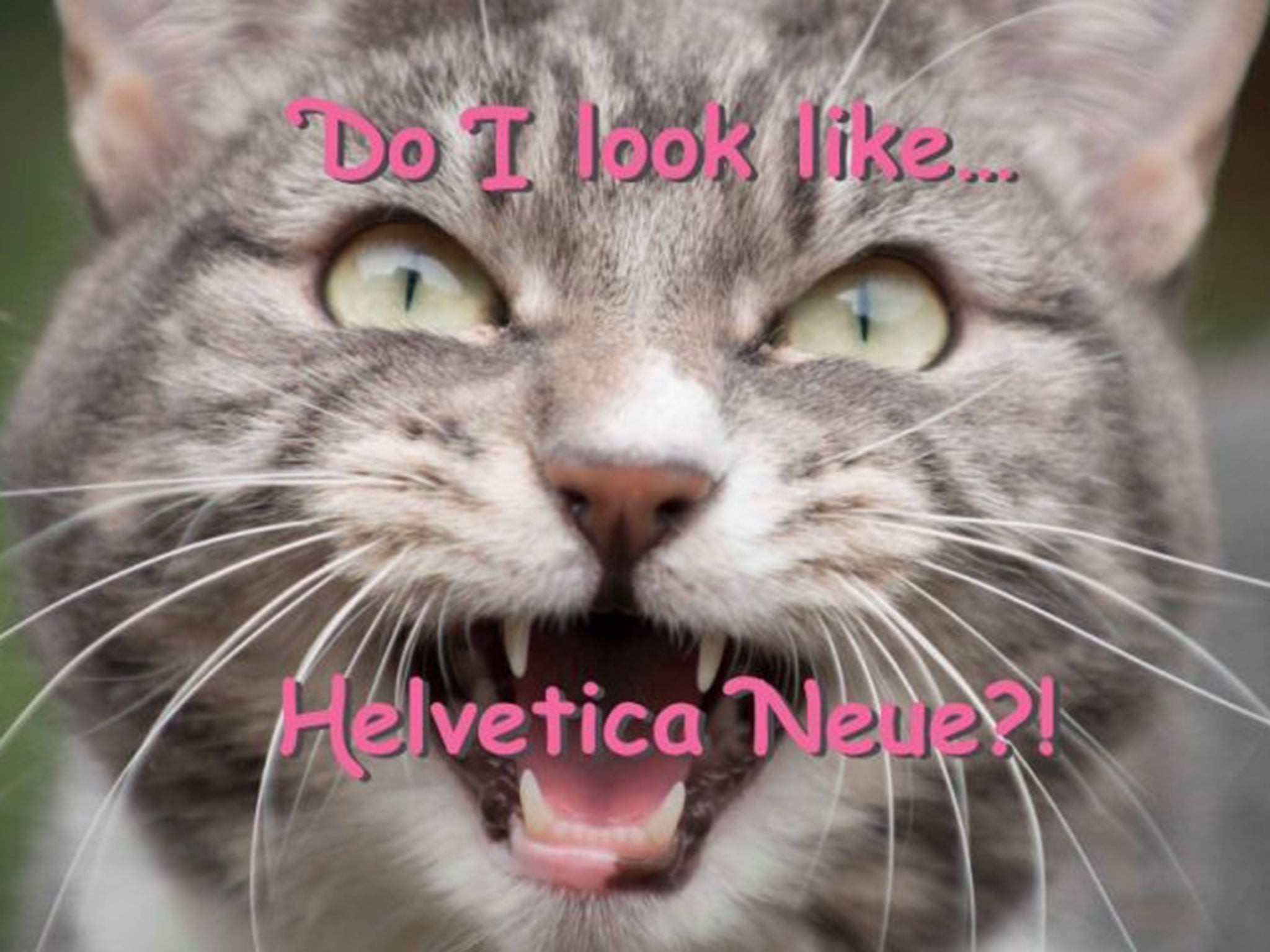
Comic effect: Poster for the exhibition from the font’s designer, Vincent Connare

Your support helps us to tell the story
From reproductive rights to climate change to Big Tech, The Independent is on the ground when the story is developing. Whether it's investigating the financials of Elon Musk's pro-Trump PAC or producing our latest documentary, 'The A Word', which shines a light on the American women fighting for reproductive rights, we know how important it is to parse out the facts from the messaging.
At such a critical moment in US history, we need reporters on the ground. Your donation allows us to keep sending journalists to speak to both sides of the story.
The Independent is trusted by Americans across the entire political spectrum. And unlike many other quality news outlets, we choose not to lock Americans out of our reporting and analysis with paywalls. We believe quality journalism should be available to everyone, paid for by those who can afford it.
Your support makes all the difference.Vincent Connare has only used Comic Sans once in the 20 years since he designed it to be the voice of a cartoon dog.
“I was trying to switch my broadband to Sky a couple of years ago and they failed to send me a modem so I had no internet for a month,” he says. “I wrote a letter and thought it was appropriate to take the piss and say, I’m so angry at you I don’t really care about manners and I’m going to use this typeface.”
The jolly creation has been used incongruously – sarcastically or otherwise – for as long as it has existed. Primary schools, village halls and aunties love it for its engaging, informal style, but it is also a subject of ridicule. Dave Gibbons, the renowned comic book creator, whose work inspired Connare, once called it “a real mess”, adding: “I think it’s a particularly ugly letter form.” There is even a campaign to ban it.
Better-humoured designers celebrate the font for its clear identity and popular success. Tonight, an exhibition of posters by top designers opens in London to mark 20 years of Comic Sans. Chris Flack, a designer from New Zealand based in Britain, curated the exhibition to raise money for Cancer Research when he noticed there were no plans to mark the anniversary.
Connare himself has supplied a poster – a photo of his cat with a caption, written in a Comic Sans variant: “Do I look like Helvetica Neue?!” Helvetica is the antithesis of Comic Sans: neutral, elegant and loved by design buffs – but not fun. “I used it to sarcastically say, I’m a cat and I don’t talk in Helvetica,” Connare explains.
The gag recalls the typeface’s original function. In 1993, Bill Gates hired Connare as a “typographic engineer”, partly to jazz up Microsoft’s drop-down menu before the launch of Windows 95. To help lead users into the unfamiliar world of home computing, the system came with “Microsoft Bob”. Bob’s dog, Rover, popped up with tips in speech bubbles, but he was due to speak in Times New Roman.
“I said it would be better in the style of comics or cartoons in newspapers, so they asked me to do something,” says Connare, who is from Boston but has lived in Britain since 1999. Now 53, he works for a font design studio in Brixton, south London. “I drew up Comic Sans in about three days. I thought it would go into a pile and get forgotten about.”
Consumers had other ideas, while businesses applied the typeface to signage and to bring a sense of cringey fun to corporate literature. But it was never cool and the backlash came quickly. In 1999, two American designers launched the Ban Comic Sans campaign. Gibbons, whose work with Alan Moore in the Watchmen comics had inspired Connare, took aim in 2009.
Connare, who is also responsible for the Ministry of Sound logo and a new, award-winning font for Nokia, says he has never been bothered by the criticism, putting it down to design snobbery. He is amused to learn about an unlikely preference for Comic Sans in the House of Lords. Earlier this month, Lord Steel, the Lib Dem peer, filed an opinion piece to this newspaper about the ongoing crisis in Israel. An attached Microsoft Word document called “Time to talk to Hamas” opened to reveal 900 words about a subject that could hardly be more serious. He had written it Comic Sans.
Lord Steel replies with bemusement to a polite inquiry about his use of the typeface. “It is my preferred font – just because I like it, but know nothing about it, sorry!” But does he think its comic-ness changes the reader’s perception of what is written? “I have used it since I became computer literate – late – in 2003,” he replies, again in Comic Sans. “The comic title did not bother me, I just liked it and no one has ever commented.”
“That’s what everybody says – they just like it,” Connare says. “They don’t know why but they’re not designers but regular people. It’s like when people talk about modern art. I went to the Rothko exhibition recently and a man looked at his black painting and said, ‘I could have done that’. Yes, but you didn’t!”
comicsanscancer.com
Join our commenting forum
Join thought-provoking conversations, follow other Independent readers and see their replies
Comments