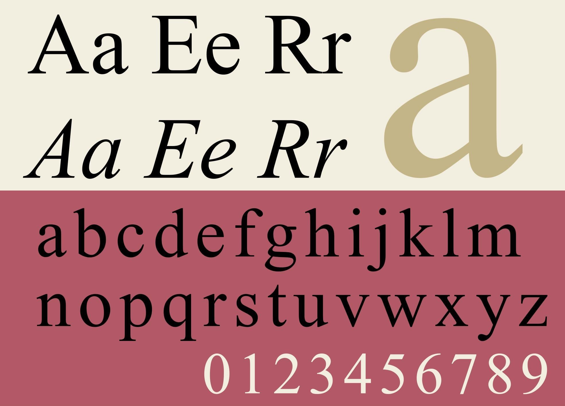
Times New Roman is the most trustworthy font, study finds
The serif typeface dates back to 1931

Your support helps us to tell the story
From reproductive rights to climate change to Big Tech, The Independent is on the ground when the story is developing. Whether it's investigating the financials of Elon Musk's pro-Trump PAC or producing our latest documentary, 'The A Word', which shines a light on the American women fighting for reproductive rights, we know how important it is to parse out the facts from the messaging.
At such a critical moment in US history, we need reporters on the ground. Your donation allows us to keep sending journalists to speak to both sides of the story.
The Independent is trusted by Americans across the entire political spectrum. And unlike many other quality news outlets, we choose not to lock Americans out of our reporting and analysis with paywalls. We believe quality journalism should be available to everyone, paid for by those who can afford it.
Your support makes all the difference.Times New Roman, the world’s go-to font for official looking documents, has been found to be the most trusted typeface among the UK public.
Printing company Solopress surveyed 1,000 people, and remarkably Comic Sans came in second, despite being renowned as the village idiot of fonts.
Perhaps it is Comic Sans’ humbleness and conviviality that makes it trustworthy, while Times New Roman’s is likely down to its use in academic journals.
Times New Roman was created by advertising designer Victor Lardent in collaboration with Monotype in 1931, commissioned by The Times newspaper (which no longer uses it).


The study also found that the ubiquitous Arial was the most recognisable typeface - 33% of participants managing to identify it - despite it being boring as hell.
Only 5% could recognise the Johnston font, though this jumped to 23% in London as it is used on the London Underground.
There were interesting data differences with regard to the age of respondents too.
The over 55s best recognised the BBC font, 35 - 44 year olds the Google typeface and 18 - 24 year old’s picked up on Facebook’s use of Helvetica.
Fonts can prove surprisingly controversial amongst design aficionados, as was the case with The Met museum’s recent logo change.
Join our commenting forum
Join thought-provoking conversations, follow other Independent readers and see their replies
Comments