Your support helps us to tell the story
From reproductive rights to climate change to Big Tech, The Independent is on the ground when the story is developing. Whether it's investigating the financials of Elon Musk's pro-Trump PAC or producing our latest documentary, 'The A Word', which shines a light on the American women fighting for reproductive rights, we know how important it is to parse out the facts from the messaging.
At such a critical moment in US history, we need reporters on the ground. Your donation allows us to keep sending journalists to speak to both sides of the story.
The Independent is trusted by Americans across the entire political spectrum. And unlike many other quality news outlets, we choose not to lock Americans out of our reporting and analysis with paywalls. We believe quality journalism should be available to everyone, paid for by those who can afford it.
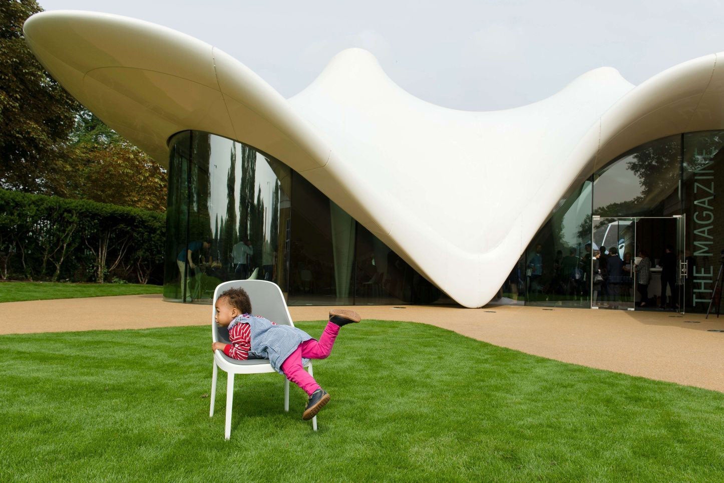
Your support makes all the difference.What is it? Zaha Hadid’s renovation and extension of an 1805 gunpowder store, turning it into a new Serpentine gallery in London’s Hyde Park. The project cost £14.5 million.
The Independent says: “The headline feature of Hadid’s renovation and extension of the 215-year-old building is the languid lily-white roof of the new gallery’s café and social space. The canopy ripples outwards from the old brick facade, and melts down over the glass walls like a subsiding Modernist soufflé to touch the ground at three points. Some may declare it an outrage that a Grade II* listed building, designed by Decimus Burton, should be carbuncled with a kind of Mr Whippy splodge minus the Flake. And not a few architectural aficionados will wince and murmur: “Designer chic.” [But] interventions of this design quality show how historic buildings, regardless of scale, can retain their historic character, yet reach forward ingeniously into the 21st century … By Hadid’s standards, the new extension is remarkably deferential to its context.”
They say: The Telegraph: “The effect is determinedly homogeneous: a pristine white shell, entirely devoid of articulation or scale. If you were told you had accidentally wandered into the saleroom of a superyacht vendor, you might not be entirely surprised. The project may fulfil the Serpentine’s ambitions for it more than adequately but, as an addition to a historic building of some quality, it is hard to see it as other than aggressive and banal.”
The Evening Standard: “The main building’s geometry has been cleaned up and sympathetically augmented, using historically appropriate bricks … But it is the new addition [that] will draw the eye and fire the imagination of the casual visitor … the coated glass fibre of the roof breasts up into the sky and spools in places down to earth like unravelling silk.”
You say: @TonyRogers70: “Just love the organic, undulating form … Stunning.”
@malouie: “Architecture that looks like a manta ray!”
Join our commenting forum
Join thought-provoking conversations, follow other Independent readers and see their replies
Comments